
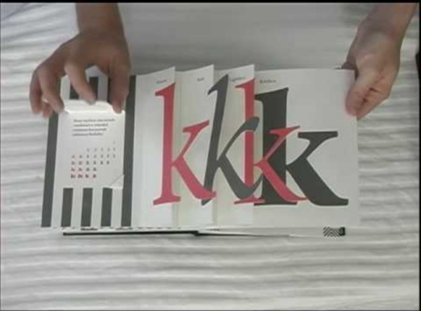
Artes Finais | Tag Archive | revistas Para os amantes do design editorial e do cinema. A revista britânica bi-mensal Little White Lies já está entre nós desde Março/Abril de 2005. É composta por 120 páginas dedicadas ao cinema, destacando em cada edição um filme como tema principal. Cada rubrica é personalizada oferecendo-nos uma verdadeira obra de arte através da perfeita conjunção de elementos gráficos, tipografia, ilustração, fotografia e conteúdo. Nesta última edição a Little White Lies presenteou-nos este video: “A magazine was born” “We wanted to make a short film that captured some of the love, care and hand-crafted passion that goes into the making of an issue of LWLies. Podem acompanhar este trabalho cuja direcção de arte é da autoria de Paul Willoughby em www.littlewhitelies.co.uk.
Illustrator * Overprinting By default, when you print opaque, overlapping colors, the top color knocks out the area underneath. Overprinting prevents knockouts and makes the topmost overlapping printing ink appear transparent in relation to the underlying ink. Where colors printed from separate plates overlap or adjoin one another, press misregistration can cause gaps between colors on the final output. To compensate for potential gaps between colors in artwork, print shops use a technique called trapping to create a small area of overlap (called a trap ) between two adjoining colors. About overprinting By default, when you print opaque, overlapping colors, the top color knocks out the area underneath. You may want to overprint in the following situations: Overprint black ink to aid in registration. Colors knocked out (by default) and with overprinting Set up overprinting Select the object or objects that you want to overprint. Overprint black Select all the objects you might want to overprint. Choose File > Print.
Top 10 Tips: Preparing images for print - Features Getting printed output that matches what you see on screen is a bugbear of most graphic designers and digital artists, so here's the colour geeks at Colour Confidence's guide to producing perfect prints. Before we begin, it almost goes without saying that a precisely calibrated? monitor is the first step towards ensuring that the images you are preparing? for print are as accurate as possible. A monitor calibrator, such as Pantone's ColorMunki or DataColor's Spyder3Elite, is a must for this. Right, let’s get started. Tip 1: Set your preferences In the Adobe Colour Preferences (Edit > Color Settings) in Photoshop, Illustrator and InDesign, set your RGB working colour space to Adobe RGB and the CMYK working colour space to Coated FOGRA39. Selecting the ‘Europe Prepress 3’ preset in CS5 apps will pre-configure these accordingly. One trick to ensure your colour spaces are matched -- and save a bit of time -- is to set this in Adobe Bridge. Tip 2: Always select ‘Preserve Embedded Profiles’
Illustrator * Creating Adobe PDF files Portable Document Format (PDF) is a universal file format that preserves the fonts, images, and layout of source documents created on a wide range of applications and platforms. Adobe PDF is the standard for the secure, reliable distribution and exchange of electronic documents and forms around the world. Adobe PDF files are compact and complete, and can be shared, viewed, and printed by anyone with free Adobe Reader® software. Adobe PDF is highly effective in print publishing workflows. By saving a composite of your artwork in Adobe PDF, you create a compact, reliable file that you or your service provider can view, edit, organize, and proof. When you save in Adobe PDF, you can choose to create a PDF/X-compliant file. Adobe PDFs can solve the following problems associated with electronic documents:
Adobe Photoshop Plugins and Filters :: Digital Photography Special Effects :: Photoshop, Photoshop Elements :: Digital Anarchy Small Business Software: Logo Design Software/-Email Marketing Software/ Press Release Software& More - Summitsoft Corporation How to Scan Film Negatives with a DSLR Well, lets just say I’ve gotten better at this over the last couple of years. The left image was one of the first I’ve “scanned” with my DSLR, and the one on the right I’ve just rescanned using the techniques described below (higher resolution available here). Right now I can get higher resolution and better image quality that what street labs give you on CD. I’ve seen many articles on the web explaining the basics of digitising film negatives or transparencies with a digital camera. First of all: Why? Street labs can usually scan the film but I’ve got bad scans and missing/cut frames more than once. These are my reasons, you may obviously have different ones. All the following instructions have the objective of achieving the best possible resolution, colour depth and dynamic range out of the film, while keeping image noise as low as possible. What You Will Need Ideally, you need a DSLR (any would do) because of the higher colour/bit depth. Setting Up the Hardware Turn auto-focus off.
TUTORIAL - Digitalizar filme com uma DSLR - Scanning e Impressões - Fórum Fotografia@net Bem, hoje acordei e vi o vídeo da DigitalRev, em que o Kai ensinava a digitalizar negativos com uma DSLR. A parte dos disparates do costume que ele faz, pareceu-me bastante interessante e gostei dos resultados que ele obteve, e agradou-me especialmente a ideia de não ter de gastar mais 200€ num Scanner. Materiais necessários: - Slide a digitalizar - Suporte para o slide (já explico) - Computador - Máquina fotográfica com lente macro - Tripé - Software de edição de imagem Então, a primeira coisa que fiz foi um suporte para segurar o negativo. Não tem de ficar perfeito, só serve para segurar o slide a uma posição mais ou menos alta, consoante o vosso monitor (o meu suporte tem cerca de 10cm) O setup que usei ficou assim (desculpem o coputador feio, para a semana já vai ser um MacBook Air A seguir, deve-se limpar o negativo com a ajuda de um “soprador”, para evitar que fiquem partículas e sujidade na foto final. :pos:
Blog de Design com uma pitada de criatividade e Inspirações de qualidade! Tutorial | Bons Tutoriais Fala pessoal, neste tutorial ensinarei você a criar um mosaico de Lego com qualquer imagem que quiser, assim como você vi na imagem de pré-visualização de nossa artigo, é um tutorial fácil e rápido de fazer, você ... Hoje ensinarei você a criar esta arte senssacional utilizando o Photoshop, dominando ela você conseguirá criar pôsteres, cartões ou cartazes, sei que não é a hora exata para eu estar compartilhando isso com você, ... Depois de um tempinho sem postar as próximas vídeo aulas sobre o blogspot agora voltamos com força total, nesta vídeo aula estaremos falando sobre como trocar o layout do seu blog criado com a ferramenta gratuita de ... Neste facílimo tutorial de Illustrator ensinarei você a criar estas belas e super coloridas estrelas geométricas, te ensinarei a base e a partir daí você usando a sua criatividade você conseguirá aplicar vários ... Fala galera!! Hoje em dia, é muito fácil comprar pela internet.
Inspire-se: referências de pictogramas Há alguns anos, um post sobre sinalização foi publicado aqui no Choco. Ele continha uma breve história da sinalização e alguns fundamentos. Um dos tópicos […] Há alguns anos, um post sobre sinalização foi publicado aqui no Choco. Atualmente o pictograma é frequente em espaços públicos e é um dos trabalhos que compõem os sistemas de sinalização dos quais os designers costumam ser responsáveis. Mas depois da breve definição, apresento para vocês uma série de trabalhos inspiradores de pictogramas, objetivo deste artigo. Veja também: Atalhos secretos do Photoshop - Designers Brasileiros - Design Gráfico | Web Design Como já foi dito antes, aprender a trabalhar com atalhos é extremamente importante, pois isso implica em aumento de produtividade. Muitos atalhos estão documentados, mas ainda existem alguns que somente profissionais experientes conhecem. Por isso, vamos aprender aqui alguns atalhos poucos conhecidos. O tutorial original foi feito para Mac, mas aqui está traduzido para usuários PC. Arrastar seleção Com a Marquee Tool, faça sua seleção no documento mas não solte o botão do mouse ainda. Navegue no documento para a esquerda ou direita Sabemos que o scroll do mouse faz a navegação para cima e para baixo, porém, se segurarmos a tecla Ctrl a função agora será a navegação para a direita e para a esquerda. Escolha as fontes da lista Clicando na caixa da lista de fontes você pode pressionar as teclas direcionais para cima e para baixo e navegar nas fontes existentes. Modifique o tamanho da fonte Com o texto selecionado, pressione Ctrl+Alt+Shift+> ou < para aumentar ou diminuir o tamanho da fonte.