
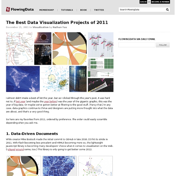
5 misconceptions about visualization Last month, I had the pleasure of spending a week at the Census Bureau as a "visiting scholar." They're looking to boost their visualization efforts across all departments, and I put in my two cents on how to go about doing it. For being a place where there is so much data, the visual side of things is still in the early stages, generally speaking. During all the meetings, there were recurring themes about what visualization is and what it is used for. Some people really got it, but others were new to the subject, and we ran into a few misconceptions that I think are worth repeating. Here we go, in no particular order. Visualization is for making data flashy This is probably the most common one. Well, maybe. For example, I mapped the growth of Walmart a while back (It's amazing how much mileage I get out of this graphic.), and people seem to like it because of the organic growth pattern. For example, here's a map with the same style as my Walmart one, but it shows the spread of Target.
Online project maps militant groups STANFORD (US) —A new online mapping project clarifies the complex relationships among terrorist organizations around the world. What’s the difference between Hamas in Iraq, the Islamic Army in Iraq, and the Jihad and Reform Front? The three militant Islamist groups are based in Iraq, but they have different historical roots and leadership structures. And their goals and strategies do not necessarily align, say researchers at Stanford University. These differences highlight one of the biggest challenges to tackling terrorism: understanding the motivations, allegiances, shifting priorities, and organizational structures of the dozens of militant groups around the world. The project is developing a series of interactive diagrams that “map” relationships among groups and show how those relationships change over time. Groups with similar grievances and demographics sometimes merge with one another; other times they don’t. They are almost finished with Somalia. Mapping al-Qaeda
Five Big Database Breaches of 2011's Second Half FIDO Alliance technology will allow enterprises to replace passwords with plug-and-play multifactor authentication. By Phil Dunkelberger President & CEO, Nok Nok Labs, 3/26/2014 1 Comment | Read | Post a Comment News Hackers interrupt and deface sites of black-market forums selling credit card data stolen from Target and other retailers.By Mathew J. 4 comments | Read | Post a Comment Breaches create outliers. 1 Comment | Read | Post a Comment Commentary Is "browser-ized" security a better defense against hackers than traditional methods? 2 comments | Read | Post a Comment Proponents say the new specifications will pave the way for the replacement of passwords, which are frequently lost, stolen, or hacked.By Tim Wilson Editor in Chief, Dark Reading, 2/18/2014 0 comments | Read | Post a Comment Report suggests malware-laced email attack on Target's HVAC subcontractor leaked access credentials for retailer's network.By Mathew J. 12 comments | Read | Post a Comment 1 Comment | Read | Post a Comment
Projects Zeiss How to Clean Your Glasses Cigna Top 10 Training Tips Infographic Cigna Blessings in a Backpack Cigna Summer Swim Safety Infographic Sports Poll Poster Spring 2015 Update Turner Better With Age Snackables Annual Appeal Infographics Vevo Fifth Anniversary Infographic Turner Santa's Logistical Nightmare Cigna Overcoming Running Roadblocks Turner Black Friday Infographic Turner College Life Infographic Turner Picture Perfect Infographic Cigna Health and Well-being Visual Content Turner Supernatural Disaster Infographic MapR The Walking Data Indeed Hiring Lab Interactive Infographic Turner National Coffee Day Infographic Facebook India Elections Infographic 2014 Sports Poll Poster Spring 2014 Update Turner National One-Hit Wonder Day Yelp Yelp vs Google+ Infographics Appirio Customer Service Infographic Oakley Le Tour de France Series Google+ Grow with Google Event Installations Android OS Update LeWeb LeWeb'13 Paris Live Graphics Imperva Web Attack Survival Safety Card YouTube Music Awards 2013 Nike Nike Free Run iD Facebook Tab Mindjet
Data Visualization & Mapping What is Data Visualization? "A picture is worth a thousand words" "Information design makes complex information easier to understand and to use.” – AIGA from aiga.org "Information design is all about the psychology and physiology of how users access, learn, and remember information; the impact of colors shapes, and patterns, learning styles." – Luigi Canali De Rossi from "What is information Design?" "Information design addresses the organization and presentation of data: its transformation into valuable, meaningful information." – Nathan Shedroff from nathan.com Who can use our solution? Journalists and bloggers Visualizations for articles To effectively communicate a message to their readers, lots of journals and magazines around the world (The Guardian, The New York Times, Le Monde…) use data journalism and data visualization. Available connectors XML / CSV / OLAP / Analytics / Zoho / Basecamp
Data, Data, Data: Thousands of Public Data Sources We love data, big and small and we are always on the lookout for interesting datasets. Over the last two years, the BigML team has compiled a long list of sources of data that anyone can use. It’s a great list for browsing, importing into our platform, creating new models and just exploring what can be done with different sets of data. In this post, we are sharing this list with you. Categories of data sources We grouped the links into some categories that bit.ly calls ‘Bundles’ to help you find what you are looking for and bundled the Bundles into a single Data Sources Bundle. Machine Learning Datasets Although many datasets can be used for machine learning tasks, the sources in this Bundle are specifically pre-processed for machine learning. Machine Learning Challenges Our next bundle of links contains links to Machine Learning Challenges. Marketplaces and data hubs There is an ever growing number of places where one can offer data, search data and download data. Open companies Like this:
NSA spying scandal fallout: Expect big impact in Europe and elsewhere (Updated) UPDATE: I’ll admit I am shocked to have received this response from the European Commission to my request for comment, with particular regard to the impact on EU citizens’ privacy: “We do not have any comments. This is an internal U.S. matter.” For the reason behind my surprise, read on… This is a great day to be a conspiracy theorist. Vindication! The companies themselves – Google, Facebook, Apple, Yahoo and so on – have denied the existence of these backdoors , but the U.S. authorities have not. That last part appears to be nonsense, hence the uproar within the U.S., but let’s for a moment take the Obama administration at its word and pretend it’s not spying on its own citizens. Great timing And nowhere more so than in Europe, which is already in the throes of a wide-ranging debate over data privacy . Guess which side of this battle just got a boost? Unsafe Harbor? But what about the current EU data protection rules? Cloud impact But that’s just business. Goodbye moral high ground
Council of the European Union Discusses Progress on the Proposed EU Data Protection Regulation On June 6, 2013, the European Union’s Justice and Home Affairs Council held legislative deliberations regarding key issues concerning the European Commission’s proposed General Data Protection Regulation (the “Proposed Regulation”). The discussions were based on the Irish Presidency’s draft compromise text on Chapters I to IV of the Proposed Regulation, containing the fundamentals of the proposal and reflecting the Presidency’s view of the state of play of negotiations. At the Council meeting, the Presidency was seeking general support for the conclusions drawn in their draft compromise text on the key issues in Chapters I to IV. Alan Shatter, Minister for Justice, Equality and Defense of Ireland, who chaired the meeting, noted the extensive work completed and progress made since the previous Council meeting on March 7-8, 2013. Some of the main issues discussed during the deliberations included: Legal Form Consent Risk-based Approach EU Institutions, Agencies, Bodies and Offices
Hunk: Raw data to analytics in < 60 minutes Update: now with UI setup instructions Finally, I got a bit of down time to sit down and get to the third part of the “Hunk: Splunk Analytics for Hadoop Intro” series of blogs, a follow up to part 1 and part 2 Summary of what we’ll do 1. So let’s get started .. Minutes 0 – 20: Set up the environment In order to get up an running with Hunk you’ll need the following software packages available/installed in the server running Hunk: 1. Installing the Hunk bits is pretty straightforward: #1. untar the package > tar -xvf splunk-6.0-<BUILD#>-Linux-x86_64.tgz #2. start Splunk > . Download and follow the instructions for installing/updating Java and the Hadoop client libraries and make sure you keep note of JAVA_HOME and HADOOP_HOME as we’ll need it in the next section. Minutes 20 – 40: Configure Hunk using the UI Configuring Hunk can be done either by (a) using our Manager UI interface by going to Settings > Virtual Indexes or (b) through editing conf files, indexes.conf. 1. 2. 3. 4. 5. 6. 7.
NSA Surveillance: First Prism, Now Muscled Out Of Cloud Companies can no longer discount the risk of losing control of confidential corporate data in the cloud. Government data mining is here to stay, in one invasive form or another. The latest round of stunning revelations of National Security Agency (NSA) surveillance and data mining of cloud-based services and Internet communications has added a new term to our lexicon of government spying. In addition to Prism, we now have Muscular looming over cloud adoption. The Muscular revelations are eye opening because, according to The Washington Post, they point to a far wider scope and far more indiscriminate data capture than even the Prism revelations suggest. Inevitably, we find ourselves asking the same set of questions we did when reports of Prism emerged. These new revelations certainly underscore the risk of cloud data landing in places outside enterprise controls. First of all, the NSA has circumvented the SSL encryption process by tapping the provider's datacenter directly. More Insights