

Adaptive Images in HTML Our Special Wordpress Theme | Mid Missouri Web Design | Located in Columbia, MO 10 petits conseils pour le Responsive Web Design ! Aujourd’hui, rendre son site internet utilisable à tous ses utilisateurs ressemble parfois à un challenge ! En effet, on trouve tout type d’utilisateurs qui navigueront : sur Chromesur FirefoxSur Internet Explorersur Safarietc.Mais aussi :sur iPhonesur iPhone 5 (pas la même taille)sur Androidsur BlackBerrysur Windows Phoneetc.Mais aussi :sur iPadsur Galaxy tabsur Galaxy Notesur iPad Minisur les tablettes Archossur Kindle FireMais aussi :sur la télévisionsur le frigo connectésur l’Amstrad CPC de mamie zinzin.. De nombreux outils, de nombreux supports et des tailles qui ne cessent de changer ! C’est dans cette évolution que l’on parle de « responsive web design » et c’est aussi dans cette pensée que j’ai réalisé la fameuse Responsive Museum Week où j’invitais les utilisateurs, les développeurs, les designers à « hacker » les sites internet des musées. Aujourd’hui, ce sont dix conseils pour le Responsive Web Design que l’agence Splio nous propose :
Peace and Wool ☮ kits en tricot - Peace and Wool 50+ CSS Techniques Designers Should Know 118 Flares Twitter 9 Facebook 0 Google+ 0 StumbleUpon 109 Pin It Share 0 118 Flares × CSS (Cascading Style Sheets) is just an important part of Web Designing. Without CSS, Websites can look untidy as it used to happen before. Designers can alter images, graphics, shading, spacing and other design elements. It can provide the designers with number of new styles to design a website. Navigation Matrix Reloaded Advance CSS Menus Block Hover Effect for a List of Links Cross Browser CSS SlideShow Hoverbox Image Gallery CSS Tabs Make Clickable Areas Bigger CSS-Based Forms: Techniques CSS Based Image Maps Sliding Photograph Galleries CSS For Bar Graphs Control Tabs Some styles for your Pagination No JavaScript LightBox Using CSS Drop shadow on an image CSS Shadows Styling blockquotes with CSS Glowing Tabs Menu Image Replacement for Buttons Cross Browser Multi-Page Photograph Gallery Footer Stick CSS Star Rating Part Redux Zebra Table with JavaScript and CSS Animated Navigation Menu using CSS CSS Photo Zoom
Bryan Connor Simple and Minimalistic Scandinavian Web Design Scandinavian design in general is known for being simple and minimalistic, from IKEA furniture, to Bang & Olufsen TVs, to interior design. Even Scandinavian fashion design, most notably Danish, is known for its simplicity. Many of those aspects of minimalism and simplicity have been inherited by web designers based in Scandinavia, as you’re about to see. We’ve gathered two dozen examples of exemplary clean, simplistic and minimal web designs from the Scandinavian countries, Denmark, Sweden, Finland, Norway and Iceland. Scandinavian simplicity really is beautiful! Activeark.com Angrycreative.se Appear.dk Bergh.dk Birth.se Bleed.no Carls.no DesignLabCPH E-types.com GreatWorks.se In2Media.dk Konstellation.dk LassePedersen.biz LillQvist.com PerssonStefan.se PhilipArvidson.se PlantCPH.dk rekryt.mil.se SorenRose.dk Wepic.se
Golden Grid System GGS was my next step after Less Framework. Instead of a fixed-width grid, it used a fully fluid-width one, without even a maximum width. The resources it was published with are still available on GitHub. The idea was to take a 18-column grid, use the outermost columns as margins, and use the remaining 16 to lay elements out. On smaller screens the 16 columns could be folded into 8, 4 and 2. This behaviour was inspired by Massimo Vignelli's Unigrid system. While the grid's columns were fluid — proportional to the screen's width — the gutters (spaces between the columns) were proportional to the font-size being used. GGS also contained a set of typographic presets, strictly to a baseline grid. Correctly setting all of these measurements is difficult, of course. When published, GGS gained a lot of attention, as the web design community was searching ways to work with fluid-width grids, which have always been troublesome, running counter to many graphic design principles.
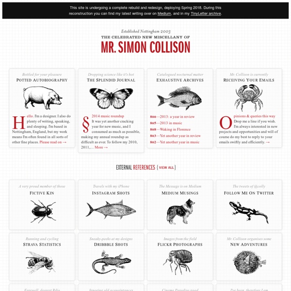
Responsive Web Design: 50 exemples et meilleures pratiques Responsive web design term is related to the concept of developing a website design in a manner that helps the lay out to get changed according to the user’s computer screen resolution. More precisely, the concept allows for an advanced 4 column layout 1292 pixels wide, on a 1025 pixel width screen, that auto-simplifies into 2 columns. Also, it suitably fixes on the smartphone and computer tablet screen. This particular designing technique we call “responsive design”. Now you can test your website using the Responsive Design Tool. Responsive web designing is an entirely different designing version than traditional web designing, and developers (especially fresher) must know about the pros and cons of responsive web designing. Pages that include data tables pose a special challenge to the responsive web designer. Images in responsive web designs are called context-aware. Designmodo Designmodo has a very clean and clear design with a perfect responsive design interface. Simon Collison
30 Cutting Edge Examples Of CSS Navigation | Graphic and Web Design Blog -Resources And Tutorials Navigation is one of those things you have to get right in order to provide your users with easy access to your website’s content. Today we’ll take a look at 30 well-designed navigation menus. Some of them use CSS sprites, some use jQuery or another library, and others take advantage of the great properties available in CSS3. I hope you will enjoy this post. Please feel free to chime in by leaving a comment at the end of this post as well! 1. 2. 3. 4. 5. 6. 7. 8. 9. 10. 11. 12. 13. 14. 15. 16. 17. 18. 19. 3.7 Designs 20. 21. 22. 23. 24. 25. 26. 27. 28. 29. 30. If you enjoyed this article, get email updates (it's free).
Robot…or Not?