
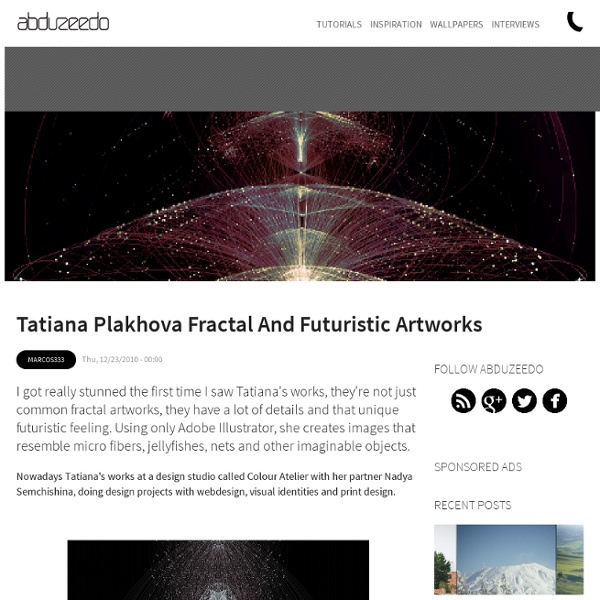
Interview with Cathy Martin aka flashparade In this interview we meet Cathy Martin aka flashparade, a vector artist from Canada. Her style of illustration is simple yet attractive with an appealing color scheme. Cathy talks about how she got started with vector art, her design process, ideas and inspirations. Read more about this artist who loves to create some amazing modern, sassy and cute female characters. Q Hi Cathy, give us a little background bio of yourself; tell us where you're from. What is a typical day for you? Well I was born in Prince Edward Island, Canada, and have lived there most of my life, though I did live in Halifax Nova Scotia for awhile. In the run of the day I can be found doing so many different things! Q What inspired you to become an artist? I don't really have a single moment of inspiration when I decided to pursue art, it was something that I had always done as a child, but as I got older I set my artistic nature to focus on school and studying. Q What is your work flow for creating a typical image?
Weekly Vector Inspiration #101 Vectips is a site dedicated to Illustrator tutorials, tips, tricks, and resources. It was created by Ryan Putnam of Rype Arts who is now an exclusive vector art contributor to iStockphoto. The site is now operated by his good friend Victor Jansen and his little dog Lou. Learn More We're currently looking for writers that can write articles on topics such as Adobe Illustrator, design and illustration techniques. Learn More Vectips is visited by over 200k beginner and advanced illustrators each month. How to Organize and Save a Vector File Vector is a great medium for collaborative work, but can become frustrating if the file you're using is badly organized. If you work in a collaborative environment, or want to upload files to stock sites such as Graphic River, you should always take the extra time to clean up and optimize your file. In this Vector Quick Tip I will be showing you how to organize and optimize a vector file so that it can be easily edited and understood by others. Step 1 Open the file that you want to optimize. Then open the Layers Panel, the Graphic Styles Panel, the Symbols Panel, the Brushes Panel and the Swatches Panel. Step 2 Delete the layers that aren't needed. Step 3 Separate out the various elements into their own layers. Step 4 Group together the items within a layer that should be a group. Step 5 You can make additional Group Layers within Group Layers. In the example below, I have a shadow under the Right Leg of the figure. Step 6 Step 7 Step 8 Step 9 Expand lines and brushes. Step 10 Step 11 Step 12
How to Create an Entangled Lettering Illustration – Part 1 In this two part tutorial, we're going to look at how to create a brief typographic message from scratch. In part one we'll go over the basics of constructing the letterforms. Step 1 Start by creating a simple line, which will become a capital letter "i." Step 2 Duplicate the line (Command + C, Command + F) and go to Object > Transform > Rotate, and rotate it by 90 degrees. Step 3 We duplicated the vertical line in order to form the top and bottom bracket of the letter "i." Step 4 Make sure you have Smart Guides and Snapping enabled. Step 5 Duplicate the top bracket and place one on the bottom as well. Step 6 Reduce the vertical size of this line to 70% of its original size. Step 7 We're using geometric methods as a starting point, but you're going to need to grab the pen tool (P) and draw the top with it. Step 8 Trace the bottom half just as you did with the top, but this time with an additional anchor point. Step 9 The "o" letter is obviously a simple circle path with a stroke. Step 10 Step 11
Cool Calendar Designs to Inspire your New Year Hope everyone had an enjoyable Christmas and we are now approaching into a brand new year! Here is a showcase of beautiful calendar designs made by the experts. Wish you have an inspiring 2011! Saurians Renaissance (Calendar 2011) Chinese Wrigley Calendar View more works from Fil Dunsky Calendar ’11 View more works from Benjamin Koh 2011 Blue-Nox Calendar View more works from Corrado Grilli MWM : B/W Typography 2011 Calendar View more works from Matt W. 2011 Calendar of Silly Holidays View more works from Annica Lydenberg ‘Target Practice’ Dart Calendar View more works from Serhiy Chebotaryov Pantone Calendar View more works from Derek Bowers MWM : Cycles & Seasons 2011 Calendar View more works from Matt W. Calendar 2011 View more works from Felix Ng
Best of 2010: Vector Weekly Inspiration Vectips is a site dedicated to Illustrator tutorials, tips, tricks, and resources. It was created by Ryan Putnam of Rype Arts who is now an exclusive vector art contributor to iStockphoto. The site is now operated by his good friend Victor Jansen and his little dog Lou. Learn More We're currently looking for writers that can write articles on topics such as Adobe Illustrator, design and illustration techniques. Learn More Vectips is visited by over 200k beginner and advanced illustrators each month.
How to Create an Entangled Lettering Illustration – Part 2 In the second part of this tutorial series, we're going to bring this treatment to life with some color. Stick around to learn about casting shadows and highlights through abstract color shapes. Before you proceed with this part, I suggest you back up the original file from part 1. Before we begin to add color, we need to add shadows. Expand the stroked path (Object > Expand). Once you've done the same for the bottom, grab the Rounded Rectangle Tool and create a rectangle from corner to corner. Repeat this process and apply it to any straight parts of the letters where using the tool is possible. For other parts, we'll have to create the gap in a different way. Expand the stroke (Object > Expand), and make sure to have it on top of the layer you want trimmed. Select it and the object behind it that you want to trim, and use the Pathfinder to delete those portions. You now need to round off the corners of the newly created gaps. With the Pen Tool, click on the corner anchor to delete it.
Draw a Realistic Pineapple Using 3D Illustrator Effects Learn how to easily draw a vector pineapple using the 3D Revolve effect, how to create the realistic texture and apply it with the Map Art option. This tutorial could also by a great way for you to practice your Pen Tool skills by drawing all the different leaves. Step 1: Pineapple Base The first thing to do is to draw the curved path from the image below using the Pen Tool and to give it a 0.5 pt Stroke. Step 2: 3D Revolve Now go to Effect > 3D > Revolve and change the values (as shown below) to obtain the pineapple body shape. Step 3: Polygons Here is how to create the texture for the pineapple's body. Step 4: Irregular Shape Go to Object > Path > Add Anchor Points to add the four middle points on each side, then move them by pressing the arrow keys on the keyboard one time in the direction shown in the image for each point. Fill the shape with a radial gradient using the following colors: dark brown (R=113, G=64, B=19), brown (R=157, G=106, B=53) and green (R=93, G=112, B=43). Final Image
Create a Green Viscous Text Effect In the following tutorial expand an existing font, use illustrator's 3D tools to add dimension, and then add a green viscous text effect. If you want to add a fun, vector text effect to your portfolio, then get started now. Step 1 First, download the Earthling font and move in your Fonts directory. Now, open Illustrator, create a 700px by 300px document and pick the Type Tool (T). Click on your Artboard, enter your text and go to Object > Expand. Step 2 Select the group made in the previous step and go to Effect > 3D > Extrude & Bevel. Step 3 Drill down in the group and subgroups created in the previous steps. Step 4 Select all the top, letter shapes and go to Object > Compound Path > Make. Step 5 Open the Gradient and the Swatches panel. Step 6 Let's focus on the "v" shapes. Select this new fill, and use "Gradient 01," as shown below. Step 7 Now that you understand how to work with multiple fills, use the same gradients for the rest of the shapes, as shown in the following images. Step 8
Weekly Vector Inspiration #103 Vectips is a site dedicated to Illustrator tutorials, tips, tricks, and resources. It was created by Ryan Putnam of Rype Arts who is now an exclusive vector art contributor to iStockphoto. The site is now operated by his good friend Victor Jansen and his little dog Lou. Learn More We're currently looking for writers that can write articles on topics such as Adobe Illustrator, design and illustration techniques. Learn More Vectips is visited by over 200k beginner and advanced illustrators each month. Preparing Artwork for Screen Printing in Adobe Illustrator - Smashing Magazine Advertisement Getting t-shirts printed is an ideal way to promote your business, organization or event. They are a promotional item that people can actually use, and they have the added bonus of being an advertisement for you. In this post, Adobe Illustrator will be used to create a three-color screen print using a fictional company logo, and have it set up to allow a screen printer to easily print the color separations that create the separate screens for each color print. Although some printers prefer to create their own separations, it’s always good to understand the process. Printing Techniques As the t-shirt is going to be printed in three colors, we have to create separate artwork for each layer of color. Examples of Trap, Knockout and Overprint There are three artwork techniques commonly used for this type of printing: Trap, Knockout and Overprint. Preparing Your Artwork File 1. Opening the vector artwork in Illustrator presents the graphic in Layer 1. 2. 3. 4. 5. 6. 7. 8. 9. 10.