
Element Rotation with CSS Transformations I've gone on a million rants about the lack of progress with CSS and how I'm happy that both JavaScript and browser-specific CSS have tried to push web design forward. One of those browser-specific CSS properties we love is CSS transformations. CSS transformations allow us to rotate elements on a 360 degree axis. Rotating elements is a breeze too -- take a look. The Mozilla CSS -moz-transform:rotate(120deg); The CSS property is denoted as Mozilla-only with the "-moz" prefix. -moz-transform:rotate(120deg); -moz-transform:skewx(25deg) translatex(150px); The WebKit CSS -webkit-transform:rotate(120deg); Obviously WebKit uses the "-webkit" prefix. The Opera CSS -o-transform:rotate(120deg); Opera uses its standard o- prefixed property to signal the transform. The Internet Explorer CSS Microsoft has implemented a -ms prefix for the transform: -ms-transform:rotate(120deg); The CSS snippet above works well within IE9, but IE8 and lower require some filter magic: That's about it.
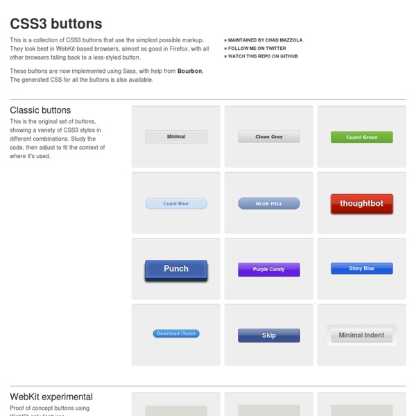
CSS3 Facebook Buttons Buttons To create the default "button" add a class of uibutton to any appropriate element. To create the blue variant include an additional class confirm. To create the green variant include an additional class special. <a class="uibutton" href="#">Button</a><button class="uibutton" type="submit">Button</button><input class="uibutton" type="submit" value="Button"> Larger buttons To create larger buttons inclue an additional class of large. Grouped buttons To created grouped buttons wrap them in an element, or use a list, given the class uibutton-group. <div class="uibutton-group"><a class="uibutton" href="#">Dashboard</a><a class="uibutton" href="#">Inbox</a><a class="uibutton" href="#">Account</a><a class="uibutton" href="#">Logout</a></div><ul class="uibutton-group"><li><a class="uibutton" href="#">Dashboard</a></li><li><a class="uibutton" href="#">Inbox</a></li><li><a class="uibutton" href="#">Account</a></li><li><a class="uibutton" href="#">Logout</a></li></ul> Mixed groups New message
CSS Débutant : Feuilles de style CSS pour les débutants - Tutori Supported CSS3 Features – CSS3 PIE: CSS3 decorations for IE The following sections describe in detail the exact levels of support PIE has for certain CSS3 properties and value types. border-radius PIE fully supports the border-radius property syntax as defined in the CSS3 Backgrounds and Borders module specification for IE 6-8. IE 9 and up support border-radius natively so PIE does nothing. border-radius: [ <length> | <percentage> ]{1,4} [ / [ <length> | <percentage> ]{1,4} ]? Only the shorthand version is supported; the longhand border-top-left-radius etc. properties are not. border-radius: 5px 10px 15px 20px; (top-left, top-right, bottom-right, bottom-left). The rounded corners are applied to the element's background area (including solid background colors, background images, and background gradients), the element's border, and the box-shadow if specified. Both the standard border-radius property name as well as a custom prefixed -pie-border-radius property name are recognized; if both are present then the prefixed value will take precedence.
CSS3 Box Shadow Generator - CSS3gen Use this CSS3 box shadow generator to quickly generate box shadow CSS for your project. Your browser does not support the CSS3 box-shadow property. You can still use this tool to generate the CSS3 rule, but you won't be able to see the results. <div class="error_msg">Please enable Javascript to use this page. Box Shadow Explained The CSS3 box-shadow property allows you to add depth to your website's design without the need for images or extra container elements. While the syntax is easy to understand, it is hard to visualise the style using just code. The box-shadow syntax works as follows: The first value defines the distance of the box shadow in the x (horizontal) direction and the second value defines the distance in the y (vertical) direction. Optionally you can include an additional parameter after the blur distance: This defines the spread distance of the shadow. Supporting Browsers
EOTFast - Convert TTF to EOT, Fast untitled FOUT-B-Gone — Demo This page demonstrates the “onload” method, which is the most reliable but slower than “asap.” To see how this script performs make sure you are viewing this on Firefox 3.5/3.6 or Internet Explorer 7–9. Other browsers will not see any differences in web font loading. *Web font load time is still dependent on the font server download speed. Installing FOUT-B-Gone Begin by downloading the foutbgone.js, and inserting it in the head of your document after your CSS calls. Using FOUT-B-Gone The simplest initialization will look like this: fbg.hideFOUT('asap'); FOUT-B-Gone hides elements with custom fonts assigned to them. fbg.hideFOUT('asap', 400); Putting it all together: <script src="foutbgone.js" type="text/javascript"></script>\ <script type="text/javascript">\ fbg.hideFOUT('asap', 400);\ </script> Configuring FOUT-B-Gone Option Default Description method asap fbg.hideFOUT('asap');fbg.hideFOUT('onload'); delay 100 (ms) fbg.hideFOUT('asap', delay);fbg.hideFOUT('onload', delay);
CSS3 Multi Column Layout Generator Dignissim tristique a, auctor massa in nascetur lundium, nascetur mid integer dis et egestas rhoncus ac aliquet turpis integer velit, est dolor porttitor auctor, elementum porta sit tristique urna ac proin odio, habitasse ridiculus, non nunc nisi ac integer ultricies vel ac, phasellus ac? Scelerisque, ac sagittis sociis vel dictumst! Ac odio, dis placerat mus platea odio a in arcu!
CSS transitions This is an experimental technologyBecause this technology's specification has not stabilized, check the compatibility table for usage in various browsers. Also note that the syntax and behavior of an experimental technology is subject to change in future versions of browsers as the specification changes. CSS transitions provide a way to control animation speed when changing CSS properties. Instead of having property changes take effect immediately, you can cause the changes in a property to take place over a period of time. For example, if you change the color of an element from white to black, usually the change is instantaneous. Animations that involve transitioning between two states are often called implicit transitions as the states in between the start and final states are implicitly defined by the browser. Which CSS properties are animatable? The Web author can define which property has to be animated and in which way. Also the auto value is often a very complex case. HTML Content
spin.js The Essential Guide to @font-face Fonts on the Web The days of being limited to a handful of fonts on the web are very close to being a thing of the past. The problem is no longer a lack of viable solutions, but rather, an abundance of them. Technologies like Cufon, sIFR, FLIR and @font-face all represent different groups of developers placing bets on what they believe to be the future of web typography. There is, as of yet, no consensus in this ever-evolving game. Further, even the most popular browsers support each of these technologies in widely varying degrees. However, the @font-face CSS method is among the strongest, simplest and most flexible competitors in this game. This guide will teach you how to implement @font-face with cross-browser compatibility and will also look at a number of the supporting services that have arisen, making it even easier to use custom fonts in your web designs. Licensing and Free Fonts Font licensing presents one of the largest headaches and stumbling blocks to great typography on the web.
50 Useful CSS Snippets Every Designer Should Have - Hongkiat With so many new trends advancing every year it can be difficult keeping up with the industry. Website designers and frontend developers have been deeply ingrained into the newer CSS3 properties, determining the ultimate browser support and quirky hacks. But there are also brilliant CSS2 code snippets which have been unrequited in comparison. For this article I want to present 50 handy CSS2/CSS3 code snippets for any web professional. These are perfect for storing in your development IDE of choice, or even keeping them saved in a small CSS file. Recommended Reading: 20 Useful CSS Tips For Beginners 1. Basic CSS browser resets are some of the most common snippets you’ll find online. 2. This clearfix code has been around the Web for years circulating amongst savvy web developers. 3. 2011 Updated Clearfix From what I can tell there isn’t a major difference in rendering between this newer version and the classic version. 4. Code Source 5. Code Source 6. 7. Code Source 8. Code Source 9. 10. 11.
Fighting the @font-face FOUT FOUT is what I’m calling the flash of unstyled text that you get while using @font-face in Firefox and Opera. Heads up, lots of things have changed around this stuff. check out all the updates on this post! In June, Remy Sharp documented the how a browser progressively renders a page using @font-face. Things work differently between browsers natch: Here’s how in Firefox; basically the text is in a default webfont until the custom font is ready: Webkit takes a very different approach, and very intentionally. I really don’t like the text upgrade FOUT, so I personally prefer webkit’s technique. Best practices for serving fonts: Minimize the overall kilobyte size of your font file. When exactly do browsers download the font file? Garrick at Kernest tipped me off to IE’s interesting behavior here. After some research we can see when the asset download is initiated: I’ve put up a test page where you can experiment and watch your dev tools to see when the file is grabbed. 2009.11.07. 2009.11.08.