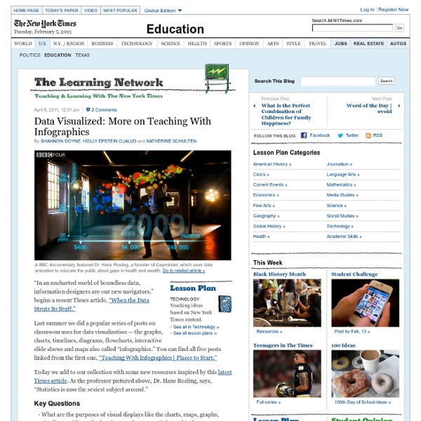
The Best Sources For Interactive Infographics Interactive Infographics are online representations of information or data that usually allow the user to “interact” with it and the data that is visualized. They’re generally created by newspapers for their websites, and often, though not always, are accessible to English Language Learners. In fact, they can be an exceptionally accessible way for ELL’s to learn complicated information that might ordinarily not be comprehensible. I’ve posted about quite a few interactive infographics over the past three years. I thought readers might find it useful to learn which sites I have found to be the best sources of good interactive infographics. The links on this list will take you directly to the Interactive Infographics page of the named newspapers. Here are my picks for The Best Sources For Interactive Infographics: The Boston Globe The Wall Street Journal TIME Magazine The Cleveland Plain Dealer The New York Times The Denver Post USA Today The Sun Sentinel Wilmington News Journal The Guardian
Everything You Own In A Photo: A Look At Our Worldly Possessions : The Picture Show Today on All Things Considered, photographer Peter Menzel and his wife, Faith D’Aluisio, discuss their latest book, What I Eat: Around the World in 80 Diets. But 16 years ago, Menzel was working on another project, called Material World: A Global Family Portrait. He and other photographers took portraits of 30 statistically average families with all of their worldly possessions displayed outside their homes. Hide caption The Ukita family in front of their home in Tokyo. From Peter Menzel's "Material World" project, which photographs 30 statistically average families in 30 different countries with all of their possessions.
Infographics By Alex , Infographics Explained and How to Use Them In Your Classroom What Are Infographics? I found many definitions of what Infographics are as well as explanations of how they are useful in a variety of settings. Here are a couple of the definitions I liked followed by their sources:Information graphics or infographics are graphic visual representations of information, data or knowledge. These graphics present complex information quickly and clearly, such as in signs, maps, journalism, technical writing, and education. With an information graphic, computer scientists, mathematicians, and statisticians develop and communicate concepts using a single symbol to process information. And finally, an Infographic that explains what is an Infographic: These three examples do a nice job of defining what infographics are, but what is the value of an infographic in education? Smiciklas also notes that "Robert Lane and Dr. Infographics and Education "Helping students interpret visual representations of information - NYTimes.com." Rosenthal Tolisano, Silvia.
Helping students interpret visual representations of information Update: Feb. 29, 2012 Please note: The original video we used for this post was a video podcast by Gestalten TV in which New York Times Graphics Director Steven Duenes and Graphics Editor Archie Tse describe how their team works with breaking news to create clear, concise visualizations of data for readers. Since that has now been taken down, we have substituted a classic TED talk by David McCandless that we refer to in the post. We’re declaring this week Infographics Week on The Learning Network because we know how important it is for students to be able to read and interpret visual representations of information — and because The New York Times consistently creates useful and elegant examples that we think teachers across the curriculum should know about. Not only do charts, graphs and maps show up on standardized tests of all kinds, but whiteboard technology has made the graphic depiction of information that much more useful and ubiquitous in classrooms. Infographics in General:
Blog - Cool Infographics Helping children to become better researchers To teach children how to become competent researchers requires several stages. I like to use Inspiration (or Kidspiration) Graphic Organisers to guide them in this task. That is why I use this Graphic Organiser 'What do we know about?' The nouns or verbs in the question are likely to be their search words. The next step is to go to Google or any other search engine enter in the search words. type in one of the key words, if that word is on the page it will be highlighted, ask the child to read the sentence the word is highlighted in, refer them back to their research question and ask them if it answers their question, if not they click on the Next and that will highlight the next instance of that word, again they read that sentence. The next Graphic Organiser is the 'Finding Information on the Internet'.Children type in
FlowingData | Data Visualization, Infographics, and Statistics Creating Infographics with Students I have been mesmerized by Infographics for a while now. Take a look at my previously written posts. What are infographics? Here are some definitions I ran across as I was learning and wrapping my mid around teaching with infographics: Visua.ly, a soon-to-be-released site to “Create, Share, Explore Great Visualizations” states in their intro video: Visualization= Story+Data+Design The video clip also points out the following three elements of an Infographic DesignJournalismAnalysis which lead directly into the reasons why we should not only teach students WITH but also to allow the to CREATE their own infographics. You can download the following flyer “Creating Infographics with your Students” as a pdf file. Creating Infographics with your Students Why teach with infographics? How to create your own infographics? What tools to use to create your infographic: Creating charts and other components Pulling all together: Word/PagesPowerpoint/KeynotePhotoShopComicLife (mac and iPad app)Visualize (iPad app)
Gapminder: Unveiling the beauty of statistics for a fact based world view. Infographics and Inquiry Presenting All of my schools at the present are embroiled in Rugby World Cup fever. Students are researching and finding out information not only about their own country but also adopted countries. Soon they will need to present this information so I have been talking to teachers about how 'Infographics' are a great way to present student work. Students will have created their research question, found their keywords and used the smart researcher tools to find information. They will have copied photos or graphics to folders and the internet references to WordProcessor (Word, Pages, Google Docs) along with 'brief' notes copied from Internet pages that answer their research question. They will synthesise their notes and present facts and 'hopefully' they will present new ideas with conclusions and inferences. Now how could they present it? The following example has been created in Comiclife. Or in PowerPoint Or in Keynote The criteria for an infographic presentation is
Tomorrow’s College Will Be Free edtechdigest.com © 2010-2014 EdTech Digest. Skip to content ← Implementing 1-to-1 Computing: Getting Close, But Content Still Falls Short Trends | Infographic: College Degree on Your iPad → Trends | Infographic: Tomorrow’s College Will Be Free Share this: Like this: Related Trends | Are MOOCs the Future of Online Education? Trends | Infographic: Online Education Around the WorldIn "trends" Trends | Coursera by the NumbersIn "trends" Image | This entry was posted in Uncategorized and tagged Coursera, MOOCs, udacity. Leave a Reply Find your favorite stories: FREE! edtechdigest.com The Twenty Ten Theme Blog at WordPress.com. %d bloggers like this:
Data Visualization and Infographics Resources - Smashing Magazine Advertisement Data visualizations and infographics can make complex datasets easier to understand and comprehend. By creating a graphical represenatation of data and statistics, complicated concepts and information can make more sense in less time. Many visualizations focus on representing a specific set of data or statistical information. But visualizations and infographics can be used poorly, too. Also consider our previous articles: Data Visualizations and Infographics which lists examples and types of infographics and data visualizations.Data Visualization: Modern Approaches showcases modern examples of data visualization and infographics. 1. Here are some blogs and website that provide great information for information designers, including how-to articles, visualization showcases and galleries, and other resources. Strange Maps Strange Maps features only map-based graphics, both modern and historical. Wall Stats Visual Complexity Cool Infographics Data Mining Edward Tufte Infographics News