
Apprise - Une alternative élégante aux alert Javascript en jQuery Apprise est un plugin jQuery permettant de proposer une solution élégante aux fameuses alert() Javascript. Il faut l'avouer, les alert() javascript dans un site en prod, c'est franchement laid ! Apprise propose de reproduire l'effet de ces alert JS mais avec style et de façon moins bloquante. Les possibilités d'Apprise sont nombreuses: Simple alert box ou affichage de texte (alert)Alert box avec demande de confirmation (confirm)Demande de saisie avec texte et confirmation (prompt)Etc Le plugin créé une fenêtre modale (qui ne se redimensionne pas automatiquement si on redimensionne le navigateur, dommage), moins bloquante qu'une alert javascript. D'un point de vue utilisation: 01. 03. if(r) { 06. else { Et la série d'options qui va avec pour personnaliser les textes, l'animation etc. 02.' 03.' 04.' 05.' 06.' 07.' 08.' 09.' Le style est personnalisable en CSS pour coller avec le design de votre site. Site Officiel
Responsive Navigation Patterns Update: I’ve also written about complex navigation patterns for responsive design. Top and left navigations are typical on large screens, but lack of screen real estate on small screens makes for an interesting challenge. As responsive design becomes more popular, it’s worth looking at the various ways of handling navigation for small screen sizes. Here’s some of the more popular techniques for handling navigation in responsive designs: There are of course advantages and disadvantages of each method and definitely some things to look out for when choosing what method’s right for your project. Top Nav or “Do Nothing” Approach One of the easiest-to-implement solutions for navigation is to simply keep it at the top. Pros Cons Height issues- Height matters in mobile. Responsive navigation breaking to multiple lines on small screens In the Wild Resources This clever solution keeps the nav list at the footer of the site, while the header contains a simple anchor link pointing to the footer nav.
Parallax Content Slider with CSS3 and jQuery Easy management Far far away, behind the word mountains, far from the countries Vokalia and Consonantia, there live the blind texts. Separated they live in Bookmarksgrove right at the coast of the Semantics, a large language ocean. Read more Revolution A small river named Duden flows by their place and supplies it with the necessary regelialia. Warm welcome When she reached the first hills of the Italic Mountains, she had a last view back on the skyline of her hometown Bookmarksgrove, the headline of Alphabet Village and the subline of her own road, the Line Lane. Quality Control Even the all-powerful Pointing has no control about the blind texts it is an almost unorthographic life One day however a small line of blind text by the name of Lorem Ipsum decided to leave for the far World of Grammar.
Apprise - The attractive alert alternative for jQuery The initial release of Apprise has been a major success and is often what this site is most commonly associated with. As far as I've been able to track, Apprise has been downloaded over 23,000 times and has been mentioned in over 46,000 blogs. Which is fantastic, especially for something that I've never been very proud of. I've wanted to update, and change the UI, of this for over a year now. Time has finally permitted and it's, finally, ready. Demos Let's get right down to business. Pretty slick, right? Let's take a peak at the default settings before we change the options around a bit. You'll notice that the buttons are completely customizable and can easily be altered using your own CSS rules. Let's try another demo, but changing the settings around a bit. We're going to use a custom CSS class on our confirm button. You'll see the custom blue button with it's custom text, as well as a goofy little callback function that populates the field below: Response: Using
10 Free jQuery Rich Text Editors To Enhanced Your Web Application Rich Text Editor very important web component of any CMS based web application, which allows users to edit articles within a web browser. There are many rich-text editors out there. What’s even better than a lot of choices? In this article, we present jQuery based free rich-text editors. MarkitUp markItUp! demo / source jWYSIWYG This jquery plugin is an inline content editor to allow editing rich HTML content on the fly. demo / source RTE jQuery This Rich Text Editor as simple as possible to be easily changed according your needs. demo / source jHtmlArea A simple, light weight, extensible WYSIWYG HTML Editor built on top of jQuery. demo / source WYMEditor WYMeditor is an open source web-based WYSIWYM editor with semantics and standards in mind. demo / source uEditor uEditor is flexible and easy to use. demo / source jQuery WYSIWYG Rich Text Editor demo / source HtmlBox Cross-browser interactive open-source HTML / XHTML textarea built on top of the jQuery library. demo / source CLEditor demo / source
Swiper - Most Modern Mobile Touch Slider Swiper - is the free and most modern mobile touch slider with hardware accelerated transitions and amazing native behavior. It is intended to be used in mobile websites, mobile web apps, and mobile native/hybrid apps. Designed mostly for iOS, but also works great on latest Android, Windows Phone 8 and modern Desktop browsers Swiper is not compatible with all platforms, it is a modern touch slider which is focused only on modern apps/platforms to bring the best experience and simplicity. Swiper, along with other great components, is a part of Framework7 - full featured framework for building iOS & Android apps. Swiper is also a default slider component in Ionic Framework Powered With Top Notch Features Library AgnosticSwiper doesn't require any JavaScript libraries like jQuery, it makes Swiper much more smaller and faster. Buy Us A Beer If you like Swiper you can always buy us a bottle of a nice beerso we can continue developement of such amazing product and to keep it always free Donate
8 ressources Jquery pour sites fullscreen Les sites avec un webdesign plein écran, envahissent le web. Pour la simple et bonne raison que leur mise en page est souvent simple, efficace et permet de mettre avant des visuels qui en jettent. Pour vous aider a faire de même, je vous propose 8 ressources Jquery. Bien avant l’explosion et l’utilisation massive de Jquery, le Flash était la principale technique utilisée pour réaliser des sites « fullscreen« . Les designers qui se sont tourné vers la librairie Jquery ont permis de faire avancer la technologie pour offrir des sites toujours plus rapides, toujours plus animés et prenant la totalité de l’écran du navigateur. Vous cherchez les ressources et les tutoriels sur le sujet ? Menu animé Jquery en plein écran Galerie fullscreen avec miniatures animées Galerie fullscreen Galerie Jquery avec miniatures Le célébre plug-in « Supersized » Jquery Jquery Fullscreener plug-in Un tutoriel CSS + Jquery Galerie / slider en fullscreen
Why Rounded Corners are Easier on the Eyes by anthony on 08/17/11 at 10:17 pm Designers use rounded corners so much today that they’re more of an industry standard than a design trend. They’re not only found on software user interfaces, but hardware product designs as well. So what is it about rounded corners that make them so popular? Indeed they look appealing, but there’s more to it than that. Rounded Corners are Easier to Process Anyone can appreciate the aesthetic beauty of rounded corners, but not everyone can explain where exactly that beauty comes from. Some experts say that rectangles with rounded corners are easier on the eyes than a rectangle with sharp edges because they take less cognitive effort to visually process. Scientific research done on corners by the Barrow Neurological Institute found that the “perceived salience of a corner varies linearly with the angle of the corner. Which object is easier to look at? We’re Conditioned for Rounded Corners Which object would you trust with your child? Conclusion References
Case Study: jQuery Fixer Upper Recently in the CSS-Tricks Forums, user named Waffle posted the following bit of jQuery JavaScript: $(function(){ $('.ContactArea').hide(); $('.Portfolio').hide(); $('.WebDesign').hide(); $('.AboutCoadin').hide(); $('li.Contact').click(function(){ $(".ContactArea").slideToggle(); }); $('li.PortfolioBtn').click(function(){ $(".Portfolio").slideToggle(); }); $('li.WebDesignBtn').click(function(){ $(".WebDesign").slideToggle(); }); $('li.AboutBtn').click(function(){ $(".AboutCoadin").slideToggle(); }); }); This user's actual question was how they can extend their code to add functionality to scroll the page down to the areas as they expand. But in looking at code like this with a slightly more experienced eye, there are things that stick out as things that we can likely improve upon. Since I bet there are some of you folks that are at Waffle's level and writing code like this, I thought we could use this as a case study to learn from. It works, but... Do we need a DOM ready statement? ID's <!
Why ‘Ok’ Buttons in Dialog Boxes Work Best on the Right by anthony on 05/25/11 at 11:30 pm Designers often question where to place their ‘Ok’ and ‘Cancel’ buttons on dialog boxes. The ‘Ok’ button is the primary button that completes the task action. The ‘Cancel’ button is the secondary button that takes users back to their original screen without completing the action. Platform Consistency Is Not Good Enough Many have referred to following platform conventions as the answer. “Consistency” is a popular word used among designers. What if a certain design convention is harmful to users? There are certain platform design conventions that are widely used today because they work for users. Button Placement Matters One could argue that making your action buttons prominent by giving it more visual weight and a clear and distinct label is more important than its placement. To only focus on one design aspect and not the others is an act of a careless designer. Why ‘Ok’ Buttons Work Best on the Right Less visual fixations Conclusion Our Products Affiliates
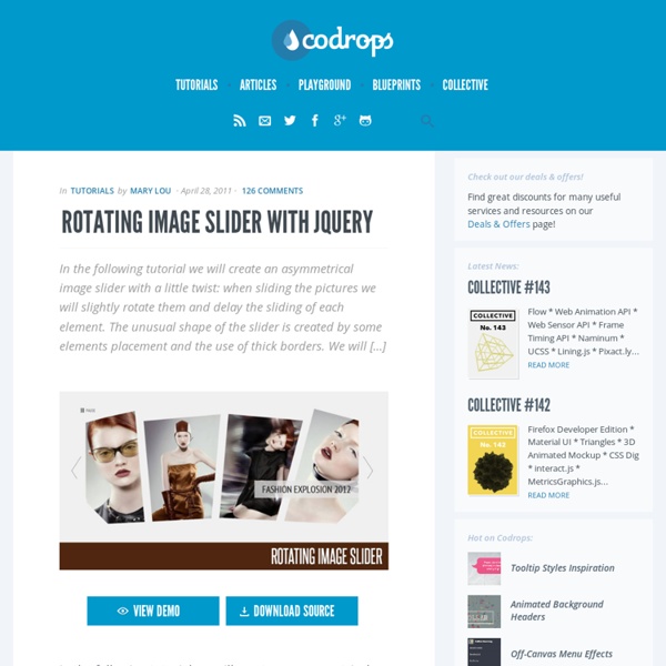
Sliding Letters with jQuery Today we have a neat little effect for you. We want to bring some life to the standard hover effect by playing around with the letters in an anchor word. The aim is to slide in letter by letter when hovering over a link element. We can either have the same word or a different […] Today we have a neat little effect for you. We want to bring some life to the standard hover effect by playing around with the letters in an anchor word. We will be using the Lettering.js jQuery Plugin which you can find on Github. Example In the following we will go through an example and we’ll start by the html for a little menu: We will use data-hover to indicate the word that should appear on hover. So, “sl-w1″ is the class for the first word letters and “sl-w2″ is the class for the second word letters. Finally, we call the plugin: The following settings can be used: We hope you liked this little experiment and find it useful! View demoDownload source
Why Your Business Needs a Mobile Website Right Now The Digital Marketing Series is supported by HubSpot, an inbound marketing software company based in Cambridge, MA, that makes a full platform of marketing software, including lead generation tools. First, the good news: If you have a website, then you have a site that can be accessed by any mobile device with a browser. Now, the bad: Chances are, that site looks pretty crappy on said mobile device. If you're worried about this, you're not alone. In such an environment, a site designed to be viewed on a desktop PC comes across as woefully lacking. At that point, your potential customer may start looking around. Yet currently, most businesses haven't optimized their sites for mobile. If you're among the other 79% or so, take heart. In part, that's because Google has stepped in. Google's howtogomo.com is a clearinghouse of information on the topic and even includes a feature that lets you see how your site looks on a mobile device. Series supported by HubSpot