
Tom Davie | 2010 Typographic Posters Blackletter 4CP. 5 x 7 inches. This typographic poster features a photographed 3-D two-tone blackletter paper sculpture overlaid with an original graphite line drawing. « buy a signed print Note: posters currently for sale are indicated below their respective project description. Now Available — Note card sets and numbered edition print sets featuring Blackletter, Can O’ Dingbats, Typographic Hype, Paragraph Indentation and Sans Serif are now for sale in the...studiotwentysix2 shop Can O’ Dingbats 4CP. 5 x 7 inches. This typographic poster is an ode to Hermann Zapf’s Zapf Dingbats. « buy a signed print Paragraph Indentation 4CP. 5 x 7 inches. Photographed in natural light, this poster is based on the typographic suggestion that paragraph indentation should be a one-em space. « buy a print or iPhone case Typographic Hype 4CP. 11 x 17 inches. This typographic poster features a photographed 3-D letterform sculpture overlaid with an original graphite line drawing. « buy a signed print « buy a print
Typefoundry The League of Moveable Type 25 MORE Completely Free Fonts Perfect for @fontface A year or so ago we published our original Completely Free Fonts Perfect for @fontface. It has been a long time coming but here, at long last, is our next installment. Again, we have chosen 25 free (for both personal and commercial use) fonts that are so good we can’t believe they are the free. Here they are… Bemio Download Page → Bemio Copyright → Pay what you want (or zero) for personal and commercial use. FV Almelo Download Page → FV Almelo Copyright → Free for personal and commercial use. Rex Download Page → Rex Copyright → Free for personal and commercial use. Poly Download Page → Poly Copyright → Free for personal and commercial use. Exo Download Page → Exo Copyright → Free for personal and commercial use. Arvil Download Page → Arvil Copyright → Pay what you want (or zero) for personal and commercial use. Hagin Download Page → Hagin Copyright → Free for personal and commercial use. Haymaker Download Page → Haymaker Copyright → Pay what you want (or zero) for personal and commercial use. Static
80 Beautiful Typefaces For Professional Design Every now and again designers stumble upon the very same problem: the choice of a unique and beautiful typeface which manages to fulfill three basic tasks. Support the corporate identity, enrich the visual appearance and is compatible with the overall design. However, usually there are simply too many options you can consider, which is why you need time to find the option you are most comfortable with. Although the choice usually depends on clients’ requirements, it is necessary to have some pretty starting points for your font decision. Every now and again designers stumble upon the very same problem: the choice of a unique and beautiful typefaces which manages to fulfill three basic tasks. So which typefaces are “bulletproof”? We have answers. Further Reading on SmashingMag: Let's take a look at over 80 gorgeous typefaces for professional design, based upon suggestions from designers and web-developers all over the world. Classic Typefaces Classics of typography in a brief overview. 1.
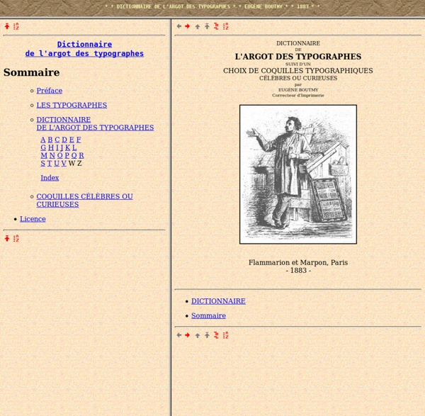
Museo font Downloads: 0 Rate this font: Lowercase characters Uppercase characters Other characters 14 Punctuation Marks That You Never Knew Existed TypeCon | Presented by the Society of Typographic Aficionados Lexique Des Règles Typographiques En Usage À L'imprimerie Nationale - Achat Vente Neuf Occasion page crée le 2014 04 15 21:38:23 bbc2a27a2d82f6a45062138320946ce920100915 15,30 €Promo-4%14,54 €Produit Neuf+ 3,05 € (frais de port) Note du vendeur :4,9/5pour 113859 ventes Commentaire vendeur : Vendu par TOPSLIBRIS, expédié par PriceMinister-Rakuten - NEUF EN STOCK DISPONIBLE IMMEDIATEMENT. Vendeur professionnel, remise de 5%, expédié sous 12h à 24h, hors week-ends. Voir le détail de l'annonce - Voir les modes d'expédition Autres vendeurs pour ce produit Livre - Collectif - 23/08/2002 - Broché Résumé :Vous qui devez rédiger ou corriger, saisir ou préparer un texte, vous vous posez souvent ces questions... et bien d'autres aussi délicates. © tire Les PriceMembers ayant vu 'Lexique Des Règles Typographiques En Usage À L'imprimerie Nationale' ont finalement acheté 7 vendeurs pour Lexique Des Règles Typographiques En Usage À L'imprimerie Nationale de Collectif Les PriceMembers ayant vu les mêmes produits que vous ont aimé Dans votre région Donnez votre aviset cumulez 1 Note :5incontournable Edito
Règles typographiques (résumé) Résumé de règles typographiques Les "règles typographiques" indiquées ici pour l'impression papier sont conformes à celles définies par l'Imprimerie nationale et détaillées dans : Lexique des règles typographiques en usage à l'Imprimerie nationale. 3e édition. Paris : Imprimerie nationale, 2002. Rappelons que ce n'est pas la norme obligatoire, mais simplement une norme parmi d'autres. Règles, codes, guides Index des points traités Pour plus de précisions sur chacun des points abordés, cliquer sur les liens indiqués. – virgule, point, points de suspension, parenthèse fermante), crochet droit fermant] : pas d'espace avant, espace après – (parenthèse ouvrante, [crochet droit ouvrant : espace avant, pas d'espace après – deux points, point-virgule, point d'interrogation, point d'exclamation : espace insécable avant – apostrophe : pas d'espace avant ni après – titres : pas de point à la fin N.B. Ponctuation Espaces Pour les guillemets, voici les usages pour l'allemand, l'anglais et le français :
revues.refer.org/telechargement/fiche-typographie.pdf