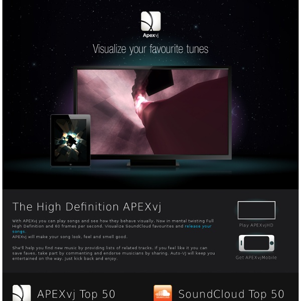
APEXvj - Visualize your favourite tunes online
I often get cheers and good ideas from several people around me. You know who you are, thank you! Would also like to point out that all the rocks and the beautiful hand model where made by Jonny Ree. Jani Länsimäki made the basis for the APEXvj visual line where it could evolve to what we see today. A lot of it is still here. It's made for the love of music and realtime graphics.
http://www.apexvj.com/
blog » Hexbins!
Binning is a general term for grouping a dataset of N values into less than N discrete groups. These groups/bins may be spatial, temporal, or otherwise attribute-based. In this post I’m only talking about spatial (long-lat) and 2-dimensional attribute-based (scatterplot) bins. Such binnings may be thought of as 2D histograms. This may make more or less sense after what lies beneath.
The 101 Most Useful Websites on the Internet
Here are the most useful websites on the Internet that will make you smarter, increase productivity and help you learn new skills. These incredibly useful websites solve at least one problem really well. And they all have cool URLs that are easy to memorize thus saving you a trip to Google.
About Google+ Ripples - Google+ Help
Google+ Ripples creates an interactive graphic of the public shares of any public post or URL on Google+ to show you how it has rippled through the network and help you discover new and interesting people to follow. Ripples shows you: People who have reshared the link will be displayed with their own circle.
FREE DESKTOP WALLPAPERS
ITO - Road Fatalities USA
This web site and the information it contains is provided as a public service by ITO World Ltd, using data supplied by the National Highway Traffic Safety Administration (NHTSA), U.S. Department of Transportation (DOT). ITO World Ltd makes no claims, promises or guarantees about the accuracy, completeness, or adequacy of the contents of this web site and expressly disclaims liability for errors and omissions in the contents of this web site.
Annuaire telephonique entreprise et professionnel
Protovis
Protovis composes custom views of data with simple marks such as bars and dots. Unlike low-level graphics libraries that quickly become tedious for visualization, Protovis defines marks through dynamic properties that encode data, allowing inheritance, scales and layouts to simplify construction. Protovis is free and open-source, provided under the BSD License. It uses JavaScript and SVG for web-native visualizations; no plugin required (though you will need a modern web browser)! Although programming experience is helpful, Protovis is mostly declarative and designed to be learned by example.
The Overview Project » How Overview turns Documents into Pictures
Overview produces intricate visualizations of large document sets — beautiful, but what do they mean? These visualizations are saying something about the documents, which you can interpret if you know a little about how they’re plotted. There are two visualizations in the current prototype version of Overview, and both are based on document clustering.
d3.js
Data Science Toolkit
Gephi, an open source graph visualization and manipulation software
MALLET homepage
Related:
Related: