
12 Tips For Designing an Excellent Checkout Process - Smashing UX Design. Advertisement Shopping online can be a great experience. You don’t have to leave the comfort of your home and you can quickly compare and read about all the competing products in order to pick the best one for you. But it can also be a little frustrating if the process isn’t designed correctly. Looking around for that checkout link, having to fill out registration forms and then being told the product is out of stock isn’t going to make your day.
Spend a little bit of time fine tuning your checkout process and polishing off the user experience and you’ll be rewarded with happier customers and more sales. You may be interested in the following related posts: 1. Your customers are here to shop, not fill out forms. Target requires an account, but it’s only prompted after you’re ready to check out. By moving these barriers further down the line you increase the chance of your visitors becoming paying customers. 2. 3. Everyone makes mistakes. 30 Impressive Ways to Design Sign-Up Page/Form at DzineBlog. Learn how to earn $125 or more per hour as a freelancer - Click Here Looking for hosting?.
We recommend MediaTemple for web hosting. Use Code MTLOVESDESIGN for 20% off In most online business the revenue of the site solely depends on the registered and active users and Making the visitor of your site to sign up isn’t easy, nobody likes to fill in forms . Web forms bridge the gap between the product and the customer therefore, we designers, need to figure out sound design make the form completion process easy. But while designing the Signup page / form lot question will arise in designers mind like how should the text box / buttons should look? 1. )PSDThemes 2. )Nibbledish 3. )Livestream 4. )Big Cartel 5. )Gowalla 6. )Next Big Sound 7. )YouAre 8. )Omgpop 9. )Footytube 10. )LaunchMind 11. )PopScreen. The Apple Store's Checkout Form Redesign. Though most people wouldn't consider Apple's Web site an important online destination, November saw Apple in the top ten list of US Web sites. 62 million Internet users visited Apple online during the month with an average of 1 hour and 18 minutes spent per user.
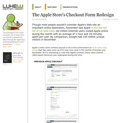
By comparison, Google had 155 million unique visitors in November. Apple's online store certainly played a role in this achievement as retail sales data shows that Mac sales were up 21% year-over-year in the months of October and November. So it's interesting to note that Apple's primary online sales channel (Web-based checkout) was redesigned during this time. The previous design of Apple's checkout form spanned multiple pages and utilized a top-level progress indicator to highlight where people were in the proces. Errors were displayed at the page-level and did not reference the fields responsible for errors nor provide actionable remedies when error messages showed up.
Credit card numbers follow a consistent structure.