
Box-shadow, one of CSS3′s best new features. Home / CSS3 Previews / Box-shadow, one of CSS3’s best new features The box-shadow property allows designers to easily implement multiple drop shadows (outer or inner) on box elements, specifying values for color, size, blur and offset.
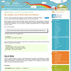
Browser support is growing of late with Mozilla (Firefox), Webkit (Safari/Chrome/Konqueror), Opera and the IE9 Platform Preview all offering a decent implementation of the spec, although Mozilla and Webkit still require their respective -moz- and -webkit- prefixes (note Mozilla Firefox 4.0+ no longer requires the -moz- prefix). Here’s a basic example: Firefox, Safari/Chrome, Opera and IE9 users should see a grey fading shadow under this box. In theory, the code for this is straightforward: But for the moment, as with many other ‘experimental’ CSS3 properties, you’ll need to use the following prefixes to support Mozilla and Webkit: How it Works The Syntax: box-shadow: none | [ , ]* = inset?
Examples: Creating a basic drop shadow Layering multiple shadows. James' Blog - The Shadow effect in CSS3. This post was written a while ago (April 2009) and hence the information presented below may have less relevance compared to new practices since the original publish date.

Please take this into consideration when reading the information below. Posted on: Sunday April 19th 2009 at 7:32 PM Shadow in website design is something that can be achieved by using CSS and images, to achieve shadow in CSS2 you would use images and positioning, it can be achieved but it usually means that you have to create multiple divs. See my tutorial of creating shadow in CSS2 but one of the exciting new attributes in CSS3 is box-shadow which allows someone to get a nice shadow effect with just using one attribute applied to a div. As simple as it sounds the box-shadow attribute has very limited implementation in browsers and at this time only Mozilla Firefox 3.1 Beta (Not Mozilla Firefox 3) and Safari 3 + will display the shadow effect that the box-shadow displays. Actually defines the padding in the order of : Ombres avancées avec CSS3 et box-shadow.
CSS3 c’est pour l’aspect vendeur du nom, car au final on va aussi et surtout bénéficier du service de pseudo éléments (:after et :before) qui sont prévus depuis CSS2.1.
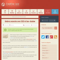
Les visuels que vous voyez sur la page de démonstration ne sont composés qu’avec des propriétés CSS sur une seule et unique <div> (pour chaque bloc). Chez moi le meilleur rendu est sous Firefox, notamment pour la dernière ombre qui est un peu osée (au passage il semblerait que la propriété opacity ne fonctionne pas sur les pseudo-éléments). Dans cette démonstration nous allons utiliser des propriétés avancées de CSS2.1 (:before et :after) qui sont des pseudo-éléments.
Des pseudo-éléments permettent de construire un élément dans la structure de votre document (DOM) sans vraiment en construire un… ok, ça commence bien pour l’explication. Pseudo-éléments :after et :before Ainsi tous les liens porteurs de l’attribut hreflang se verront agrémentés d’un « (en) », dans le cas d’un lien anglais par exemple :Mon lien (en) Bogues.