
Debsam40
Pearltrees videos. Personality types. Getting started. 10 Great, Free Apps for Students for Notetaking and Class Planning. These days, there are some great apps for students to use to take notes for class, or to use as class planners. 1.
Evernote and EverStudent My favorite is Evernote. I use it for everything, literally, and many of my students use it for taking notes, clipping web pages, creating to do lists, and more. There is also a new Android app available, called EverStudent, that integrates with Evernote and acts as a planner for students. 2. Skitch also works with Evernote and allows you to create sketches and annotate, edit and save photos and your sketches. 3.
MySchoolNotebook is another note taking app I just reviewed earlier here: 4. Memonic is similar to other note taking tools in that you can clip web content, take text notes, share notes, and access it from any computer. There is also a feature coming that will allow you to use Memonic's web clipper to save notes directly to your Evernote account. 5. SimpleNote is exactly what it's name says - it's a free, simple note taking app. Marzano.
10 Astounding Infographics Comparing Money Matters Around the World. 47 Flares Google+ 2 Twitter 31 Facebook 4 Reddit 1 StumbleUpon 1 Pin It Share 0 LinkedIn 8 inShare8 47 Flares × It goes without the saying that comparing wealth and spending in different countries is almost impossible: people work, earn and even spend differently – moreover, their ways of life and views can be too different to compare.
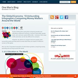
However, we still try to compare because people move around the world and they want to know what they can expect in different corners of the globe. Here are the 10 greatest examples of information graphics comparing money, spending and earning around the world: 1. U.S. The most interesting finding of the stats research and the visualization: The U.S. is the clear leader in total annual spending, but ranks 9th in Science performance and 10th in Math. Note: It is unclear what was the measure used to compare the countries in their math and science performance. 2. Most Expensive Cities is the World is an interesting visualization by Home Loan Finder. Category:Infographics. 10 Awesome Tools To Make Infographics. Advertisement Who can resist a colourful, thoughtful venn diagram anyway?

In terms of blogging success, infographics are far more likely to be shared than your average blog post. This means more eyeballs on your important information, more people rallying for your cause, more backlinks and more visits to your blog. In short, a quality infographic done well could be what your blog needs right now. Designing An Infographic Some great tips for designing infographics: Keep it simple! Ideas for infographic formats include: Timelines;Flow charts;Annotated maps;Graphs;Venn diagrams;Size comparisons;Showing familiar objects or similar size or value. Here are some great tutorials on infographic creation: Creating Your Infographic.
How To Create Outstanding Infographics. In this tutorial you will learn that data doesn't have to be boring, it can be beautiful!

Learn how to use various graph tools, illustration techniques and typography to make an accurate and inspiring infographic in Adobe Illustrator. Start by using the Rectangle Tool (M) to draw a shape. Give it a subtle radial gradient too. The entire design is based on a grid of four columns. To make the columns first select the rectangle and drag a guide onto the centre of the shape. Condense the shape so it fits within the left-most guide and centre guide. Move the shape over to the right and add another guide to the centre here. Using the Rectangle Tool (M) draw a thin white box on the centre line that will be the width of the gap between the columns.
Repeat the process for the other columns with your final result being below. I like to place the most important graphics first and work-in the ancillary charts and graphs afterwards. What Annoys People About Emails? [Infographic] Email, the never ending communication media through which everyone has succeeded and will be successful forever.
![What Annoys People About Emails? [Infographic]](http://cdn.pearltrees.com/s/pic/th/annoys-people-infographic-14299737)
Email also know as Electronic Mail (e-mail) is widely used by almost all the Internet users and can never be replaced by any other communication medium :). What would have happened if there was no “Email” ?? We would’ve never been connected to any of our friends onlineOur Knowledge would’ve never been enhanced without any latest news falling into our mailbox ;)Facebook,Twitter,Google+ and other Social Networks would’ve not gained the boom and popularity which they’ve gained nowWe would still depend on the postal system and wait for days to deliver the message and receive it back But I’m thankful to all the technicians and Engineers who has provided Email service to us and in 1971 the first Email (ARPANET) was sent and successfully received, which was the start of the Internet Revolution. For a Blogger like me , Email helps me in each and every aspects of Blogging. Source.