
Calligraphic Guidelines. This is ductus, a simple guide lines generator for calligraphers. Creating über-Flex. Namiki Falcon Collection Fountain Pen, Black Soft Medium Nib (60252): Office Products. Custom Namiki Falcon Resin Fountain Pen HD. ITALIC CALLIGRAPHY (excerpt) De Lettermakerij. Lettering Artist and Calligrapher. Since exploring the continuous line in my lettering at V&A I have noticed a plethora of advertisements/ graphics featuring this sort of connected cursive text.
The products that they are promoting range from an energy provider, a skating rink, music concerts, contraceptives and only today I noticed my sugar sachet had lettering as a moving line too! This joined lettering has been with us since the invention of neon street signs. It is now familiar as text art too in galleries with neon displays by artists such as Bruce Nauman, Tracey Emin and Ian Hamilton Finlay. I have continued to explore the extreme cursive line in my lettering with a new design ready to be translated into an iron work sculpture. I am also working on an experimental book. Much of my time lately has been taken up with teaching commitments. I have begun teaching my first ever ” Improve your handwriting” course for adults at Idler Academy. I am often asked what led me to to take up calligraphy. Let Me Flex your Namiki Falcon! Extra fine, and full of flex .
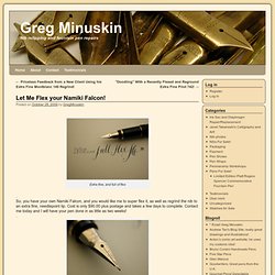
So, you have your own Namiki Falcon, and you would like me to super flex it, as well as regrind the nib to an extra fine, needlepoint tip. Cost is only $90.00 plus postage and takes a few days to complete. Contact me today and I will have your pen done in as little as two weeks! . Parts & Accesories. Paintings - Amity Parks Calligraphy. About Calligraphy.
The word calligraphy literally means beautiful writing.
Before the invention of the printing press some 500 years ago, it was the way books were made, each copy being written out by hand by a scribe in a scriptorium on materials like vellum or parchment with a quill in one of the period bookhands like rustic, carolingian, blackletter, etc. This definition of calligraphy conjures up images of Mediaeval Manuscripts, fancy wedding invitations or some other beautiful quaint relic of a long ago time and is limiting to the potential it has to offer to the artist today. To the serious modern day practitioner, re-creating the past is not of much interest and I suspect a bore to the viewer as well.
The question is "what is timeless, enduring & relevant about writing and drawing letters today? " More simply put, why do it? Vehicles for communication or subject matter / medium? Timeless attributes are still relevant... Image-making / object making: calligraphy is not a cookie cutter proposition. Gemma Black Calligrapher. Alphabet, The : Mark of Man : Free Library of Philadelphia, UPMAA. <div style="padding:5px; font-size:80%; width:300px; background-color:white; margin-left:auto; margin-right:auto; border:1px dashed gray;"> Internet Archive's<!
--'--> in-browser video player requires JavaScript to be enabled. It appears your browser does not have it turned on. Please see your browser settings for this feature. </div> All rights are reserved by the University of Pennsylvania Museum of Archaeology and Anthropology (Penn Museum). This film and all of the films in the Penn Museum collection are copyrighted by the Penn Museum, and are not in the public domain. Www.as8.it/handouts/foundational.pdf. Supplemental Writing Hands. In my opinion, those who aspire to fine handwriting should include their adaptation of the universally familiar humanistic roman writing hands in their repertoire.
There will be many occasions when headers or important passages written out in these hands will add dignity and elegance to their renditions. The humanistic minuscule letterforms originally formulated by Poggio Bracciolini in the early fifteenth century and subsequently refined by scribes throughout that century, are compatible - indeed harmonius - with Italic writing. I particularly admire the Humanistic writing of Mark of Vicenza, late Fifteenth century, PlateXX (pages 402 & 417) - Writing & Illuminating & Lettering (Edward Johnston), for its roundness and evenness.
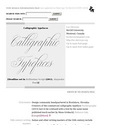
50.—16th Century [image 2164x968 pixels 75] Calligraphy. Wolgast-based type designer Peter Wiegel (b. 1955) runs CAT Design Wolgast.
Designer of these free fonts: In 2014: Incopins Clusters (multilined typeface). In 2013: Spartakus (+Round), Cut Me Out (white on black sans), 5by9 (dot matrix face), Tartlers End (high-contrast ball terminal face), Alpha 54 (rounded flared script face), Chunk Five Ex (slab serif; he writes: With permission of Meredith Mandel, the original author of the ASCII-Font Chunk Five, I have extended Chunk Five Ex to a full featured unicode font with all figures used in Latin and Cyrillic writing), Simple Print (simple sans), Fette Bauersche Antiqua (a didone fat face), Manuskript Gothisch (after Manuskript Gotisch (1899, Bauersche), which was modeled after Wolfgang Hopyl's 1514 Textura), Quast (hairy font).
Still in 2013, he published a number of school scripts, including Neue Rudelskopf, Deutsche Normalschrift, Imrans School, Rastenburg (German school font), and Bienchen. Dafont link. Abstract Fonts link.