
Vacation Time Around the World. Counterfeit-drug-industry_502916ebb3417_w1500. Counterfeit-drugs-infographic. Counterfeiting-infographic. Transparency. Infographics for Students sur Pinterest Blog About Infographics and Data Visualization - Cool Infographics. Business Infographics. Infographic Category Business Infographic Categories Follow Us.

Explicit cookie consent. WORLD leaders are currently gathered in New York for the annual meeting of the United Nation's General Assembly.
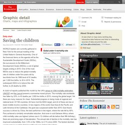
One of the foremost items on the agenda will be the Sustainable Development Goals (SDGs), the successors to the Millennium Development Goals (MDGs), a set of global targets ending in 2015. One of the main MDGs was to reduce the global mortality rate of children under five-years-old by two-thirds from its 1990 level of 91 deaths per 1,000 live births, to 30 in 2015. The subsequent SDG is to reduce this still further, to 25 deaths by 2030.
Even a below-target 50% fall in the mortality rate means a huge number of lives saved. In 1990, almost 13m children globally died before their fifth birthday; now a further 6.8m children a year are living to see it. The Economist explains: Why golf is in decline in America. Chart/Line graph vocabulary exercise. Changing British attitudes: snapshot. Changing British attitudes: explore the major trends. Super old: how many people live to 100? When it comes to government statistics, simple titles are important.

So today's numbers were clearly labelled 'Estimates of the Very Old' - and by 'very' they mean people aged 90 all the way up to the 105+ year-olds. How many old (old) people are there and which country has the most? 12,320 birthday card holders In 2012 there were almost half a million people aged 90+ living in England and Wales. Daily chart: The rich get richer. Daily chart: The rich get richer | The Economist:

China's presence in Europe: The long march. Videographic: Global fertility. Visualizing How A Population Grows To 7 Billion. 7 Billion: How Did We Get So Big So Fast?
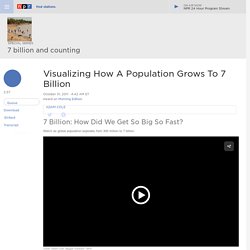
Watch as global population explodes from 300 million to 7 billion. Sometime Monday, the world will have more humans than ever: 7 billion, according to the U.N. The U.N. estimates that the world's population will pass the 7 billion mark on Monday. Much of that growth has happened in Asia — in India and China. Those two countries have been among the world's most populous for centuries. Due in part to that region's extreme poverty, infant mortality rates are high and access to family planning is low. As NPR's Adam Cole reports, it was just over two centuries ago that the global population was 1 billion — in 1804. As higher standards of living and better health care are reaching more parts of the world, the rates of fertility — and population growth — have started to slow down, though the population will continue to grow for the foreseeable future. London in figures - an interactive guide: The knowledge. Graphic detail. 35 Extremely Funny Graphs and Charts. Who could have ever thought that charts and graphs might have anything to do with fun?
At least not until creative Cheezburger guys launched a project called GraphJam few years ago. GraphJam.com explains daily life, music, songs and pop culture in charts and graphs. Readers can even submit their own graphs based on their own experiences and observations. According to its founders, GraphJam is the unholy love child of bored office workers, music and pop culture.
Describing graphs(IELTS) for ESL teachers. 15.para.dscrb.chrts.grphs. Ielts_writing. ADMC HD Common Year Writing Graphs. Back to Writing First, read this general information about graphs in ADMC HD Year 1.

Read about the two types of graphs - time and comparison - here at Writefix. Download a PowerPoint file on the two types of graphs - time and comparison - here. Read this two-page step-by-step guide to writing about graphs, or download in Word, or PDF Note: Don't forget that as well as graphs, tables, and charts, you may get maps, pictures, and diagrams. Pie Charts Read this introduction to Pie Charts. Try the following exercises with ONE pie chart Try the following exercises on TWO (or more) pie charts. Exploiting Infographics for ELT. For a while now I have been increasingly interested in using infographics in the design of the learning materials and courses I create for students and teachers.

For those of you who haven’t encountered the term ‘infographic’ before, an infographic is a visual representation of, what is often, quite dense statistical information. This is the kind of information which can be very difficult to read as prose / text, but which, when transformed to a visual, can become accessible very quickly. If this explanation isn’t clear then you can click on the infographic about infographics and get an example which should make some of the benefits of infographics a bit clearer. There are a few reason I believe these infographics are so useful for language teaching (especially online) materials.They convey a lot of information using a minimal amount of language. Once you have found the infographic you want to use, you’ll need to design a task. Related links.