
Official Google Website Optimizer Blog. Checkout the Amazon Way. The design of your checkout page determines the ease and probability with which customers succeed to convert.
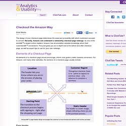
Recently, Amazon.com underwent a noteworthy checkout page redesign. As one of the world’s largest online retailers, Amazon has accumulated valuable knowledge about their customers’ conversions. This post gives you an in-depth look at its before and after checkout page, as well as expert tips to use for your own redesign. Elements of a Checkout Page All elements of a checkout page should encourage, inform, and guide a visitor towards conversion. Web analytics, Conversion & Usability Blog. The Daily Egg – Conversion Optimization and Design Advice for Small Business. Site Search. The @KISSmetrics Marketing Blog.