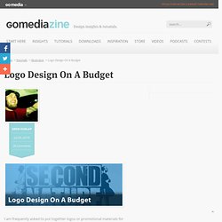

Logo Design On A Budget. I am frequently asked to put together logos or promotional materials for independent bands, which is fantastic, except they don’t have the budget of a signed or sponsored band.

Through the years I’ve found ways to cut corners to limit design time without limiting the overall design quality. In this tutorial I’ll break down my creative process used on a logo design for the UK hip-hop duo Second Nature. The Brief: Second Nature had a clear vision of what they were wanting in a logo design, which can be good or bad. It does somewhat limit the designer’s creativity but on the plus side it saves the designer time trying to hit the correct style and layout. Tools Used: Wacom Intuos3Photoshop CS4Illustrator CS4GoMedia Destoy 2 Vector Pack.
Photoshop Action: Stamp/Print Effect. Works great on any single color logo, emblem, mark, seal, crest.

Because of the great response to my Aged Type action, I took it a bit further and made a similar effect that could be applied, not only to text, but to your logo to give it an authentic stamp or print effect. I have seen various rubber stamp effects on google and none are all that great. So let me show you why mine is the bees knees. This is a premium Photoshop action that took some time to perfect. How to Create Hand-Painted Sign in Adobe Illustrator. In this tutorial we will learn how to create an inscription in a retro style based on the free font- the Agency FB.

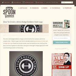
In the process of the font-change we will learn something about letter anatomy. The techniques described here will be useful not only for the work with typography but also for the work with any vector objects. Retro Badge/Emblem Style Logo. The retro style badge/emblem of logos is a hot trend at the moment, and it’s no surprise why – They’re super cool!

We’ve already looked at a showcase of retro and vintage style logos based on circular motifs, now let’s build our own. We’ll put the basic structure together in Illustrator, then give it that aged vintage appearance with some finishing touches in Photoshop. The logo we’ll be creating is for the totally fictional Powerhouse Gym (although I wouldn’t be surprised if there was a gym somewhere with this name!). It combines many of the typical traits of this retro/vintage theme with alternating rings of black and white as well as fine details such as the stars and dots. The text and tagline follow the circumference of the circle while the icon sits bang in the centre and gives visual feedback as to what the logo is promoting.
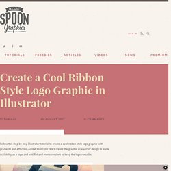
Create a Cool Ribbon Style Logo Graphic in Illustrator. Follow this step by step Illustrator tutorial to create a cool ribbon style logo graphic with gradients and effects in Adobe Illustrator.

We’ll create the graphic as a vector design to allow scalability as a logo and add flat and mono versions to keep the logo versatile. Usually a logo project would involve lots of research in order to develop a brand that reflects the company, but for this tutorial we’ll focus just on the practical task of building a cool looking graphic in Illustrator. How To Create an Impossible Shape in Illustrator. Infinite shapes are fun to design.

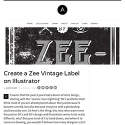
Create a Zee Vintage Label on Illustrator. It seems that the past 3 years had a boom of retro design, starting with the "cosmic neon lightning" 80's aesthetic that I think most of you are already bored about.

Not just because it became a trend, but also because everyone with a photoshop could emulate one. So here's the thing, this new retro wave more focused on 50's and 60's design and illustration seems to be really different, why? Because most of it is hand drawn, and when it to comes to drawing, you wouldn't believe how many designers can't do it. Let's assume, the last 20 years were pretty revolutionary to design since the computer took a big role on productivity and creation. But he also created patterns and made things more similar, some designers can't even work "old school", since they rely too much on the computer and that's not good. Step 1 First of all, let's open Adobe Illustrator and create a new canvas with 21 x 21 cm (8,27 x 8,27 inches). Using the rectangle tool (M) make this big square that fits over the canvas.
Colorful Logo Style Ribbon Graphic. In today’s tutorial we’re going to look at creating a colorful ribbon graphic.

Despite being a typical logo style icon, we don’t have a live client for this particular design. The tutorial is aimed towards giving you insight into actually making the cool graphic as oppsed to the full logo design process. We’ll use various tools and techniques in Adobe Illustrator to create a great looking vector based design complete with subtle gradients and shading. The logo style graphic we’ll be creating is made up of four colourfully striped ribbon style elements.
The four pieces are interweaved to create a kind of pseudo Penrose Stairs type illustration. View the full size ribbon logo design. Reader Tutorial: Geometric Flower Effect Logo in Illustrator. In this tutorial I will show you how I made this nice logo for one of my clients in Czech Republic. Feel free to use it as inspiration, but please do not copy it in any form. All copyrights belong to the owner whom I made it for.
How to Make a Business Card in Five Easy Steps. Tutorials June 15, 2012 Branding and identity design junkies, rejoice!

Create a Business Card in Illustrator and Print it with UPrinting. Business cards are one of the staples of any working graphic designer.

In this tutorial we'll take the Rockable Press brand we worked through in Part 1 of this set of tutorials and apply it to create and print business cards with UPrinting. Business Cards - Step 1 As we'll be doing tomorrow in the upcoming Brochure tutorial we'll begin by going to the printer that we're going to be using to get our item specs. So we head over to UPrinting and click on Business Cards and decide on the following specifications: Size: 2" x 3.5" Stock: 14pt Cover MatteColor: 4 Color Both Sides.
Fun Print-Ready Doodled Business Card Design. There’s nothing more unique to your creative talent than a series of your own doodles and sketches. Let’s use the good old doodle to represent our design services by combining quick and fun doodles with a print ready business card design. We’ll be drawing our doodles directly in Illustrator, and using the application’s print abilities to set up our business card document with the correct margins and bleed to build a complete print-ready PDF document. The design we’ll be building calls upon some random ideas for the topic of your doodles. How about a stick-man battle or a cow abducting UFO for the focal point of your business card?
Start work by opening up Adobe Illustrator. Illustrator has kindly positioned a red guide to let you know where your bleed boundaries are, as well as the black outline showing where the final card boundaries will be. Right click and unlock the guides. Repeat the process for the top and right guides, but this time enter -5mm so they are moved negatively. Designing a Business Card in InDesign. Print Ready Letterhead & Comp Slip. Follow this step by step process of creating professional print ready design files for your letterhead and compliment slips stationery designs. We’ll build the design in Adobe Illustrator with the appropriate bleed and margin settings, then use a mix of Adobe Distiller and Adobe Acrobat to export and check over the final design files.
The letterhead and double sided comp slip designs for Jack’s are all tied together with the bright colour scheme and vertical stripes. View the letterhead and comp slip designs InDesign is often the application that springs to mind when people think of designing for print, but Illustrator actually has all the powerful print related tools you need to create simple print work. Seeing as I use Illustrator on a daily basis, I know my way around it much more than I do InDesign. Print Ready Business Card Design in Illustrator.
Illustrator has fantastic tools available for creating small print designs such as business cards. Business Card Design Project Walkthrough. This post was originally published in 2009 The tips and techniques explained may be outdated. I recently worked on a business card design project and thought it would be a great opportunity to use the work as a base for a walkthrough of the design process. The project was for James Clarkson; a driving instructor working out of Tadcaster near York with his business, Visibility Driving Tuition. I really enjoy working with James, and with a high level of creative freedom on his projects the design process is really fun! Print Ready Business Card for Designers. This post was originally published in 2008 The tips and techniques explained may be outdated.
Business cards are a useful resource for any business, for designers in particular it gives an opportunity to create something a little out of the ordinary and artistic to showcase their creative flair. Follow this walkthrough in Adobe Photoshop, Adobe Illustrator and Adobe InDesign to create your own double sided business card design, resulting in a print-ready file to send to your favoured print firm. First of all, find yourself a printer to produce the cards. Although there are some common dimensions used throughout the industry, your printer might be different. Check the specs beforehand to ensure you send out artwork at the correct size and bleed. The print firm I use produces business cards at 88x55mm, with 3mm bleed. Start work by opening up Adobe Photoshop and creating a new document, remember our dimensions of 88x55mm with 3mm bleed?
Print Ready Die-Cut Business Card. Need a new set of business cards? Cubist Style Logo Design. Making a Retro/Vintage Style Badge With Illustrator - Yassine Bentaieb.