
Useful Mobile URLs. Why use the mobile version or at least a simpler version of a web site when Maemo devices are capable of accessing the full version?

Some reasons: Speed -- simpler versions may be considerably faster because they lack Flash and JavaScript. Full versions of websites are sometimes designed to run on desktop processors using browsers with JavaScript optimizations. Focus -- simpler versions are often to the point, more in keeping with the spirit of mobile apps vs. desktop apps. Compatibility -- sometimes the full version of a web site doesn't support Maemo devices properly. On talk.maemo.org, there are periodic requests for mobile versions of sites. [edit] Shopping Sites [edit] Application providers [edit] Various Google Services [edit] WebMail / Social [edit] News / Information Sites [edit] Search [edit] Common Patterns A quick glance at this table shows you that mobile-friendly URLs often fall into certain patterns:
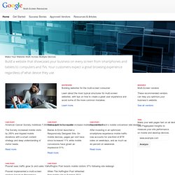
Google Sites & Google Apps Help - steegle.com. Google Apps Script. Google Apps Training Videos. Changes to the look of Google Sites - Google Sites Help. Ready to Go Mo? Multi-Screen Resources Skip to content Make Your Website Work Across Multiple Devices Build a website that showcases your business on every screen from smartphones and tablets to computers and TVs.

Your customers expect a great browsing experience regardless of what device they use. Whitepaper Building websites for the multi-screen consumer Learn about the most typical structures for multi-screen websites, with tips on how to create a great user experience and avoid some of the more common mistakes. Learn more. Case Study American Cancer Society mobilizes 7,000 web pages in one quarter The Society increased mobile visits by 250% and trippled mobile donations with a smart content strategy and deep understanding of visitor needs. Read more. Case Study Baines & Ernst’s new site increase mobile conversions Baines & Ernst launched a Responsively Designed Site. Read more. Case Study Beyond the Rack’s mobile conversion rate doubles Read more. Case Study Plusnet sees traffic grow 2x and sales 10x. Sites - Mobile Templates. Multi-Screen Resources Skip to content Make Your Website Work Across Multiple Devices Build a website that showcases your business on every screen from smartphones and tablets to computers and TVs.
Your customers expect a great browsing experience regardless of what device they use. Whitepaper Building websites for the multi-screen consumer Learn about the most typical structures for multi-screen websites, with tips on how to create a great user experience and avoid some of the more common mistakes. Learn more. Case Study American Cancer Society mobilizes 7,000 web pages in one quarter The Society increased mobile visits by 250% and trippled mobile donations with a smart content strategy and deep understanding of visitor needs. Read more. Case Study Baines & Ernst’s new site increase mobile conversions Baines & Ernst launched a Responsively Designed Site. Read more. Case Study Beyond the Rack’s mobile conversion rate doubles Read more.
Case Study Plusnet sees traffic grow 2x and sales 10x. Script Examples. Google Apps Training Videos.