

The New Bulletproof @Font-Face Syntax. February 3, 2011 Updated: April 21, 2011 10:49 AM EST Since the beginning of the 'webfont revolution' we've relied on somewhat hacky @font-face declarations to get webfonts loading cross-browser.
Could there be a better way? One that's clear and compatible with future browsers? Short history In September 2009, Paul Irish came up with the Bulletproof syntax for writing the @font-face declaration. The “Fontspring @Font-Face Syntax” The code should have been clean, clear and simple all along. What? The hack trick that makes this work is the '? ' How it works Internet Explorer <9 has a bug in the parser for the src attribute. Browser compatibility Safari 5.03, IE 6-9, Firefox 3.6-4, Chrome 8, iOS 3.2-4.2, Android 2.2-2.3, Opera 11. Twenty Advanced CSS Tutorials. The following collection focuses on advanced CSS tutorials to help you sharpen your CSS skills.

Once you’ve recreated these tutorials on your own, you can use and re-use the resulting files and keep them in your personal toolkit for future reference. We avoided tutorials that used combinations of CSS and jQuery to focus entirely on CSS development tricks. jQuery is a powerful tool, but if you want to learn pure CSS, then these advanced tutorials are a great place to start. Topics range from sliders, accordions, forms, layouts, to even image transitions. Stylish Image Content Slider in Pure CSS3 Source. Fighting the Space Between Inline Block Elements. Pretty CSS3 buttons. I’ve come across quite a few sites that explain how to create flexible CSS3 buttons but i’ve never really spent the time to implement one until i found a great little write up courtesy of the guys over at the Zurb blog who have a fantastic post on creating CSS3 buttons.
So i’ve taken their example and tweaked it to fit my needs. It’s worth noting that if your using Internet explorer you’re not going to see all these effects as IE still doesn’t support CSS3. Compatible CSS3 browsers are, Safari, Chrome and FireFox 3+. The Objective. Responsive & Retina Content Images using simple CSS & a spacer PNG - HTML5/CSS3 Experiment - Extensions, resources & tutorials for Fireworks, Dreamweaver & HTML5/CSS3. Posted: April 03 2012 This technique has been superceded by Responsive & Retina Content Images Redux. The problem with media queries and responsive design at the moment is there's no "real" way to deliver a particular content image (that's referenced in an img tag) for different breakpoints and resolutions.
So, it occurred me to that the simplest way of dealing with content images (as img tags) in a responsive design and for retina screens was to use a spacer PNG (generally smaller than an GIF) and background images. All it requires is a blank PNG or GIF the same size as the intended image, and then setting that image's background to whatever image needs to be served along with background-size: contain. It works because the spacer PNG is transparent, which allows the image's background image to be visible. Efficiently Rendering CSS. I admittedly don't think about this idea very often... how efficient is the CSS that we write, in terms of how quickly the browser can render it?
This is definitely something that browser vendors care about (the faster pages load the happier people are using their products). Mozilla has an article about best practices. Center Multiple DIVs with CSS. At some point, you may have a situation where you want to center multiple elements (maybe <div> elements, or other block elements) on a single line in a fixed-width area. Centering a single element in a fixed area is easy. Just add margin: auto and a fixed width to the element you want to center, and the margins will force the element to center. There really should be a similar simple way to center multiple elements evenly spaced. The Principles Of Cross-Browser CSS Coding. Advertisement It is arguable that there is no goal in web design more satisfying than getting a beautiful and intuitive design to look exactly the same in every currently-used browser.

Unfortunately, that goal is generally agreed to be almost impossible to attain. Some have even gone on record as stating that perfect, cross-browser compatibility is not necessary. While I agree that creating a consistent experience for every user in every browser (putting aside mobile platforms for the moment) is never going to happen for every project, I believe a near-exact cross-browser experience is attainable in many cases. As developers, our goal should not just be to get it working in every browser; our goal should be to get it working in every browser with a minimal amount of code, allowing future website maintenance to run smoothly. Understand the CSS Box Model. Cross-Browser CSS Development Workflow. Most good developers by now accept the fact that pixel-perfect cross-browser CSS is not only unnecessary, but also totally impossible.

Of course, when we speak of the challenge of “cross-browser” CSS, we’re really saying “How can I make this work in Internet Explorer versions 6-8?” — because those are really the most problematic browsers. Understanding CSS’s vertical-align Property. “Vertical-align isn’t working!”
Cried the web developer. The vertical-align property is one of those features of CSS that sounds pretty self-explanatory, but can cause problems for CSS beginners. I think even many CSS veterans have had problems figuring this one out at times. In this post, I’ll try to cover it in an understandable manner. What it Does Not Do The common misconception about vertical-align is that, when it’s applied to an element, it will make all the elements inside that element change their vertical position. Fixing IE's Opacity Inheritance. Child elements ignore the parent's opacity in Internet Explorer.
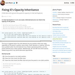
January 17, 2012 In Internet Explorer 7, 8, 9, non-static child elements do not inherit the opacity of the parent. HTML5 Placeholder Attribute. A guide to using the attribute, and support it for older browsers.
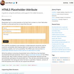
November 8, 2011. NaturalWidth and NaturalHeight in IE. Getting the naturalWidth and naturalHeight for an image in any browser.
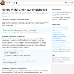
October 23, 2011 Actual width and height in modern browsers Modern browsers (including IE9) provide naturalWidth and naturalHeight properties to IMG elements. These properties contain the actual, non-modified width and height of the image. Solving IE7 & IE8 PNG Opacity Problems. How to fix transparent png issues associated with Internet Explorer's alpha filter. July 18, 2011 PNG Alpha-transparencies IE7 and IE8 have native PNG support for alpha-transparencies, but it falls to pieces as soon as opacity comes into the picture. When setting any value for opacity, even 100% (ie. filter: alpha(opacity = 100)), IE fills in the alpha-transparency of the PNG with a pure black fill.
Minimum Paragraph Widths in Fluid Layouts. The following is a guest post by Gustav Andersson who has come up with a clever little technique for a text flow problem. I've struggled with this myself in the past, so I'm happy to add this technique to the ol' toolbox. Not mention, yet another one of these. A floating image takes away horizontal space from the text that flows around it. In fixed width layouts, you can check that the space left for the text is enough to create a decent looking column, safe in the knowledge that everyone else will see the same thing. In a fluid layout, however, you have no such guarantee.
5 Really Useful Responsive Web Design Patterns. Which One: Responsive Design, Device Experiences, or RESS? As more organizations realize they need to invest heavily in multi-device Web designs, the inevitable question of “how” comes up. SASS and Compass for Web Designers: Introduction. HTML5 Video Player Comparison. Animate.css: Kick-Ass CSS Animations in Seconds Flat. The Great Tablet Flood. Free iPad CSS layout with landscape/portrait orientation modes. By Matthew James Taylor on 27 May 2010 The iPad has finally launched in Australia today, hooray! Useful CSS Snippets for Your Coding Arsenal. Writing CSS For Others. Advertisement. CSS Shorthand Guide. Sunday Oct 23 2005 Ok. Let's set the record straight. Create CSS3 Buttons Compatible with All Browsers - OurTuts.com. CSS3 brings with it some awesome styling features, like rounded corners, gradients and borders, but also brings a lot of headaches to those who want to implement it inside web pages, due to Internet Explorer lack of support for these great features.
Code a Responsive Navigation Menu. Bulletproof CSS3 Dropdown Navigation Menu. Font sizing with rem. Determining a unit of measurement to size our text can be a topic of heated debate, even in this day and age. Unfortunately, there are still various pros and cons that make the various techniques less desirable. Website dimensions - exact pixels - live check. What’s the Deal With Display: Inline-Block? 9 удивительных эффектов для сайта, или Как это повторить? How to Make Slicing Suck Less: Tips and Tricks for Slicing a PSD.
Create a Responsive Web Design with Media Queries.