
Bosque! The NASA & NYCTA Graphics Standards Manual reissues. 13 magically meticulous design style guides. This is heading directly into geek territory.
But we are self-confessed geeks, particularly when it comes to logo design, typography and pictograms. And that leads us to the meticulously regulated world of brand style manuals... A style manual, or style guide, is a set of standards for the design of documents, signage, and any other form of other brand identifier. The reason for their existence is to ensure complete uniformity in style and formatting wherever the brand is used to ensure no dilution of that brand. We love the obsessive nature of these, and so here we've gathered 12 of the best to inspire you when you create your own brand style guides...
The National Aeronautics and Space Administration's Graphics Standards Manual was created by Danne & Blackburn in 1974 when NASA changed from its original crest-based logo to the 'worm' logotype that we are now familar with. The manual has recently been revived thanks to a Kickstarter campaign to fund its reissue. 02. Blog — Offscreen Magazine. Nicolai sclater. BP&O - Branding, Packaging and Opinion. Brain Pickings – An inventory of the meaningful life. Mr-cup. Visuelle.co.uk. Graphic Design. Cool Hunting. Design of the World - Thoughtful Designs From Around The World.
Grafik. Shillington Graphic Design Blog - Posts. Dribbble - Popular. The Exile of Satan from Heavy Metal Design. — Those “heavy metal” bands that debuted during that first palmy MTV generation sound like nontoxic pop compared to today’s vast offerings of subaltern metal genres, where intricate is the new heavy, and glacially slow is far more radical than hyperfast.
Metal has evolved in such diverse directions—drawing from and crossing over with punk, math rock, noise, and avant-garde musical threads—that perhaps the real surprise is how audiences who never thought of themselves as metalheads are now exploring bands with names like Baroness, Gojira, Isis, and SUNN O))). Detail from the 2009 Isis album Wavering Radiant Heavy metal has evolved visually as well. Gone are the fantasy illustrations of radioactive zombies and band logos composed of overlapping swords.
After a generation of sprouting subgenres, the heavy metal field is littered with a diversity of styles that even the most hardy metalhead will have trouble encompassing. The band logo has always been the nexus of identity for metal bands. Luerzer's Archive - Advertising Worldwide. Graphic-ExchanGE - a selection of graphic projects. This new deck by Joe White follow the Contraband one.
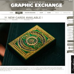
You know Joe and his amazing detailed design as we work together on the (sold out) 2015 edition of the calendar and he designed the front cover. Every single playing card within the High Victorian deck was designed from scratch - even the Aces, Jokers, and court cards exude the grand excess of ornamentation quintessential to the Victorian era. In a word: breathtaking. Antler is a deck designed by Tom Lane, who also creates this year edition of the front cover of the letterpress calendar!
An art, design, and visual culture blog. AIGA Eye on Design. Good design makes me happy. 50 Design Blogs You Have To Read In 2015 - Shillington Design Blog. Hello readers!
Guess what? We’ve updated this list for the new year. DESIGN EVERYWHERE. DesignCloud. 50 Design Blogs You Have to Read in 2016 - Shillington Design Blog. Our most popular post of last year was 50 Design Blogs You Have to Read in 2015, a comprehensive countdown of where to find the diamonds in the endless mine that is the internet.
Well a lot can happen in a year on the blogsophere, so today we take a fresh look at the hottest and brightest blogs for 2016. As well as serving up visual feasts of good design, these feeds offer sound business advice, technology hacks and the latest industry resources from all corners of the world. Selected by Shillington’s staff of international designers and teachers, this list is sure to whet your appetite for graphic design culture and inspire you to expand your horizons.
Which one is your favourite? Let us know in the comments below. The Dsgn Blog Founded and curated by Croatian designer Ena Baćanović, The Dsgn Blog has a focus on the work of young designers and students from all over the world. Swissmiss. CONTEMPORIST. Fubiz™ Exploriment. Design Bridge blog.
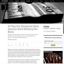
Pierre Carreau’s macrowave photography These close up miniature waves from French photographer Pierre Carreau show all the structural forms of much larger waves, but with so much more detail and transparency.
Caught standing still by the high-speed camera, these tiny wavelets drift free of all sense of scale and totally screw with your mind. They totally look like tsunamis, but they’re only really tiny. Fantastic detail, gloriously rich colours. Part of his ongoing AquaViva series, there are a LOT more shots on his site. Bradley timepiece for blind people Love this awesome piece of inclusive design – strong, simple forms bely a hidden meaning. In fact, as Dezeen points out, ”the product is now being marketed as a ‘gentleman’s watch’ that is ‘built for discretion’ – since wearers can check the time without anyone noticing.” Design Work Life » cataloging inspiration daily.
Dezeen - architecture and design magazine. 10 Tips For Designers (And Anyone Else) Working Pro Bono. Designers can outline a project down to the nitty-gritty detail, but scopes often creep, clients get overwhelmed, and designers themselves sometimes miss the mark.
This is true of pro bono design as well. But for some reason, designers and clients often lose sight of the fact that pro bono projects are really no different, no less demanding, and no less important than regular fee-generating work. Sometimes, in fact, they’re more so. The following checklist offers ten tips for designers working pro bono. The Designer's Survival Guide - Edited & Curated by Richard Baird. Posted: | Author: Richard Baird | Filed under: Design Survival | 0 Comments A guide to help new designers present their work to clients verbally, visually, on and offline.
Advice provided by international industry professionals, edited and curated by Richard Baird. Avoid fillers When you’re pulling together the first round of concepts for your client, try to avoid fillers, it can be a real heartache when a client chooses an idea you’ve used to bulk up your presentation. If you deliver two concepts rather than the promised three (and a client is really hung up on it), offer to spend additional time on development.
But does it float. Design Museum Shop: Home. How to pimp out your online portfolio, get noticed and win more work. Now that we’ve shown you how to set up an online portfolio in six easy steps, and how to write awesome copy that’s really going to sell yourself and win new business, it’s now time to look at how to get your work out there and in front of potential clients.
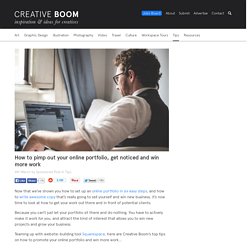
Because you can’t just let your portfolio sit there and do nothing. You have to actively make it work for you, and attract the kind of interest that allows you to win new projects and grow your business. Teaming up with website-building tool Squarespace, here are Creative Boom’s top tips on how to promote your online portfolio and win more work… Add links to everything. AisleOne - Graphic Design, Typography and Grid Systems. The Strange Attractor.