

Common Techniques in Responsive Web Design. In previous articles, I talked about why the Web is ready for responsive design and how a site owner can use the context of a user’s device and screen real estate to provide a contextually relevant experience to users across screens of various sizes, including PCs, phones and consoles.

In this article, I’ll dive into some of the most common practices for building responsive site layouts and experiences. I’ll describe the emerging and available techniques for site layouts that flexibly resize based on screen real estate (referred to as “fluid grids”) so as to ensure that users get complete experiences across whatever screen size they are using. Additionally, I’ll show how to present rich media, especially images, and how developers can ensure that visitors on small-screen devices do not incur additional bandwidth costs for high-quality media. As you play with some of the techniques I describe, here are a few ways to test what your site looks like on different devices resolutions: Performance Implications of Mobile Design. Ultimate Guide To Responsive Web Design: Tools and Examples. It is estimated that within two years mobile internet users will overtake the desktop internet users.
The rapid advancement of mobile internet has enabled more and more people to use their mobile device as a primary web browsing tool. What does it mean for web development? Well, the usual development for just a couple of screen resolutions is already dying out. Mobile is the new trend and most of the businesses are recognizing it. Having a fluid and responsive website will not only make you cooler, it’s the new way of increasing conversions and engaging your visitors. Not sure where to start? Convert Menu to Dropdown. Responsive web design, une introduction et quelques frameworks. Posté le 8 décembre 2011 dans Mobile | Technologie , par MoKaDev - On entend de plus en plus parler de « responsive web design » sur les blogs spécialisés, dans les open space d’agences, autour des tables des web designer ou des développeurs frontend.
Alors qu’est ce que le « responsive web design »? Si l’on traduit grossièrement cela donne « web design réactif » (oui je sais web design n’est pas traduit mais je laisse faire nos éminents académiciens). Il s’agit en effet de rendre un site web réactif et adaptable à l’internaute, à son matériel et au logiciel qu’il utilise pour accéder à votre site internet. Cette approche somme toute logique, permet donc de répondre aux problèmes posées par l’explosion du nombres de nouveaux appareils mobiles aux tailles d’écran diverses et variées. Pour éviter de rallonger cette page avec des exemples je vous conseille ce site qui répertorie les sites « responsives web design » Media Queries.
A Boilerplate For Responsive Websites – The Goldilocks Approach. The Goldilocks Approach is a boilerplate/starting point for creating responsive websites.
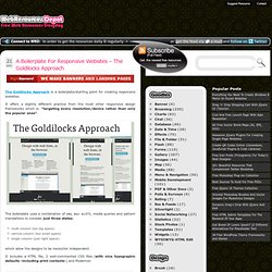
It offers a slightly different practice from the most other responsive design frameworks which is: "targeting every resolution/device rather than only the popular ones". The boilerplate uses a combination of ems, max-width, media queries and pattern translations to consider just three states: multi column (too big space)narrow column (too small space)single column (just right space). which allow the designs to be resolution independent. It includes a HTML file, 2 well-commented CSS files (with nice typographic defaults -including print contexts-) and Modernizr. Amazium: CSS Framework For Responsive Sites. Responsive web design is being implemented more and more every day + new resources easing the process are being created regularly.
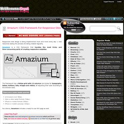
Amazium is a CSS framework that handles the most tricky and time-consuming parts of creating responsive websites. The framework has a 960px grid with 12 columns and styles for typography, tables, buttons, lists, images and videos, all adjusting their sizes according to the browser sizes. There are 4 main media queries: all browsers over 960pxiPad or other tablet Portrait (728px)iPhone or mobile Portrait (300px)iPhone or mobile Lanscape (420px) As a bonus, Amazium includes a ready-to-use 404 page as well. How to Design a Mobile Responsive Website. To build a mobile site or not to build a mobile site; this is a question at the forefront of many a discussion.
There is, however, another option: responsive web design. When, why, and how should you go about designing a responsive website? With mobile internet users set to surpass desktop internet users in the US by 2015, with tablets becoming more popular, and even with TV internet usage increasing, it’s important for companies to provide a great user experience for all their visitors no matter what device they’re on. How does responsive design help us do this? Well, by allowing us to create one website solution that is flexible for different screen widths. Why should you design a responsive site? There are many options to consider when a client asks for a mobile solution for their website, and the suitability of these options depend on the business requirements and budget; it’s also important to consider any existing solutions or sites they already have.
You’re starting from scratch.