
Photos en avant premières de l'#iphone5 . Finalement trè. iOS Fonts. iPhone - Safari Screen Dimensions & Layout. iPhone Compatibility Tips. This article describes how you can use CSS rules and simple HTML changes to make your Web site more compatible with the Web browser in the iPhone and iPod Touch.

Topics include what image formats and file formats are supported, controlling site magnification, how to create links to iPhone's built-in applications, and creating a custom Web Clip icon. iPhone Compatibility The iPhone has a built-in version of the Safari Web browser. One of the best things about the iPhone is that it allows Web sites to be viewed in Safari without any special modifications.
However, there are some simple steps you can take to ensure the best compatibility with Safari. Everything in this tip can be applied to either the iPhone or the iPod Touch. All of the information in this tip is gleaned by Apple presentations and the information on their developer Web site. Basic Compatibility The first step to ensuring compatibility of your site with iPhone is to make sure your site works great in Safari. Page Layout Forms. Targeting the iPhone 4 Retina Display with CSS3 Media Queries - WaltPad.
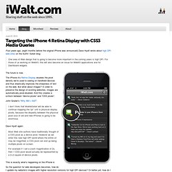
Four years ago, (eight months before the original iPhone was announced) Dave Hyatt wrote about high DPI web sites on the Surfin’ Safari blog: One area of Web design that is going to become more important in the coming years is high DPI.

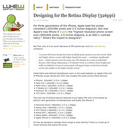
For those of us working on WebKit, this will also become an issue for WebKit applications and for Dashboard widgets. The future is now. The iPhone 4’s Retina Display doubles the pixel density we’re used to seeing on handheld devices and thus drastically improves the sharpness of text on the web. But what about images? John Gruber’s “Why 960 × 640”: I don’t think that MobileSafari will be able to continue mapping the “px” unit to physical display pixels, because the disparity between the physical pixel size of old and new iPhones is going to be enormous. Dave Hyatt again: Most Web site authors have traditionally thought of a CSS pixel as a device pixel. Designing for the Retina Display (326ppi) For three generations of the iPhone, Apple kept the screen consistent (320x480 pixels and 3.5 inches diagonal).

But now Apple's new iPhone 4 boasts the "highest resolution phone screen ever (960x640 pixels, 3.5 inches diagonal, & an 800:1 contrast ratio). " What's the impact to designers? But first, why is it an issue? Designing for iPhone 4's Retina Display. So, um, maybe you heard: there’s a new iPhone out.

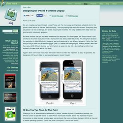
For my money (and I shelled out plenty for it), the phone’s best feature is the new “Retina display,” the eye-popping high-resolution screen. Everything they say about it is true: at 320 ppi, the pixels are just plain invisible. The crisp bright screen really looks as good as print, absolutely gorgeous. But what soothes the eye also adds headaches for designers. ProtoFluid. Rapid Prototyping of Adaptive CSS and Responsive Design. HTML5 Boilerplate, un template puissant et complet. HTML5 Boilerplate est un template (HTML+CSS+JS+...) lancé par Paul Irish (Modernizr) et Divya Manian.

Il contient toutes les bonnes pratiques du moment en terme de performances, de compatibilité inter-navigateurs, de JavaScript, avec un soupçon d'accessibilité (si utilisé à bon escient), voire de Flash. Une version sur-mesure peut être générée via Initializr. Vous retrouverez donc dans un zip tous les fichiers et sous-répertoires organisés pour débuter votre intégration avec d'excellentes bases.
Bien entendu, vous l'aurez deviné, le but est de favoriser l'adoption de HTML, d'où l'inclusion par défaut de la librairie Modernizr, ainsi que jQuery via GoogleAPI (avec fallback local). Voici une liste des fonctionnalités supportées : Bien entendu d'autres sont à découvrir dans le code source, comme par exemples les indications pour les icônes Apple touch + favicon par exemple. Les meilleurs livres iOS.