

Sm. Customer Service Statistics Infographic. Infographic of the Day: The Tangled Web of Carmaker Alliances. Cars are a fiercely competitive industry.

But these days, major automakers often have to rely on a little help from their erstwhile enemies. With margins so slim, it only makes sense that car companies lean on each other to spread the risks of expansion and cut costs. This infographic by the Financial Times reveals just how far-reaching--and deep--these relationships have become. You can actually glean quite a bit of insight into the corporate strategies of these companies just by looking at the graph. For example, Daimler of course builds Mercedes--but they also recognize that, with the rise of small cars and emerging markets, luxury cars are only a tiny fraction of the potential market. SEO & SEM Infographics. Expertise Work Capabilities About Aha!
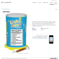
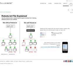
Contact Us Infographics Blog « Back to All Infographics Previous. Robots.txt File Explained. Expertise.
How to Get Rid of Villains in Social Media – Infographic. SEO In Pictures – Our SEO Infographic. Matt April 13th, 2010.
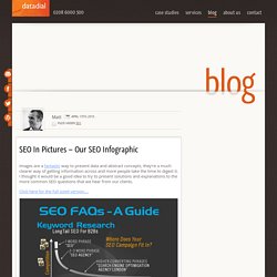
Filed under SEO Images are a fantastic way to present data and abstract concepts, they’re a much clearer way of getting information across and more people take the time to digest it. I thought it would be a good idea to try to present solutions and explanations to the more common SEO questions that we hear from our clients. Click here for the full sized version…. The image covers everything from basic keyword research concepts, through site architecture, page optimisation, link building, SEO tactics, social media, and some basic SEO and PPC clickthrough stats and explantions. SEO Hierarchy of Needs. I can’t remember where I stumbled on this diagram but I just found it in one of my archives.
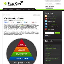
It pretty much sums up the SEO process for a new website or redesigned site from start to finish. Starting from Keyword research for content development, then matching your keyword research to the actual site architecture and other on page elements like title, header, and meta description tags. You can’t escape from good usability and web design when it comes to SEO – pages need to load fast, breadcrumb navigation is a given and good website design also improves the average time visitors stay on your site (Google apparently takes note of this).
Finally link building is the crown jewel of SEO. We need to continuously build quality inbound links to improve our search rankings and authority….so here you go voila Kunle has been involved in digital marketing since 2004. At Advertising Week: Fact Sheet and Video Presentations. For Advertising Week, The Nielsen Company provided a snapshot of ad spending in the U.S., including a comparison of ad dollars in 2009 vs. the first half of 2010.
While some sectors like Automotive and Auto Insurance are up in 2010, the majority of ad categories are down relative to the same time period in 2009. Ad Spending Overview $117B was spent on all U.S. advertising in 2009. 57% of all ad spending in 2009 went into Television, making it the largest medium for advertisers. Print media earned approximately 28% of ad dollars, while Internet earned 7% of all ad dollars.The top spending product category for national TV was Automotive with $3.4B spent in 2009. Event Video. A Detailed State of the Apps Report. The Facebook Economy Map. BP Oil Spill: A Timeline of Economic and Environmental Destruction. The recent oil spill has caused BP’s reputation and a stock value to plummet at free falling speed.
Our environment is greatly threatened and the spill has caused a huge uproar across the world. It’s a huge PR crisis and not being transparent and swift to take proper actions at the initial stage complicated this matter even further. Social media was employed but some were obviously unimpressed with the company’s weak attempt, especially when the “social” element is clearly missing. Its apology commercial seems to have better luck (at least according to Ace Metric), featuring BP’s CEO Tony Hayward, apologizing and taking full responsibility. BP Apology Ad Timeline of Economic and Environmental Destruction The timeline, created by Infographicworld, succinctly lay out the major occurrence of the BP oil spill, providing a better understanding on the environment and economic impact related to this disaster. 2009: How Americans Spent Their Time. Women and Social Media.
This post was written by Jenny Urbano, our Social Media Manager. Here at Demandforce, we love seeing and celebrating your ideas! And more than that, we love to hear from YOU. We want to bridge the gap between us and you, so that’s why we’re offering a once in a lifetime opportunity to win a trip to San Francisco, sightsee in this amazing city, visit Demandforce headquarters and share your ideas with us! 6 winners, and a guest of their choice will be flown out to San Francisco, California on March 12-14th, 2014, where they will stay in Union Square, spend a day at Demandforce, have dinner with the team, and explore the lovely City by the Bay! For contest rules, and how to enter, please visit our post in the Generation Demandforce Community here. The Social Business Ecosystem.
The iPhone App Market. Facebook Privacy: A Bewildering Tangle of Options - Graphic. How Apple Changed the Music Industry. Infographic Mobile Phones Around the World. Infographic How are Mobile Phones Changing Social Media? Infographic Stress vs Productivity. Are We Addicted to Social Media? - nice infographic. 40 Awesome Infographic Designs which Helping Analysts. Mobile Pie Chart Hell. Worldwide friends - social media infographic.