Simulated Process Color Separation Software. Separation Forums - Index. Mastering Four-Color Process Printing. Mastering Four-Color Process Printing Learn how to achieve high-end designs with these technical tips.
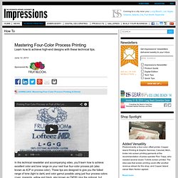
June 12, 2013 DOWNLOAD: Mastering Four-Color Process Printing (4.94mb) In this technical newsletter and accompanying video, you’ll learn how to achieve excellent color and tone range on your next true four-color process job (also known as 4CP or process color). These tips are designed to give you the fullest range of tone (light to dark) and color gamut possible using just four process colors (cyan, magenta, yellow and black, also known as CMYK) plus the optional, but recommended, Wet White. Eternyl Asylum Channel. Separations for Four-Color Process Printing. Obtaining great four-color process separations from Photoshop is completely possible, as long as the correct settings are in place.
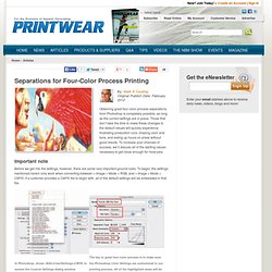
Those that don’t take the time to make these changes to the default values will quickly experience frustrating production runs, chasing color and tone, and eating up hours on press without good results. To increase your chances of success, we’ll discuss all of the starting values necessary to get close enough for most jobs. Important note Before we get into the settings, however, there are some very important ground rules.
To begin, the settings mentioned herein only work when converting between > Image > Mode > RGB, and > Image > Mode > CMYK. In order to make the file work for screen printing, it is necessary to convert the original CMYK back to RGB and then reconvert to the custom CMYK values mentioned here. Custom CMYK Separation Settings All of the custom settings are found under the Color Settings dialog in Photoshop. Black generation curve Frequency. Myseps.com color separations. T-Shirt Color Separation Guide. . . .

The Gotta have gook. -DOT-TONE-DAN- Different methods of color separation in Photoshop channels for specific exercises. All bundled together in one package that will teach you step-by-step, how to separate colors for T-shirt printing. To purchase Your book, go to this page: The Art Of T-Shirt Color Separation is now available for e-readers, such as an iPad and computers that can view a PDF format.
The hardback book comes with a DVD for opening up the working files for each exercise. The following images are spotlights pages from the book: Much thanks to Terry Combs and Aaron Montgomery for inviting me as a guest on their podcast show on January 10th. Workshop for Live Hands-on Training See us in the October issue of PRINTWEAR magazine, Page 101! Or see us on the virtual magazine online of the 108-109 spread, Clickhere Special Thanks to Deborah Sexton for the great press!
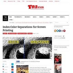
Also, Check us out on Face Book! Excerpts e Book. Separation processes for Screen Printing. Art Work Design and Color Separation for Screen Printing. Stochastic Dots used in sim process (pics) included. - T-Biz Network Forum. Film Output. Colors from a color separation are output as positives on transparent film for screen printing.
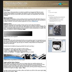
Film positives can be output onto sheets or rolls of film using inkjet printers. Inkjet printers with the correct film work well for output, are inexpensive, and readily available. Black and White Film positives for making a screen printing stencil are printed with solid black shapes on a clear background. Gray tones that are not 100% white or black need to be converted to a shape or pattern. The most common approach is to use a Halftone dot. Halftone Dots Halftones are named by the number of dots used per inch, this it the halftone frequency.
Halftone dots and Grayscale Frequency The size of the dot used is determined by the screen printing mesh. To determine the halftone frequency divide the mesh count by 5 Halftone dots overprinted at various angles Angle and the Moire Pattern Moire appears as light and dark areas in an image when two regular patterns are overprinted. Or The Output Settings. Filmgate%20Technical%20Screen%20print%20information. Halftone Screens and Dots. Learn by free tutorials. Index Separations Tutorial. Index separation tutorial. this tutorial is for intermediate to expert level photoshop users, as well as for those who are familiar with using channels for spot color separations. here's an explanation by another website on the advantages of index over halftones wrecks 'n effects let's begin!
(image on top. explanation below image) never resize index seps in RGB mode. everything will become 'dirty'. ideally, create index separations at print size. you can however resize index seps in index mode without significiant quality loss Onward! L. Index Sep. Printing - Translating DPI or PPI to square dot size? - Screen Printers Open - A Forum for Screen Printing and Embroidery. Isn't PPI related to a monitor, DPI related to an IJP, and LPI related to film output for screens?
- Scotty Pixels per inch are a monitor/scanner expression of resolution. All images are in pixels on the computer end. They can be Bitmap (just black and white, no grays, like line art), Grayscale(black and white photo with all grays from black to white), and color. Dots per inch are the expression of resolution of a printer, inkjet or laser printer. And before I could finish, Steve chimed in more succinctly. LPI is lines per inch, an expression of the halftone line count. That being said, people have exchanged PPI and DPI all the time, and I for one just accept it, because I know what they mean.
Steve. Index printing, Highly accurate and easy to print. - Screen Printers Open - A Forum for Screen Printing and Embroidery. Here lately I have started doing a few jobs as 'Index" prints.
The reason being that I had some jobs that required opaque prints on several colors of shirts from black to white I needed a way to do this where the prints would look then same regardless of the shirt color. I opted to use index for a few reasons. First simulated process sometimes takes more colors to achieve the same result as index. Not always but sometimes. Next on simulated process you are reliant on halftones that must be perfect to get the desired results. As time goes on I will continue to comment about index printing as I have decided I am going to do a lot more of it. The following was provided courtesy of QuikSeps. Index Color Separations for Screen Printing by Scott Fresener. By Scott Fresener.