
CSS Vertical Stretch CSS Vertical Stretch Update: Due to Microsoft’s release of IE 7, parts of this article have become outdated. Please be aware that the * html hack for IE 6 causes some issues in IE 7. An often asked question that I’ve come across frequently is how to make a page stretch the entire height of the browser window if there is not enough content to make it stretch. In ‘the olden days’ it was easy to just make a table and give it a 100% width/height to make it take up the entire viewport of the browser. It’s not particularly difficult to accomplish, but there are some intricacies to address when we try to make these techniques compatible with most browsers. The Out-Dated Method The old way of doing things was to just create table and give it a height of 100%. <table width="750" height="100%"> <tr> <td width="750" height="100%"> <p>Content Here</p> </td> </tr> </table> The CSS Method Common thinking would suggest that you’d just have to give the div a 100% height. <! Centered Splash Page <! Notes:
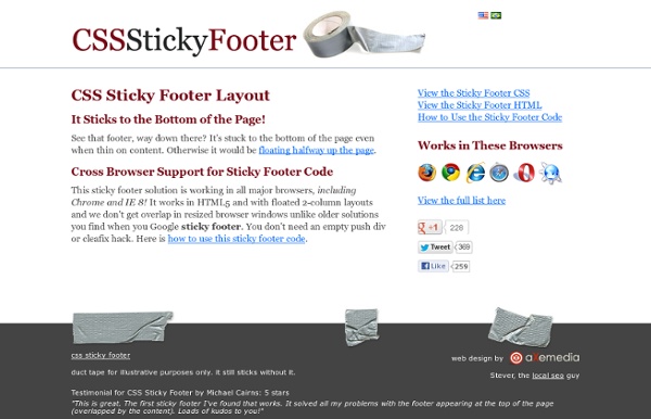
A CSS Sticky Footer A CSS Sticky Footer that just works We've all tried to use a CSS Sticky Footer one time or another, but they never seem to come out right, do they? Well, the days of a hard to understand CSS Sticky Footer are thankfully over. Usage of the CSS Sticky Footer Great! Absolutely. View the CSS or learn about using it NEW: HTML5 Sticky Footer The Perfect 2 Column Liquid Layout (double page): No CSS hacks. SEO friendly. iPhone compatible. Percentage dimensions of the double page layout All the dimensions are in percentage widths so the layout adjusts to any screen resolution. Vertical dimensions are not set so they stretch to the height of the content. Maximum column content widths To prevent wide content (like long URLs) from destroying the layout (long content can make the page scroll horizontally) the column content divs are set to overflow:hidden. 800 x 600 Left & right columns: 357 pixels 1024 x 768 Left & right columns: 459 pixels The nested div structure I've colour coded each div so it's easy to see: The header, colmask and footer divs are 100% wide and stacked vertically one after the other. No CSS hacks The CSS used for this layout is 100% valid and hack free. SEO friendly The higher up content is in your page code, the more important it is considered by search engine algorithms (see my article on link source ordering for more details on how this affects links). Full length column background colours No Images No JavaScript
CSS Wrap CSS Tutorial > Wrap Text wrap can be achieved in CSS using the white-space property. Common values of this property are as follows: normal: This is the default. Let's look at the examples below: Example 1 The HTML code, renders This line shows the layout with white-space:normal. In Example 1, text wraps to the next line when it reaches the right edge of the pink box. Example 2 This line shows the layout with white-space:nowrap. In Example 2, text does not wrap to the next line when it reaches the right edge of the pink box. Example 3 These two lines show the layout with ... white-space:pre. In Example 3, text is displayed exactly as how it was shown in the HTML document, and does not wrap to the next line when it reaches the right edge of the pink box. Note that in CSS 3, two additional properties, text-wrap and word-wrap, can be used to control text wrap using CSS. Next Page: CSS Codes Copyright © 2014 1keydata.com All Rights Reserved Privacy Policy
Why I think divs are better than tables From CSS Discuss "Tables prompt eye-gouging hissyfits among accessibility advocates and Web designers of all stripes, whether oldschool or avant-garde. Both sides are saddled with myths and both argue in large part from ideology. Let’s do a reality check, shall we?" OK. Yes, that reality check can basically be boiled down to "Before stylesheets were invented the spec said layout tables were OK (and lets not mention that the spec also said they could cause problems in the very next sentence)", "WCAG doesn't forbid it! Many people try to use table elements and its descendants for page layout, for two reasons. Advantages CSS can have over tables: smaller page size, quicker to load future flexibility search-engine-friendly Advantages tables can have over CSS: Broadly similar layout in ancient graphical browsers Why we shouldn't use tables Tables were created to provide structure to data. This is the intended use of tables.
Маниакальный веблог » Резиновая раскладка После статьи с примером раскладки очень многие спрашивали, как сделать ее тянущейся. Надо сказать, я изначально не планировал с ней делать что-то подобное. Во-первых, Учебник, все же, не коллекция кода для копирования, а описание сути вещей. Во-вторых же, несмотря на удивительную популярность колоночных раскладок, CSS на них просто не расчитан. Тем не менее, я подумал, что такой пример все же будет полезен, потому что наглядно показывает, на какие ухищрения надо идти при использовании неподходящих инструментов. То есть это будет скорее отрицательный пример. Общий принцип Сам по себе предыдущий макет, в общем-то, уже сверстан достаточно гибко. Но наступлению счастья, к сожалению, мешает фоновая картинка, которая визуально представляет колонки. Решение усложняется тем, что колонок в макете — три. Итак, приступим... Растягивание Начниаем с того, что убираем у <body> его ширину в 700px. Значения padding, min-height и position — это не что-то новое, они остались из предыдущей раскладки. Почему?
CSS layouts Here are a range of CSS responsive HTML and CSS layouts – including one, two and three column layouts. All layouts are ready to use – as is – with folders, dummy AppleTouch icon, dummy favicon and CSS files in place. All layouts are FREE to use as needed and can be downloaded directly from Github. Simple responsive layouts One-column fixed-width responsive layout View layout Download from Github One-column full-width responsive layout View layout Download from Github Two-column full width responsive layout View layout Download from Github Three-column full-width responsive layout View layout Download from Github Bootstrap responsive layouts Bootstrap kickoff template View layout Download from Github Bootstrap kickoff template with image logo View layout Download from Github Bootstrap kickoff template with responsive type View layout Download from Github Bootstrap blog post template with right sidebar View layout Download from Github
SEO Two Columns Elastic CSS/Table/Div Page Layout Content Area This layout has two columns: Navigation area on the left and Content area where main content is located. One of many factors that search engines use when calculates ranking is location of the content in HTML of the page. It is better if your main content is on the top of the HTML. Because of that, in this page layout Content area comes first in HTML and Navigation area is second. Elastic layout means that it uses em units to define elements size, like font size, layout width etc. This layout contains Header area on top, two columns (Navigation and Content) in the middle and Footer area on the bottom. If you prefer three columns check SEO Three Columns Elastic page layout, or choose some other layout from left menu.