
CSS3 : 9 morceaux de code prêts à l'emploi Comme bien souvent dans notre métier, ce que nous souhaitons faire a déjà été fait, Je vous propose ici, une petite sélection de "snippets" CSS3, ce sont des portions de codes réutilisables à utiliser dans vos projets. Il peut arriver qu'on recherche à réaliser quelque chose en CSS3 bien que ce langage soit encore assez "jeune", j'entends par là, très peu utilisé / utilisable dans des projets de grande envergure (compatible IE). Comme bien souvent dans notre métier, ce que nous souhaitons faire a déjà été fait, alors pourquoi réinventer la roue ? Je vous propose ici, une petite sélection de "snippets". Bien qu'il s'agisse de codes dit réutilisables, il faudra très certainement repasser dessus afin de faire quelques ajustements pour qu'ils correspondent à vos besoins N'oubliez pas que certaines propriétés CSS3 utilisés dans ces snippets, ne sont pas comprises par tous les navigateurs et que certaines nécessitent l'utilisation de préfixes. Effet feuilles superposées n°1 Démo | Source Démo Démo
A Comparison of Animation Technologies Rollout: Powerful Feature Flag Management The question I am asked most frequently: what animation tool do you recommend? Having worked with a slew of them, I can tell you there is no right answer. If you’re here for React, we’ve got you covered! There’s no possible way to go over every single animation library around, so I’m going to stick with the ones that I’ve either used or that interest me. #Native Animation Before we talk about any libraries, let’s go over some native animation implementations. CSS remains one of my favorite ways to animate. Pros: You don’t need an external library.The performance is great, especially if you do things that are inherently hardware accelerated (offloaded to the GPU). Cons: The bezier easings can be a bit restrictive. requestAnimationFrame requestAnimationFrame (rAF) is a native method available on the window object in JavaScript. Canvas Canvas is great to get those pixels moving! It’s difficult to make accessible. Web Animations API WebGL GreenSock (GSAP)
CSS3 – Effet parallaxe (sans JavaScript) Retour des tutoriels CSS avec quelque chose d’un peu original pour cet article : un effet parallaxe uniquement en CSS3. C’est à la suite de l’article de Simon Kern sur Alsacréations que m’est venue l’envie de tenter d’utiliser CSS pour reproduire cet effet initialement conçu avec JavaScript. L’article zoom sur l’effet parallaxe de Simon est bien conçu, je vous invite à le lire si vous préférez l’utilisation de jQuery, ou si vous souhaitez découvrir une alternative ou un complément à ce tutoriel. J’en profite pour remercier Simon qui m’a autorisé à reprendre son design ainsi que la base du code qu’il a conçu pour l’article sur Alsacréations. Démonstration Place à l’explication ! Concept Pour réaliser cet effet il nous faut plusieurs éléments qui vont nous permettre de simuler différents plans. Lorsque un tel effet est mis en place sur un site web, il l’est souvent pour offrir une transition originale entre deux vues, un peut comme lors d’un diaporama pour passer d’une slide à l’autre. <!
animation Enables to animate an element. Every animation consists of the animation properties, e.g. delay and duration, and the related keyframes, which define its appearance. Compatibility -webkit-animation Safari 5+, Chrome 10+ iOS 3.2+ Android 4+ Blackberry 7+@-webkit-keyframesanimation Firefox 16+ Internet Explorer 10+ Opera 12.1+ IE Mobile 10+@keyframes Not supported by Firefox prior to version 5, Internet Explorer prior to version 10, Opera prior to version 12 and Opera Mini. For detailed compatibility info see caniuse.com. Firefox 16+Safari 5+, Chrome 10+Internet Explorer 10+Opera 12.1+iOS 3.2+Android 4+Blackberry 7+IE Mobile 10+ General description Animation properties Multiple animations can be specified comma separated. animation: 1 animationName 2 4s 3 linear 4 1.5s 5 infinite 6 alternate 7 none 1 The name of the animation as specified at the keyframes. Keyframes 1 The name of the animation. Separated notations Sets the same animation properties like above. animation-name: animationName Example
80+ Free CSS3 HTML5 Menu Tutorials [updated] HTML5 and CSS3 have both revolutionised web design and we all see more powerful and functional websites using these two languages.HTML5 and CSS3 have many advantages like faster loading times,greater functionalities and more flexibility.You can apply to any website very easily. In today’s post we have collected free CSS3/HTML5 menu tutorials and plugins.This is a really huge list.Enjoy..!! [UPDATED - jQuery Menu Tutorials Added] How to Create a CSS3 Dropdown Menu View Tutorial and Demo Orman Clark’s Vertical Navigation Menu: The CSS3 Version View Tutorial and Demo Pure CSS3 LavaLamp Menu View Tutorial and Demo HTML5/CSS3 Gray Navigation Menu View Tutorial and Demo How to Build and Enhance a 3-Level Navigation Menu View Tutorial and Demo CSS3 Minimalistic Navigation Menu View Tutorial and Demo Colorful CSS3 Animated Navigation Menu View Tutorial and Demo Making a CSS3 Animated Menu View Tutorial and Demo Create a stunning menu in CSS3 View Tutorial and Demo Flat Turquoise Vertical Dropdown Menu Sidr mmenu
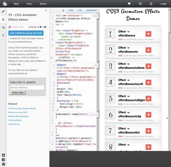
CSS3 Animations I recently wrote about CSS3 Transitions and the next step for that is sort of CSS Transitions on steroids: CSS3 Animations (CSS Animations Module Level 3 specification). What are CSS Animations? CSS Animations offers a more detailed way to control animations, the number of times it should iterate and property values at certain keyframes. A simple example Let’s take a look at the code for a simple CSS3 Animations example: 01..animation-container { 02. 03. 04. 05. 06. 09. 10. from { 11. width: 200px; 12. background: #f00; 13. opacity: 0.5; 14. 16. to { 17. width: 400px; 18. background: #ffffa2; 19. opacity: 1; 20. There are a number of new things we see above. The most interesting part here is the animation name, which is, contrary to what you might believe, any name of your choosing. In this example, the element will rotate to being straight, fade in and become twice as wide at the end of the animation. Using keyframe values and iteration-count 02. height: 60px; 03. padding: 10px; 05. 08. 10. width: 200px;
#130: First Moments with Grunt There are all these tasks that we need to do as front end developers. Concatenate and compress our files. Run our preprocessors. Optimize images. Run tests. Grunt is perfect for reining all this in. In this screencast we cover getting Grunt up and running on a simple project. Relevant Links: Make sure you've done first: Install NodeGrunt site: getting startedMy Grunt Boilerplate - which does what we did in this screencast plus more stuff.Grunt plugins we talked about: Uglify, Sass, Watch Note: I know I'm a Grunt newb. Download Video File
animations · css {{{Editorial notes}}} In this section See also Related articles Animation Web Animations API currentTime reverse currentTime @keyframes CSSKeyframeRule keyText style CSSKeyframesRule cssRules deleteRule findRule insertRule name transition JavaScript animation Attribution This article contains content originally from external sources. Menu horizontal en CSS - CSS Debutant Les menus sont logiquement des listes à puces. Oui, mais voilà, si on veut un menu horizontal, on ne voit pas bien comment faire devenir une liste verticale en liste horizontale... Et bien si ! Fonctionne avec : Tous les navigateurs graphiques Attributs utilisés : background-color border-color ; border-style ; border-width color float height list-style-type padding text-align ; text-decoration width Code (x)html <ul><li><a href="#">Item 1</a></li><li><a href="#">Item 2</a></li><li><a href="#">Item plus long</a></li></ul> Ce code html va donc être stylisé afin d'obtenir un menu horizontal, soit sous forme de boutons simples sans images, soit avec des images de fond qui changeront au survol de la souris par effet rollover. Mise en forme de boutons CSS simples Le principe est donc de transformer cette liste à puces verticale en liste (sans puces) horizontale. Chaque item (li) devra néanmoins être légèrement écarté de son voisin, on va donc déclarer une marge droite à 2 pixels (margin-left:2px).
CSS Animations Abstract This CSS module describes a way for authors to animate the values of CSS properties over time, using keyframes. The behavior of these keyframe animations can be controlled by specifying their duration, number of repeats, and repeating behavior. Status of this document This section describes the status of this document at the time of its publication. Publication as a Working Draft does not imply endorsement by the W3C Membership. The (archived) public mailing list www-style@w3.org (see instructions) is preferred for discussion of this specification. This document was produced by the CSS Working Group (part of the Style Activity). This document was produced by a group operating under the 5 February 2004 W3C Patent Policy. Some changes since the draft of April 2012: Added a reference to the accessibility guidelines around seizures caused by rapid visual changes. Table of contents 1. This section is not normative. This proposal introduces defined animations 2. 3. 4. The keyframe selector 5.
CSS Tools: Reset CSS The goal of a reset stylesheet is to reduce browser inconsistencies in things like default line heights, margins and font sizes of headings, and so on. The general reasoning behind this was discussed in a May 2007 post, if you're interested. Reset styles quite often appear in CSS frameworks, and the original "meyerweb reset" found its way into Blueprint, among others. The reset styles given here are intentionally very generic. There isn't any default color or background set for the body element, for example. I don't particularly recommend that you just use this in its unaltered state in your own projects. In other words, this is a starting point, not a self-contained black box of no-touchiness. If you want to use my reset styles, then feel free! Previous Versions v1.0 (200802) Acknowledgments Thanks to Paul Chaplin for the blockquote / q rules.
CSS Keyframe Animation with Delay Between Iterations Say you want an animation to run for 1 second, but then delay for 4 seconds before running again. Seems like that would be easy. Turns out it's not-so-straightforward, but doable. Nope There is an animation-delay property, but that won't help us here. Solution: Keyframes with No Changes You'll need to do a little mental math: I want the animation to run for 1 second. ~ plus ~ I want the animation to delay for 4 seconds in between iterations. ~ equals ~ 5 total seconds So when you call the keyframe animation, you use the total seconds: But now our @keyframes will run for 5 seconds: @keyframes move { /* this will happen over 5 seconds */ } So to make our animation run for only 1 second, you'll need to have the changes happen over 1/5 of the time, or 20%. We can write with less code, since the 0% values are assumed and you can comma separate keyframe steps: Demo