
Joconde BOUDIN Eugène, Venise, La douane et Notre-Dame-de-la-Salute, huile sur bois, 1895, Reims, musée des beaux-arts © Christian Devleeschauwer1/28 Costume de China Poblana, Mexique, coton, laine, sequin, perle de verre, 4e quart 19e siècle, 1er quart 20e siècle, Barcelonnette, musée de la Vallée, © BERNARD Jean2/28 MAISON J ROTHSCHILD & Fils et RHEIMS & AUSCHER, Modèle de landau à huit ressorts, crayon graphite sur papier bristol, 4e quart 19e siècle - 20e siècle, Compiègne, musée national de la voiture et du tourisme © Arkhênum ; Compiègne, musée national de la voiture et du tourisme - utilisation soumise à autorisation3/28 Portrait de Tiberius Gemellus ? DE DIETRICH, Saint Georges terrassant le dragon, bas-relief, fonte moulée, entre 1950 et 1960, Reichshoffen, musée historique et industriel, musée du fer © Pommois Etienne28/28
Explore Sound - welcome to exploring 10 Things...Finding Your Audience Portrait of Leonard Bernstein, during his final concert Greg Manchess You’re the student everybody pointed to in grade school and said “she’s the artist in the class.” I get a lot of questions when critiquing a portfolio about how one goes about finding work, getting hired, making a name, finding an audience. Finding your voice and your audience may be your greatest hurdle. But the first thing you must do is get practical. There is a catch here: you find your audience when you find your style. Narrow it down. Sure, you’d like to get work from all over the industry. You already know down deep. You cannot afford to confuse your potential client. Decide what you love most. Not good. Sit yourself down and give yourself a stern talking to. Comics? Study artists who work in that arena. Create pieces specifically for that area only. Now put all of that into your book. Practice showing it around, test it out. A successful illustrator doesn’t shotgun this field. This is like an ‘elevator pitch.’
Initiation à l'histoire des arts Allez au contenu Allez au menu principal Allez à la recherche Change language Accessibilité Soutenez le Louvre Accueil>Arts & éducation>Conférences de l'auditorium>Initiation à l'histoire des arts Initiation à l'histoire des arts Pour écouter, voir ou revoir le programme « Initiation à l’histoire des arts ». Conférences Informations pratiques Visites & Activités Expositions & Actualités Œuvres & Palais Arts & éducation Soutenez le Louvre Missions et fonctionnement Le Louvre dans le monde Les bases de données Presse Editions et Productions audiovisuelles Média en ligne Rubriques transverses Espace personnel S’inscrire Haut de page © 2005-2011 Musée du Louvre - Tous droits de reproduction réservés AddToAny En poursuivant votre navigation sur ce site, vous acceptez l’utilisation de cookies pour vous proposer des services adaptés à vos centres d’intérêts et réaliser des statistiques de visites
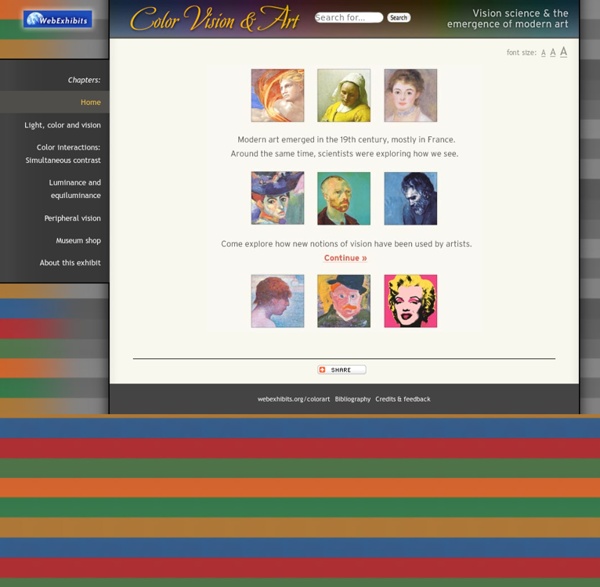
Andy Warhol's Marilyn Prints In the 1960s, Andy Warhol created several “mass-produced” images from photographs of celebrities such as Marilyn Monroe, Elvis Presley and Jackie Onassis. Andy Warhol (1928-1987) was a key figure in Pop Art, an art movement that emerged in America and elsewhere in the 1950s to become prominent over the next two decades. The Fauves used non-representational color and representational form to convey different sensations. Apply the same idea to the portrait of Marilyn Monroe below, using the controls to adjust the colors. Unlike the Fauve colors, the non-representational colors of Pop Art do not depict the artist’s inner sensation of the world. Warhol discusses his choice of color in this 1981 recording. On the occasion of Marilyn Monroe’s suicide in August 1962, Warhol used this image for his screenprinting. Warhol was fascinated with morbid concepts. In August 62 I started doing silkscreens. Using photo-stencils in screen-printing, Warhol uses photographic images for his screenprints.
10 Things...Evaluate Your Painting Greg Manchess I used to put my head down and plow through a piece, waiting for it to turn up some magic. Wanting it to be exactly like the picture in my head. And it wouldn’t. It was agony. So now it’s your turn. But there’s hope. Ask yourself these questions about your piece. Erwin Madrid's delightful piece has an actual line in it that helps lead the eye. Line Do the elements in your piece flow through the rectangle? Thom Tennery...foreground, middle ground, background. Depth Does your painting feel dimensional? Noelle Triaureau's excellent concept piece is side-to-side, top-to-bottom, front-to-back designed to flesh out the whole scene. Area, Space Does the space that you’ve shown feel designed from side to side, front to back? Ruan Jia's skill at keeping the values in a tight range give us fantastic depth into this world. Value Is there a full range of values from dark to light? I love the way PJ Lynch controls the light to an exquisite degree. Still think painting is magic?
Comment analyser une œuvre d’art Part.2 Juil27 Cette méthode est plus générale, mais peut très bien convenir pour sa simplicité. Vous pouvez partager votre expérience dans les commentaires sous l’article. Ce qui est visible ou audible Ce qui est donné DateAuteurTitreLieu d’expositionTechniqueTaille – formatUsage (photo de reportage, image publicitaire, photo artistique, reproduction, copie, illustration, œuvre d’art…) Ce qui est représenté Famille d’œuvres (paysage, portrait, nature morte, scène de genre…)Description par plans (1er, 2ème, arrière plan)Point de vueCadrage Description des composants plastiques TechniqueSupportCouleursStyleLumièreCompositionMatièreMatériaux Ce qu’on en comprend de quoi parle l’œuvre? Par rapport à la date Par rapport à l’auteur Par rapport au titre Par rapport au style Par rapport à la technique Les ouvertures possibles Liens avec d’autres artistes Liens avec d’autres œuvres Liens avec d’autres arts Réponses possibles au questionnement de l’œuvre Autre solution Synthèse des idées importantes Appréciation personnelle
Resources and tools for Optics and Photonics Educators SPIE has assembled this list of websites containing lesson plans, activities, demonstrations and free materials to provide resources for educators, parents and students. Use them to bring light into your classroom! The Exploratorium Science Snacks - Snacks about LightNASA Educational Materials - Light and Color activities for grades K-12Flame Challenge--What is Color? - Winners from the 2014 Flame Challenge explain colorCanon Science Lab - What is Light? 2015 International Year of Light - Official website listing events, resources, sponsors and information on how to get involved International Year of Light Posters - Dozens of free posters available for downloadNanoscale Informal Science Education - International Year of Light Resources assembled by NISE Discover Engineering – Information about Engineers Week, self-guided tutorials content and activities for volunteers and educators TeachEngineering.com - Browse standards based K-12 curriculum modulesWhat Is Engineering?
Using images from the Web: A Guide to “Fair Use” | Shake By Anna Wang, Legal Researcher at Shake People commonly repost images to flesh out their text, point out something cool, or serve as a good backdrop to their website. Some even do it as a way to gain popularity online. As a general rule, you can’t publish an image you don’t own without the permission of the owner. Images are protected by copyright law, which grants creators exclusive control over their works for a limited period, giving people an incentive to create. “Fair use” is an exception to the general rule. Unfortunately, there are no hard and fast rules for when fair use applies. 1. Using copyrighted works for educational, informational, journalistic or critical purposes, as opposed to for-profit commercial purposes, is favored from a fair use standpoint. What if you use a screenshot of a recent TV episode in a review of the episode that is published on a for-profit website? Another element weighing in favor of fair use is if the use is “transformative.” 2. 3. 4.