
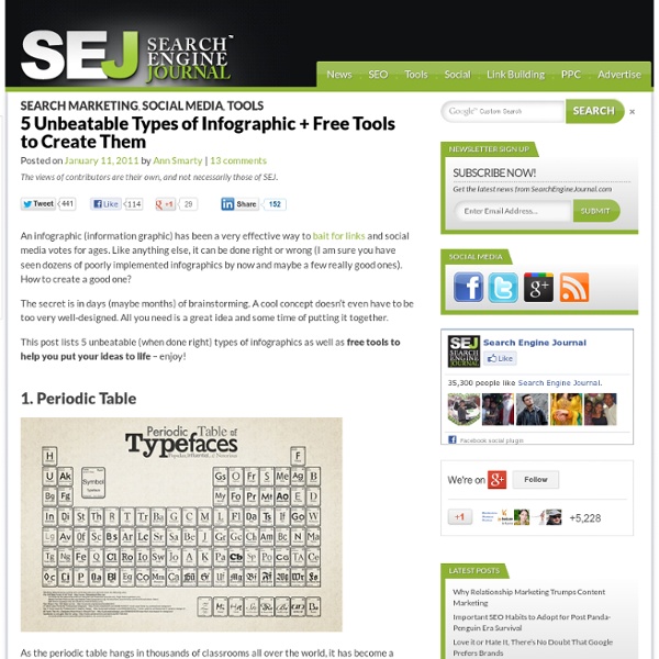
The Inner Structure of Infographics: How to Create, Important Tips and Free Tools | Moto CMS Templates Every day Internet users read a lot of data, look through news-websites and blogs, which are really overwhelmed with up to date information. It’s hard to remember everything important and keep in mind all facts we’ve learned during a day, sometimes some really valuable content is missed. So, how to convey effectively the main message to the readers and how to make them draw attention to your post? As human beings remember better the visual representation of information, than the whole sheet of complete text, the answer is much simpler you might think. Do you want to have more visits, backlinks and more views of your website? To achieve that just follow these influential tips: It can be in different style formats, such as: Typography infographics are the real masterpieces of art, they are completely designed from type and deliver the main message with the help of words. Source: Thegeorgereport.com Flow charts infographic is the most complex in terms of designing. Source: Sugarrae.com/
Top Tools For Making Incredible Infographics Top Tools For Making Incredible Infographics | Eyecare Resources Repost from the Optical Vision Site: By now, if you are reading our blogs, you can see that we have been using a lot of infographics. Infographics are Visual Images of data and are a huge growing trend on the web. For eyecare professionals, Infographics are fun and interesting news for your followers, networkers, patients, family and friends. Make Use Of has a great article on Tips for Creating Incredible Infographics as well as a listing of FREE Tools to Make Infographics. A Short List of Free Tools To Make Infographics (visit the link to read more) Original Post from The Optical Vision Site
How To Create Outstanding Modern Infographics In this tutorial you will learn that data doesn't have to be boring, it can be beautiful! Learn how to use various graph tools, illustration techniques and typography to make an accurate and inspiring infographic in Adobe Illustrator. Start by using the Rectangle Tool (M) to draw a shape. Give it a subtle radial gradient too. The entire design is based on a grid of four columns. Condense the shape so it fits within the left-most guide and centre guide. Move the shape over to the right and add another guide to the centre here. Using the Rectangle Tool (M) draw a thin white box on the centre line that will be the width of the gap between the columns. Repeat the process for the other columns with your final result being below. I like to place the most important graphics first and work-in the ancillary charts and graphs afterwards. Early on you can experiment with placing a main graphic that will help give the piece some visual interest. Give the circles a variety of gradients. That's it!
Online Charts Builder Hohli Online Charts Builder New version: Try new version of Charts Builder, it based on new Google Charts API Load From Image URL: Chart Data can't equal to original, but very similar to it. Only for images on chart.apis.google.com Chart Type: 3D Pie charts Lines Bar charts Pie charts For Pie Charts with labels choose 1000x300 or 800x375 size Venn diagrams Scatter plots Radar charts Chart Size: 320x240 Horizontal 1000x300 800x375 600x500 320x240 Vertical 300x1000 375x800 500x600 240x320 Square 546x546 400x400 300x300 200x200 Chart Ads: Data: Should be consists only positive numbers, use minus one (-1) for missing value, separated by coma, space or semi(,; ), e.g.: 23, 432, 456, 341 For Lines (pairs): Input data as x-axis and y-axis coordinates, e.g.: x1,y1, x2,y2, x3,y3 Title: Use a pipe character (|) to force a line break in title. Background: Chart is ready you can save it as image Right click on the chart Select "Save image as" Save the image to your computer © 2011 Charts Builder. Developed by Anton Shevchuk
Cool Infographics - Blog A Look at the Growing "Work From Home" Phenomenon [INFOGRAPHIC] Working from home is more prevalent and more widely accepted than ever. With 26.2 million teleworkers in the U.S. in 2010, the virtual workforce is expected to grow in coming years. For starters, 56% of senior leaders and hiring managers at Fortune 500 companies believe that the workforce will steadily or greatly increase at their companies, according to a recent survey by WorkSimple. The study findings outline the changing virtual workforce with a number of compelling stats and findings, as seen in the infographic below. Have you noticed an increase in the number of employees at your workplace that work remotely? Every week we post a list of social media and web job opportunities. Vice President - Digital at Edelman PR in Los AngelesSoftware Developer at Hulu in Los Angeles or SeattleAssociate Games Analyst at Arkadium in New York Infographic courtesy GetWorkSimple; thumbnail graphic courtesy iStockphoto/LajosRepasi
Tips, tricks and resources to make your own gorgeous infographics Infographics (or Information Graphics) are graphic visual representations of data or information, presented in a way to make it easier to consume information. Infographics gained popularity in the mid-2000′s with the advent of sites like Digg and Reddit, and have quickly become one of the most popular methods to display researched data. There are three main types of infographics – where data is presented in a timeline, where statistical data is presented in graphs or with icons, or where data is presented on a map. In order to create an infographic which will be widely shared, think about your typography, colours, and layout. You can also get very creative with how you display your information, and do something completely unconventional. Infographics are among the most popular modern methods of sharing information with an audience. There are a few automated ways you can create your own infographics. But what if you want to create your own infographic from scratch? Where to get icons
How to print large infographics by admin on Monday, March 7th, 2011 | 1 Comment Let’s pretend you’re either not rich, or don’t feel like spending a ton of money. Who knows, maybe you’re scared of leaving your home, but still want to print this insanely cool infographic you found online. Happened to me today. Then I googled “how to print large infographic”. With this new algo, i’m kinda not suprised the machine isn’t learning well. The thing’s called rasterbator, and claims it will let you print wall size pics if you need. The graphic I found online today was a complete visual of most marketing strategies online, but it was way too big to get a good view of from on it’s own. Here’s a pic of Raseterbator in action:
Public Data Explorer Indicadores sobre Desarrollo Humano Informe sobre Desarrollo Humano 2013, Programa de las Naciones Unidas para el Desarrollo Los datos empleados para calcular el Índice de Desarrollo Humano (IDH), y los otros indicadores compuestos que se publican en el Informe Sobre Desarrollo ... Desempleo en Europa (mensual) Eurostat armonizados de datos de desempleo de los países europeos. Salario mínimo en Europa Salarios mínimos brutos bianuales por mes en euros o en paridades de poder adquisitivo. Penetración de la banda ancha en Europa Cantidad bianual de líneas de acceso a banda ancha en valores absolutos y por cada 100 personas. Deuda gubernamental en Europa Estadísticas financieras gubernamentales de los países europeos. Los precios del combustible en Europa. Los precios medios de Diesel y Gasolina sin plomo 95. Población México Instituto Nacional de Estadística y Geografía (INEGI) Población Total Estados Unidos Mexicanos Datos de población según Padrón Municipal Instituto Nacional de Estadística
A Carefully Selected List of Recommended Tools on Datavisualization When I meet with people and talk about our work, I get asked a lot what technology we use to create interactive and dynamic data visualizations. At Interactive Things, we have a set of preferred libraries, applications and services that we use regularly in our work. We will select the most fitting tool for the job depending on the requirements of the project. Sometimes a really simple tool is all you need to create something meaningful. On other occasions, a more multifaceted repertoire is needed. That’s why we have put together a selection of tools that we use the most and that we enjoy working with. Let me answer the most likely questions right away: No, not everything find its’ way into this list, so you might not find your personal favorite.
Social Media for B2B Marketing Infographic | Internet Marketing Blog Here at Ecreative Internet Marketing, most of our clients are in the B2B market — largely industrial companies, which is a niche in which we are experts. Recently we’ve found ourselves fielding B2B social media questions more and more frequently — questions about Facebook, Twitter, and LinkedIn. So we decided to put together this simple Social Media for B2B Marketing infographic. We hope you find this B2B Social Media infographic as interesting as we do! Social Media for B2B Marketing Infographic Click the image for a larger version! Social Media for B2B Infographic A couple of the main points that this infographic makes about social media for B2B companies is that using social media is not just a B2C technique anymore. Unlike B2C companies, B2B businesses rely on their sites to generate leads, rather than generating sales (most B2B companies don’t sell fixed products for fixed prices — often what they’re selling is services or wide-encompassing solutions).
The Do's And Don'ts Of Infographic Design Advertisement Editor’s Note: You might want to read Nathan Yau’s article The Do’s And Don’ts Of Infographic Design: Revisited1 here on Smashing Magazine which is a response to this article. Since the dawn of the Internet, the demand for good design has continued to skyrocket. Infographics are visual representations of information, or “data viz” as the cool kids call it these days. Of course, just as Web 2.0 changed 1.0, today’s infographics are far more eye-catching than simple pie charts and bar graphs. While some design trends come and go, infographics are here to stay. Wrapping Your Mind Around Data Viz Designing an infographic is not the same as designing a website, flier, brochure, etc. Show, Don’t Tell A rule of cinema is to show, don’t tell. 4This Twitter infographic writes out the data, rather than visualizing it. What’s wrong with this infographic? If the Client Wanted an Excel Chart, They Wouldn’t Need You It might sound harsh, but it’s true. Typography Should Not Be a Crutch (al)