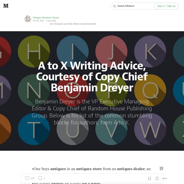
A to X Writing Advice, Courtesy of Copy Chief Benjamin Dreyer
There’s no such word as moreso.Mucus is a noun; mucous is an adjective.Nerve-racking, not -wracking; racked with guilt, not wracked with guilt.One buys a newspaper at a newsstand, not a newstand. An ordinance is a law; ordnance is ammo.Palette has to do with color; palate has to do with taste; a pallet is, among other things, something you sleep on. Eugene Pallette was a character actor; he’s particularly good in the 1943 film Heaven Can Wait.Nounwise, a premier is a diplomat; a premiere is something one attends. “Premier” is also, of course, an adjective denoting quality.That which the English call paraffin (as in “paraffin stove”), we Americans call kerosene. Please don’t mix somewhat and something into one murky modifier. This piece originally appeared on Biographile.
Pixar's 22 Rules of Storytelling--Visualized
Note: This article is included in our year-end storytelling advice round-up. A while back, now-former Pixar storyboard artist Emma Coats tweeted a series of pearls of narrative wisdom she had gleaned from working at the studio. This list of 22 rules of storytelling was widely embraced as it was applicable to any writer or anyone who was in the business of communicating (which is pretty much everyone, including software developers). And much of its advice (e.g. Last week, Dino Ignacio, a UX Director at a subsidiary of Electronic Arts, created a series of image macros of the 22 rules, posting them to Imgur. Have a look through more of them in the slides above.
Vintage and Modern Free Public Domain Images Archive Download - Public Domain Images | Free Stock Photos
NounProject
11 Design Tips for Beautiful Presentations
Presentations often receive a bad rap—for good reason. We’ve all sat through those long-winded speeches and hot mess PowerPoints, which completely undermine the point of visual presentations. So, what differentiates a good presentation from a poor one? Content and design. 1) Skip the Stock Template Using the slide themes included in your software is presentation death. 2) Don’t Use More than 6 Lines of Text Packing too much information into a slide will completely undermine its purpose. 3) Ditch the Bullet Points Too many presentations are bullet point crazy. 4) Use Sans Serif Fonts With typography, go for legibility over fun. 5) Size Fonts Appropriately Chances are you’re designing your presentation on a laptop—and that’s a much different size than the final presentation screen. 6) Maintain a Strong Contrast Between Text and Background In order for your message to pop, you need a high level of contrast between your text and the background. 7) Use No More than 5 Colors 9) Use Single Images
Related:
Related: