
Gis gör kartan konkret – Här ska det ligga en båtkrog. Folk ska kunna komma hit med båt och äta. Felix Wigström, Jonas Wachster och Sara Düsing pekar ut den vackra platsen på udden där deras restaurang ska ligga. Det är ett liv och ett kiv i Vinterviken, denna soliga dag i början av maj. En flock paddor har också spritt ut sig över parken. – Anteckna hur det ser ut och hur ni känner, att ha som stöd. Den här eftermiddagen är han och kollegan Åsa Colliander Celik ute tillsammans med 7C och 7E. Platsen är känslig för översvämningar och ligger vid Mälaren, en vattentäkt med oviss framtid. – Det är dricksvatten, man vill inte ha in saltvatten, svarar en pojke. Hemma i klassrummet har eleverna tittat på digitala kartor och försökt se var det kan passa att bygga. Eleverna undersöker förutsättningarna för exempelvis transporter, miljöpåverkan, befolkning och annat. – För att kunna identifiera sårbarhet i världen utifrån kartan, behöver man först förstå närområdet, säger Åsa Colliander Celik. Vinsterna är stora.
Explorer for ArcGIS Access your maps, search and visualize your data, and brief stakeholders. Create a map Create a map in your ArcGIS organization to use in Explorer. Show me how Guided tour Find maps relevant to you, search and visualize your data, find your assets and view their details, and share maps with others. Show me how Communicate with maps Use your device to share presentations authored with your map. Show me how Need help? See the FAQs to get answers to common questions, use the Quick reference to learn where tools are in the app, or visit our forum. Features Access your maps, search and visualize your data, and display presentations. Experience a personalized app with your favorite maps, places, and contacts. System requirements There are certain device requirements to run Explorer, as well as requirements on the data that is used within the app. Data requirements To use your maps in Explorer, you must have an ArcGIS organizational account. Device requirements Supported languages What's new Sneak peek
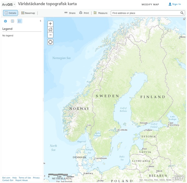
GIS i geografiundervisningen – en möjlighet och utmaning Geografididaktisk forskning från Norge visar att högstadieelever med rätt stöd kan hantera relativt avancerade kartanalysprogram. Ett projektorienterat arbetssätt fungerar också väl när man tillämpar geografiska informationssystem, GIS, i geografiundervisningen. Utvecklingen av geografiska informationssystem (GIS) har sedan länge inneburit nya möjligheter och utmaningar för olika tillämpningar i geografiundervisningen. GIS-applikationer kan ge goda förutsättningar för en mer systematisk och dynamisk användning av kartor och geografiska data. Teknik eller innehåll i fokus? Den tekniska utvecklingen har också under senare tid inneburit ökad tillgång på allt mer användarvänliga applikationer. Den särskilda programkurs i GIS som finns i gymnasieskolan har t.ex. bara genomförts på ett 15-tal skolor i Sverige. GIS som ett verktyg i en aktiv lärandeprocess Andersland utgår från den amerikanske geografen Daniel Suis indelning i att lära om och med GIS. Tekniken ger möjligheter och ställer krav
Making Maps: DIY Cartography | Resources and Ideas for Making Maps Geoskolan – kartor, geodata och GIS för skolan – Omvärldsbloggen Geoskolan är en lärresurs som skapats av Lantmäteriet för att hjälpa lärare och elever att arbeta med kartor, geodata och GIS i undervisningen. Den här tjänsten är en sammansmältning av ett antal olika initiativ inom området, som genomförts i omgångar under flera år. Just nu pågår uppbyggnaden av en nationell infrastruktur för geodata, och Geoskolan är en del av detta. 2014-15 drevs Geoskolan som en innovativ testmiljö inom ramen för Vinnovas satsning Digitalisering för framtidens skola. Förutom Vinnova, har Lantmäteriet byggt upp Geoskolan tillsammans med bland annat Vetenskapsrådet, Västerås stad, Gävle kommun, SCB och SGU. Dessutom har flera lärare bidragit med ämneskunskaper och insikter i didaktik och pedagogik. Än så länge är Geoskolan i ett uppbyggnadsskede, men tjänsten ingår sedan förra hösten i Lantmäteriets ordinarie verksamhet, och man räknar med att vara i skarpt läge inom kort. På grundskolan ska eleverna lära sig att På gymnasiet ska eleverna utveckla sin