background preloader

Bootstrap Material

Bootstrap Material
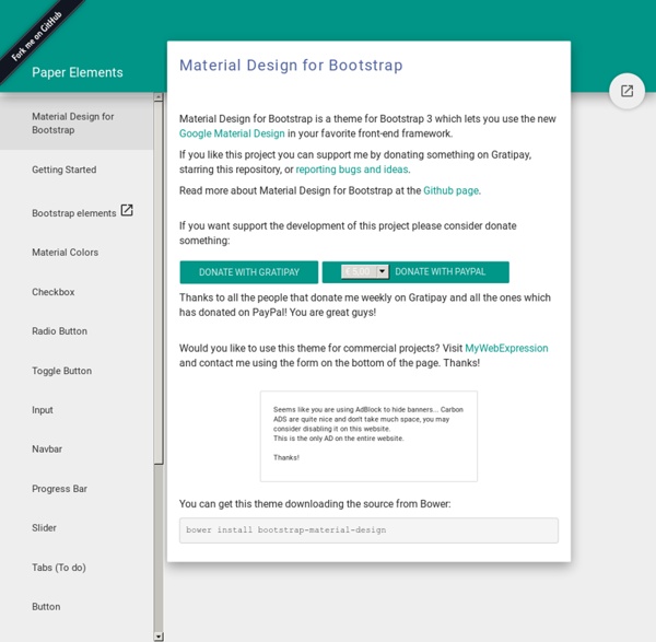
Material Design for Bootstrap is a theme for Bootstrap 3 which lets you use the new Google Material Design in your favorite front-end framework. If you like this project you can support me by donating something on Gratipay, starring this repository, or reporting bugs and ideas. Read more about Material Design for Bootstrap at the Github page. If you want support the development of this project please consider donate something: Donate with Gratipay Thanks to all the people that donate me weekly on Gratipay and all the ones which has donated on PayPal! Would you like to use this theme for commercial projects? Seems like you are using AdBlock to hide banners... Thanks! You can get this theme downloading the source from Bower: bower install bootstrap-material-design Download Install with NPM - Coming Soon You can also install and manage Material Bootstrap using NPM npm install Install with Bower You can also install and manage Material Bootstrap using Bower Install with Meteor What's included Sound Alarms

Flippant.js Heading Donec id elit non mi porta gravida at eget metus. Fusce dapibus, tellus ac cursus commodo, tortor mauris condimentum nibh, ut fermentum massa justo sit amet risus. Etiam porta sem malesuada magna mollis euismod. Donec sed odio dui. Modal » Card » Donec sed odio dui. Whys and hows: Flippant is tiny. Flippant is easily customized. Flippant exports a single function: flip. var front = document.getElementByID('flipthis') , back_content = "<h1>I'm the back! Two modes: card (the default), and modal. back = flippant.flip(front, back_content, 'modal') The back gets the default class of flippant-modal-dark for modal flips and flippant-modal-light for cards. back = flippant.flip(front, back_content, 'modal', 'my-modal-classname') The full API: flip(element_to_flip, content_for_back, type(modal/card), classname_for_back) -> back_element 74.3% of the magic is in the css file.

Dogfalo/materialize Bootstrap Date/Time Picker Introduction Simple date/time picker component based on the work of Stefan Petre, with contributions taken from Andrew Rowls and jdewit. Demo Code: Similar to above example, but in US date/hour format: Disables date picker: Disables time picker: The widget class provides 4 methods to manipulate dates: ‘getDate’/’setDate’ for working with UTC and ‘getLocalDate’/’setLocalDate’ for working with local dates: // Considering you are on a GMT-3 timezone and the input contains '2000-01-17 10:00'var localDate = picker.getLocalDate(); // localDate === 2000-01-17 07:00var utcDate = picker.getDate(); // utcDate === 2000-01-17 10:00//picker.setLocalDate(new Date(1998, 10, 11, 4, 30)); // input === 1998-10-11 07:30picker.setDate(new Date(Date.UTC(1998, 10, 11, 4, 30))); // input === 1998-10-11 04:30 The date value can be unset by passing ‘null’ to any of the ‘set’ methods or by erasing the input: The only event exposed is ‘changeDate’, which will expose ‘date’ and ‘localDate’ properties on the event object:

google/material-design-icons Welcome - Polymer 1.0 Material UI - Material Design React Components 7 Material Design Web UI Frameworks - Super Dev Resources Ever since Google announced their new Design Language, the Material Design, there has been a lot of excitement around its animated elements, colors and layout principles. If you have never heard of Material Design before, or haven’t had the time to see the official Material Design spec by Google before, then I strongly recommend you to see them now in order to understand its principles. With Material Design, Google wants to bring uniformity to its UI on all platforms including web, and not just Android. Google has its own Polymer Project which embraces material design throughout its Web components. In fact, Polymer Project played a key role in material design’s development and in showcase of Material design concepts for the Web. However Polymer project is still in early developer preview and not yet ready for production. Material Design Frameworks for the Web 1. Materialize is a modern responsive front-end framework based on Material Design. 2. 3. 4. 5. 6. 7. Material Design Web UI Demo 1.

25+ Best Material Design Frameworks The Great thing about web designing is that it is always changing and evolving. Material design is the googles new design practice; it is mobile first approach design system. Google is already started rolling out material design in their product like Android. The idea of material design is to make everything in a same simple way so anybody can understand them even if it is an app with brand new functionality. Material design is more like the flat design, but it have more depth than the usual designs. Material design derived from the thinking of using paper as a user interface. The material design used bolder colours and better use of typography. There are many well know companies started to adapt material designs for their products. See also : Material Design Resources For Designers And Developers Google may provide a framework for material design in future, but we don’t have any official announcement regarding that. Material Design Lite for Dart Developers Source Material Design Lite LumX

Material design with Polymer Edit on GitHub Material design is a unified system of visual, motion, and interaction design that adapts across different devices. Material design is inspired by tactile materials, such as paper and ink. Material surfaces interact in a shared space. Surfaces can have elevation (z-height) and cast shadows on other surfaces to convey relationships. Polymer’s paper elements collection implements material design for the web. For more detail on the material design philosophy and guidelines, see the Material design specification. For a sample of the material design patterns in use, see the Topeka sample app. For quick visual demos of many of the paper elements, see the Paper elements sampler. Application layout The Polymer core elements set includes several elements for application layout, including creating toolbars, app bars, tabs, and side nav consistent with the material design guidelines. See Layout elements for information on using these elements. Baseline grids Keylines Touch target size Icons

Related: