
What Do You Hope Will Still Exist in 2030? Humanity will change more in the next 15 years than it did in the past century. Some of us may have our pizzas and packages delivered on flying drones. We could travel in driverless cars, use 3D printers to make our meals and makeup, and wear technology from head to toe. Others may face issues with land degradation and water shortages, which could cause droughts in some areas and floods in others. It's crazy what can happen over time. From September 21 to 22, the fifth annual Social Good Summit — a unique gathering of world leaders, business pioneers and tech innovators — will explore how technology can be used for social good to build a better future. This week's Mashable Photo Challenge will be based around the event. That could be your iPhone 5s — which will probably be in a museum by then — or a normal pair of glasses and a hardcover book. What do you hope will still exist in the year 2030? Have something to add to this story?
CSS and the Golden Ratio A few weekes ago while at Brooklyn Beta, I was lucky enough to sit next to Scott Kellum during lunch. He mentioned how recently he had been interested in the idea of making fractals using nested CSS shapes with sizes defined by ems. I was excited to play with the idea, and so I began working with the golden ratio (1.618033988...). (after 4 years of architecture school, it still has a soft spot in my heart.) Getting the basic shape was easy enough, though I needed to do some tweaking with the positioning to keep the rectangles radiating from the center. click to toggle css visibility click to toggle html visibility Then I began work to create the ubiquitous golden spiral. however, after a bit, I realized my css was flawed (see below). nothing aligned quite right. click to toggle html visibility (same old, just some more classes) After getting lost in the possibilities and hacking away at the CSS, I realized the answer was simple (as is the case with most problems of this type). tweet
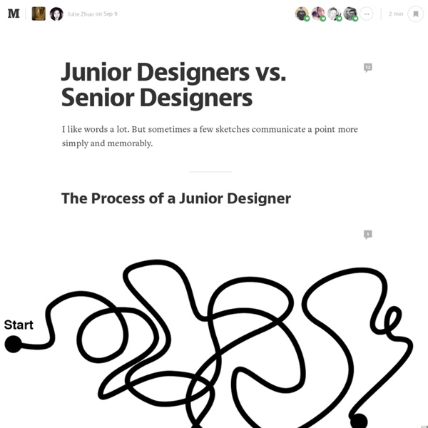
The Boring Designer Whenever I’m looking at a product designer’s work, I find myself continuously asking the same question: which solution is the boring one? Maybe it’s born out of seeing apps choose flash over function, or trying to understand just one too many indecipherable icons-as-buttons. Whatever the case, here’s an ode to the boring designers among us. The designers who… Choose obvious over clever every time. If you haven’t read Randy Hunt’s book on Product Design, you haven’t lived. Rarely stand their ground. The boring designer chases the right idea over their idea every time. Are Practical. With infinite time and resources we could do anything, but the boring designer knows we have neither of those things. Value Laziness. The boring designer realizes that the glory isn’t in putting their personal stamp on everything they touch. Lead the team. You’d think with all those traits, the boring designer would get run over or ignored most of the time by their teammates and fellow designers. So be great.
Twitter Announces Its First Commerce Product — A “Buy” Button On Mobile After months of reports and rumors, Twitter is announcing its first commerce product. The company first signaled its interest in this area last year, when it hired former Ticketmaster CEO Nathan Hubbard to lead its commerce team. Then it started recruiting other commerce specialists, and Recode got its hands on mock-ups of a Buy Now button. So Twitter is officially announcing that Buy button today — in a blog post, the company says it will be visible to “a small percentage of U.S. users (that will grow over time).” And even though the test is starting out on mobile, a company spokesperson said it will be moving onto desktop soon as well. Twitter says it’s partnering with a number of companies to make the Buy Now button happen, starting social shopping company Fancy, digital content seller Gumroad, fan commerce company Musictoday, and payments company Stripe.
From Google Ventures: 5 Rules For Writing Great Interface Copy For many technology companies, design is mysterious. So when I work with startups, I try to demystify design by talking about processes and skills. The idea is: Design is not a magical creative thing that designers are blessed to do. It's rational and objective, and the components are pretty easy to understand. People are often surprised when I tell them writing is a design skill. I used to work with an excellent visual designer who hated being called a visual designer. At Google Ventures, my partners and I get to try different approaches to design all the time—we work with different startups every week. We think this is pretty amazing—and no one is more amazed than me! (What’s interface copy? 1. Some say short is best. My principle: Clarity is king. • Be specific. • Watch for jargon and abbreviations. • Front-load your labels (i.e., put the important words up front). • Don’t be lazy. These are small things, for sure. 2. Everyone wants to stand out. 3. 4. 5.
Interface Animations Workshop, BlendConf 2014 Usage and performance Usage Only two properties are required for a CSS transition. transition-property transition-duration The other two properties are optional (transition-delay and transition-timing-function). You could breakout everything: or do shorthand: timing-functions Since transitions and animations must have a beginning and end, cubic-bezier will give you the best unique motion. will-change Give the browser a heads up by listing CSS properties that will more than likely change. No more translateZ(0) or translate3d(0,0,0) hacks ☺ Everything You Need to Know About the CSS will-change Property Performance You'll want to stick to transitioning transform and opacity as much as possible. Altering anything else can be costly at a larger scale. Transitioning layout properties creates browser paint and composite issues. csstriggers.com caniuse.com/#feat=css-transitions CSS Exercise #1 Transitions Transitions, Form misc codepen.io/markgeyer/pen/yklLx/ Add transition properties to these form elements. Whoa...
Creative Latitude: Articles It's amazing how much visual material businesses create. I like that, though. It tends to keep me in business. Think about the typical mid-size company. They have signage, stationery, forms, vehicle graphics, uniforms, brochures, catalogs, webs sites, newsletters and advertisements to name a few things. A design audit is a review of all the visual elements used by a business, as well as its message to the public. And, it's not just for the big guys. A design audit concerns itself with the consistency of visual style and message. An audit begins with the collection of all visual elements a business creates. As companies expand, they often start to have materials created and printed in remote locations. So, is that a big deal? Visual style and message are a big part of branding. We communicate with words, but also with our mannerisms, body language, clothes, attitudes, etc. A design audit brings all the inconsistencies to light. 2002, Neil Tortorella
5 tips on how to prepare a design presentation You lost. The work was on brief, you spent hours getting it ready and the client generally loved it. So what happened? All things being equal, I’d say someone else had a better presentation. 1. Why is this border yellow? If you ever stared at a client with a blank face after hearing questions like these, you made 1 tiny mistake in your workflow — you forgot there was a client involved with your project. Every design decision you make has to be driven by rationale — and reasons to support it. When you approach design projects this way, you solve 2 important problems: first, your designs become functional, not just eye pleasing and second, you have an answer ready when your client pops the question. Be ruthless while designing — keep asking yourself questions and finding good answers for everything you do. 2. When client hires someone to build a house, he knows that it’s not an easy task to do. Sadly, not everyone knows how hard it is to come up with a good design solution. 3. 4. 5.
How Google Unified Its Products With A Humble Index Card If you hadn’t noticed, every Google service has been trending toward a certain understated elegance. The company’s infamous era of championing 41 shades of blue is long over, as the company has learned to embrace clean lines, airy typography, and liberal white space across their platforms. But amidst implementing these long-established good design practices, Google rediscovered an old idea: index cards. Just like index and business cards of yore (or at least the late '90s), Google’s cards are plain, white rectangles peppered with nothing more than a little bit of type and maybe a photo. We first saw cards returning results through Search’s Knowledge Graph, as Google began summarizing Wikipedia entries into condensed blurbs. Yes, Google is even developing cards on cards. Are Cards Good Design, Or A Foregone Conclusion? "It’s not like we’ve invented a new way to organize information," admits Matias Duarte, UX director for Android. Cards Spread Like A Virus Through Google
Why Your Links Should Never Say "Click Here" Advertisement Have you ever wanted your users to click a link but didn’t know how to get them to act? When some designers run into this problem, they’re tempted to use the words “Click here” on their links. Before giving in to the temptation, you should know how using these words on a link can affect how users experience your interface. “Click” Puts Too Much Focus On Mouse Mechanics In my opinion, using the word “click” on your links takes the user’s attention away from the interface and on to their mouse. “View” relates to the user’s task, while “Click” puts focus on mouse mechanics. Instead of using the word “click,” you might look for a different verb that relates to the user’s task. “Here” Conceals What Users Are Clicking Some links use the word “here” instead of “click.” When your link communicates more than “here,” users can skip the verbose text and go right to the link. Links that are labeled are a lot easier to distinguish. Phrasing Links The Right Way Link to Nouns End on a Link (al)