
Free For All: 103 Free Fonts! In this installment of "Free for All," I'll cover just one type of freebie: everyone's favorite, free fonts! You'll find script fonts, modern fonts, funky fonts, and more. All told, there are more than 100 free fonts in this one article—enough to keep even the biggest type geek giddily building type spec sheets for weeks! Please note that licenses on the fonts below vary from personal use only to free for commercial use. Some of both types require attribution to the artist. Please check the license on any font you download before using it in a project. Grunge Fonts Popularly referred to as "grunge fonts," the group of typefaces officially classified as "distressed" first become popular as a result of the title treatment on the 1990s television show the X-Files (download it below!) Handwritten and Hand-drawn Fonts Get up close and personal with fonts based on others' real life handwriting and on hand-drawn letterforms. What can I find free for you?
21 Fonts That Shouldn't Be Free...But Are! | Web Design Blog by Union Room Web Design 21 Fonts That Shouldn’t Be Free…But Are! 13 July 2009 by Jordan Hall Using the right type in your designs, both in type and web, is vital to an attractive and successful design. With so many free fonts out there (Da Font currently has over 9000 fonts to choose from) it’s hard to wade through the varying levels of quality available. We’ve picked out some great fonts that shouldn’t be free, but are! 1. 2. 3. 4. 5. 6. 7. 8. 9. 10. 11. 12. 13. 14. 15. 16. 17. 18. 19. 21. Resources 50 Incredible Fonts for Professional Print & Web Design | Noupe 30 Fonts That All Designers Must Know & Own | Just Creative Design 37 FREE Must-Have Fonts | Francesco Mugnai 40 Free High Quality Hand Drawn Fonts | Hongkiat.com Thanks for reading, from Union Room Web Design. Back to Blog
27 New Typefaces That You Need to Know About Anyone who’s ever tried their hand at designing a typeface will know that it’s a wildly difficult process, and to actually come out at the end with something beautiful takes an extreme amount of skill, taste and patience. Type design isn’t meant for everyone, but typography is, and nearly every designer works with it every day. This is exactly why we’ve teamed up with Type Release creator Sean Mitchell to share with you some of the latest typefaces released this past month. These are his findings: Trim Created by Göran Söderström of Letters from Sweden Knud V. Fighting against the desire to make something similar, this new typeface instead takes the concept to a whole new level by trimming not only diagonals, but all possible letters! The result is something – different. ➤ Trim Colfax Created by Eric Olson of Process Type Foundry A refined oval sans serif of 20th century origins and 21st century sensibilities. ➤ Colfax Chartwell Created by Travis Kochel of TK Type ➤ Chartwell Tablet Gothic Girga
25 Excellent Handwritten Fonts Get the FlatPix UI Kit for only $7 - Learn More or Buy Now The use of certain fonts is an easy way to give a design a hand-drawn effect. Fortunately, there are a number of fonts in this style that are freely available. Whiteboard Modern Demo Harrison FFF Tusj Sketch Rockwell The Quiet Scream Grutch Shaded Mia’s Scribblings Karabine Christopher Hand Brook 23 Later On Kraboudja Estrya’s Handwriting Note This Caityln HandVetica Aguzlo Tire Shop Demo WC Roughtrad Tiza Hand of Sean Alliewriting GoodDog Rabiohead Angelina To see examples of inspirational design using hand-drawn type, see TypeInspire’s hand-drawn tag. For more design resources please see: About Steven Snell Stephen Snell is the owner and editor of Vandelay Design.
dafont.com 15 Beautiful Free Web 2.0 Fonts | Dzine Blog Learn how to earn $125 or more per hour as a freelancer - Click Here Looking for hosting?. We recommend MediaTemple for web hosting. The term Web 2.0 refers to the second generation of web development incorporating websites designed to encourage sharing and collaboration between users, like social networking sites (e.g. Of course, Web 2.0 sites are not only accessed through desktop computers with large displays. Web 2.0 sites aim to encourage participation and Web 2.0 fonts must do the same. Here are 15 great ones to download and start using in your designs! 1. Corpulent is a simple font that looks at its best in uppercase. 2. Airstrip Four combines straight and curved edges to great effect. 3. This is a stylish, somewhat squat, sans serif font. 4. Rezland is a really cool, curvy font. 5. Ubuntu Title takes up little horizontal space, so it perfect for inserting into tight spots. 6. Tuffy looks friendly and playful, but not at the expense of clarity. 7. 8. 9. 10. 11. 12. 13. 14. 15.
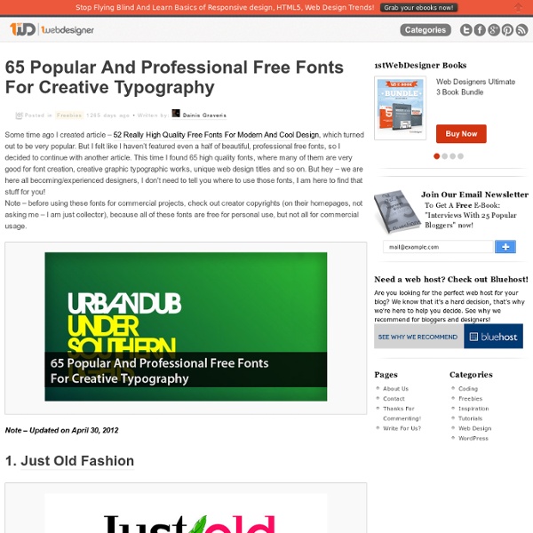
exljbris Font Foundry 36 High-Quality Latest Free Fonts To Enhance Your Designs | Fonts Typography is the art and techniques of arranging type, type design, and modifying type glyphs. Display typography is a potent element in graphic design, where there is less concern for readability and more potential for using type in an artistic manner. The proper selection of typography can convert your normal design into very attractive piece of art. Among other things, effective typography manages to achieve three necessary objectives of web designing are Look, Appearance and Outcome which helps you to keep apart from normal wave. Below you’ll find Collection of High-Quality Free Fonts to Enhance Your Designs by which you can save money and focus on making great applications. The basic purpose behind this post is to show you Popular, Artistic and most importantly Free Downloadable font types to save your time searching them online. You can also find some related free references at the end of the post. You may be interested in the following related articles as well. 01. 02. 04. 07. 09.
FontShop. The World’s Best Fonts. 30 Thin and Light Fonts That Should Not Be Free | AEXT.NET Thin and Light fonts are font types good for alternative logo design. However, looking for a good thin and light font for free is so hard because most of them is just for commercial using. I love them so much and I would like to share with you a list of 30 thin and light fonts. They’re beautiful. Furthermore, I love them because they are free. 1. 2. 3. 4. 5. 6. 7. 8. 9. 10. 11. 12. 13. 14. After a lot of broken links, I found it 15. 16. 17. id-Kaze2OT-Light 18. 19. 20. 21. 22. 23. 24. 25. 26. 27. 28. 29. 30. This one is an awesome thin font in Serifa Th BT Font Family. alternative font Font Font collection Font for design Font Free download Light Font Thin Font Related Articles
Articles: How to Spot Arial Many of the characters in Helvetica and Arial are very similar to each other, although none are quite identical. Other characters are quite a bit different, and they are the key to telling which is which. Here are some of the most obvious ones (Grotesque 215, Arial’s ancestor, has also been included for comparison): The “a” in Helvetica has a tail; Arial does not. The top of the Arial “t” is cut off at an angle; the Helvetica “t” is cut off straight. The ends of the strokes of letters like “S” and “C” are perfectly horizontal in Helvetica; in Arial and Grotesque they are cut off at a slight angle. The “G” in Helvetica has a spur at the bottom of the stem on the right side and the curve at the bottom of the “G” flows into the stem; in Arial and Grotesque the “G” has no spur and the curve at the bottom meets the stem at an angle. The tail of the “R” in Helvetica flows out from the bowl and curves straight down, ending in a slight curve to the right.
15 Beautiful And Free Urban Info: This is a guest post written by Tom Walker of CartridgeSave. A factor which cannot be overlooked when designing websites, brochures or e-magazines is the all important font type. Designers need to carefully select the font that best fits the style of the publication, is legible and perhaps a little different from the norm. There are plenty of retro and urban fonts available for download, however many are very expensive. For those on a limited budget, here are some amazing free urban and retro fonts. Victor Moscoso This funky retro font is based on the 1960′s psychedelic poster lettering of Victor Moscoso. Watson Watson is a retro font that still has the wow factor but is also simple and elegant. Thuphap Categorised as a brush font, Thuphap looks like freehand writing. Cinema This retro font is a flashback to the 1950′s movie theatres as it uses the same style as the old billboards and posters. JF Ringmaster JF Ringmaster is simply stunning. Acorn Initials Deco Caps Francis Mirtha Action Is
Category Archives: 365 Days of Hand Lettering 365 Days of Hand Lettering: Day 365 Happy New Year, friends! Thank you for following along on my project over the past year. Stay tuned Thursday for the announcement about my 2013 project. To possibility!! 186shares 33tweets 365 Days of Hand Lettering: Day 359 Merry, merry Christmas, friends. 51shares 6tweets 365 Days of Hand Lettering: Day 358 Happy Christmas Eve, friends! 89shares 5tweets 365 Days of Hand Lettering: Day 355 10 days left in the year, friends. 95shares 17tweets Hand Lettered Quotes :: Announcing the Book! I am thrilled to formally announce that I have signed with Chronicle Books to publish a book of 100 of my hand lettered quotes from the past year’s project! The book will be released in the Spring of 2014. I have already been hard at work selecting which 100 quotes I’d like included and preparing the artwork for print. In other news, tomorrow I have a new print being released on 20×200. Happy Wednesday. 176shares 7tweets
Beautiful New Free Fonts For Your Designs | Fonts Advertisement Every now and again we take a look around, select “fresh” high-quality free fonts and present them to you in a brief overview. The choice is enormous, so the time you need to find them is usually the time you should be investing in your current projects. In this selection we’re glad to present you Calluna, Andika Basic, Mentone, Sovereign Regular, Medio, Tiresias Infopoint and many other high-quality free fonts. New Free Fonts For Your Design Calluna1 (only Calluna Regular is free) The Calluna family, designed by talented Jos Buivenga, who has released 9 free fonts2 already, comes in 8 fonts: Light, Regular, Regular+Italic, Semibold+Italic,Bold+Italic and Black. Andika Basic4 (only Thin is available for free) Andika is a sans serif, Unicode-compliant font designed especially for literacy use, taking into account the needs of beginning readers. Tiresias Infopoint6 Tiresias Infofont has been designed for use on information labels to help improve legibility. Further Resources