The Joy of Stats
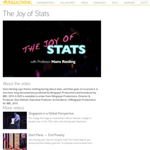
About the video Hans Rosling says there’s nothing boring about stats, and then goes on to prove it. A one-hour long documentary produced by Wingspan Productions and broadcast by BBC, 2010. A DVD is available to order from Wingspan Productions. Director & Producer; Dan Hillman, Executive Producer: Archie Baron. ©Wingspan Productions for BBC, 2010 The change from large to small families reflects dramatic changes in peoples lives. Hans Rosling asks: Has the UN gone mad? Hans Rosling explains a very common misunderstanding about the world: That saving the poor children leads to overpopulation.
http://www.gapminder.org/videos/the-joy-of-stats/
Related: InfoVis
Tools - Proportional Ink
In this article we explore a basic rule for the design of data graphics, the principle of proportional ink. The rule is very simple: when a shaded region is used to represent a numerical value, the area of that shaded region should be directly proportional to the corresponding value. In other words, the amount of ink used to indicate a value should be proportional to the value itself.
Desktop
This software has been renamed to Gapminder World Offline Because of technical problems the software on this page is no longer being maintained! Please visit Gapminder World Offline (Beta) instead. Gapminder Desktop With Gapminder Desktop you can show animated statistics from your own laptop!
25 Best Infographics Of 2011 That Are Still Relevant Today
The year of 2011 went very fast for us in the development world and I am sure some of you accomplished important things for your career during this year. But besides our personal achievements, the whole industry managed to reach something that was unthinkable around 10 years ago. To show you how the web progressed during the past year, I collected a series of infographics from the internet and hope, by the end of this article, you will realize what huge potential this year of 2012 has. Most of the images are not in full here, so you might want to click on them and read the whole infographic for an overall understanding of the presentations. 1. 60 seconds on the web This one shows what happened on the web during 2011 in a timeframe of 60 seconds, if we minimize the whole year to it. 600 new YouTube videos, almost 700,000 search queries on Google and Facebook status updates and close to 100,000 tweets should say enough about what power the internet holds nowadays.
Tools - Misleading axes on graphs
The purpose of a publication-stage data visualization is to tell a story. Subtle choices on the part of the author about how to represent a dataset graphically can have a substantial influence on the story that a visualization tells. Good visualization can bring out important aspects of data, but visualization can also be used to conceal or mislead. In this discussion, we'll look at some of the subtleties surrounding the seemingly straightforward issue of how to choose the range and scale for the axes of a graph. Bar chart axes should include zero
Human rights & democracy statistics
About this Video In this video, made for the Oslo freedom Forum 2009, Hans Rosling discuss the difficulty in measuring progress in Human Rights in the form of comparable numerical statistics. He also shows the surprisingly weak correlation between existing estimates for democracy and socio-economic progress. The reason may be that democracy and human rights measurements are badly done. It may also be that democracy and human rights are dimensions of development that are in themselves difficult to assign numerical values.
How to Make an Interactive Network Visualization
Networks! They are all around us. The universe is filled with systems and structures that can be organized as networks. Recently, we have seen them used to convict criminals, visualize friendships, and even to describe cereal ingredient combinations. We can understand their power to describe our complex world from Manuel Lima's wonderful talk on organized complexity.
City Of Melbourne : Pedestrian Counting System
Wednesday 22 March 2017 Trend over last 3 hours Note: If a sensor returns a series of zero readings it may be temporally inoperable
SEO Keyword Graph Visualization
Use this free Java application to explore the connections between related websites. Try it now! Enter keywords or a URL, and click 'Graph it!' See Getting Started below for more details. Getting Started Make sure you have the latest version of java, at least Java 1.5 Type in your search keywords or a URL, and press "Graph It!"
Related: