background preloader

Google NGram Experiments

Google NGram Experiments
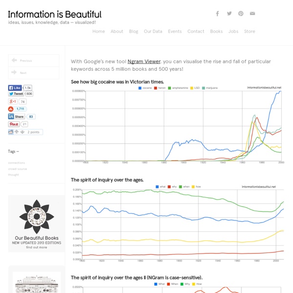
With Google’s new tool Ngram Viewer, you can visualise the rise and fall of particular keywords across 5 million books and 500 years! See how big cocaine was in Victorian times. The spirit of inquiry over the ages. The spirit of inquiry over the ages II (NGram is case-sensitive). The Battle Of The Brains What happened around 1700??? Age-old debates (by Andy, James Rooney, Nick, Bidzubido, Jacqui,Gary,Stefan Lasiewski,Mark) Got any more?

Rencontre avec David McCandless » Article » OWNI, Digital Journalism Le journaliste du Guardian tient le site "Information is beautiful", sur lequel il met en scène toutes sortes de données. Entretien autour des problématiques que pose la visualisation de données. Boire un thé avec David McCandless d’Information is beautiful quand on s’intéresse à la visualisation de données revient un peu à partager un pétard avec ses rockers préférés quand on est une groupie. Je souris béatement tandis qu’il peste contre sa nouvelle maison qu’il juge bien trop grande et trop froide. David met de l’eau à bouillir et je remarque que même sa théière est recouverte d’une petite laine. Quelques instants plus tard, je le suis, sans sucre et sans lait, dans les escaliers qui mènent à son bureau. Work In progress Là, il me montre une infographie sur les exoplanètes qu’il termine actuellement pour The Guardian. La notion d’échelle est fondamentale pour moi ; je crois que c’est véritablement la clé de la visualisation de données car elle donne à la fois le contexte et le sens.

Ebook : le cahier de l’OpenData 2010 » Article » OWNI, Digital Journalism Acteur du datajournalism, Owni suit de près le mouvement open data. Les fortunes sont diverses selon les pays. Retour sur les avancées et les reculs de l'année 2010 en dix articles. «Nous ouvrons les gouvernements» : si le slogan de WikiLeaks semble voir été entendu, au moins en partie par les gouvernements anglo-saxons, comme en témoignent les initiatives des Etats-Unis, de la Grande-Bretagne, de l’Australie et du Canada, la majeure partie des pays restent à la marge. Ainsi, les pays européens peinent à suivre le mouvement de l’open data, malgré la mise en place de la directive européenne INSPIRE en 2007, et la France ne déroge pas à cette règle. Les politiques nationales, conservatrices en la matière, ont peu évolué depuis la loi du 17 juillet 1978 et restent aujourd’hui contradictoires et inégales selon les secteurs, orientées parfois vers un mouvement de fermeture, comme en témoigne la récente loi Loppsi2. Libérez les données !

Ten Fatal Flaws in Data Analysis | Stats With Cats Blog 1. Where’s the Beef? In a way, the worst flaw a data analysis can have is no analysis at all. 2. If there were to be a fatal flaw in an analysis, it would probably involve how well the samples represent the population. 3. Sometimes the population is real and well defined, but the samples don’t represent it adequately. 4. The number of samples always seems to be an issue in statistical studies ( 5. Most people don’t appreciate variance. 6. NASA uses checklists to ensure that every astronaut does things correctly, completely, and consistently. 7. If a statistical test is conducted in a study, false positives and false negatives can be controlled, or at least, evaluated. 8. Here’s where you have to use your gut feel. 9. Make sure the data spans the parts of the variable scales about which you want to make predictions. 10. Any Questions? Read more about using statistics at the Stats with Cats blog. Like this: Like Loading...

Data journalism pt5: Mashing data (comments wanted) This is a draft from a book chapter on data journalism (part 1 looks at finding data; part 2 at interrogating data; part 3 at visualisation, and 4 at visualisation tools). I’d really appreciate any additions or comments you can make – particularly around tips and tools. UPDATE: It has now been published in The Online Journalism Handbook. Mashing data Wikipedia defines a mashup particularly succinctly, as “a web page or application that uses or combines data or functionality from two or many more external sources to create a new service.” This ‘match’ is typically what makes a mashup. Why make a mashup? Mashups can be particularly useful in providing live coverage of a particular event or ongoing issue – mashing images from a protest march, for example, against a map. Some web developers have built entire sites that are mashups. Finally, mashups offer an opportunity for juxtaposing different datasets to provide fresh, sometimes ongoing, insights. Mashup tools Yahoo! Mashups and APIs

Data journalism pt4: visualising data – tools and publishing (comments wanted) This is a draft from a book chapter on data journalism (here are parts 1; two; and three, which looks the charts side of visualisation). I’d really appreciate any additions or comments you can make – particularly around tips and tools. UPDATE: It has now been published in The Online Journalism Handbook. Visualisation tools So if you want to visualise some data or text, how do you do it? The best-known tool for creating word clouds is Wordle (wordle.net). ManyEyes (manyeyes.alphaworks.ibm.com/manyeyes/) also allows you to create word clouds and tag clouds – as well as word trees and phrase nets that allow you to see common phrases. More general visualisation tools include widgenie (widgenie.com), iCharts (icharts.net), ChartTool (onlinecharttool.com) and ChartGo (www.chartgo.com). If you want more control over your visualisation – or want it to update dynamically when the source information is updated, Google Chart Tools (code.google.com/apis/charttools) is worth exploring. Like this:

Data journalism pt3: visualising data – charts and graphs (comments wanted) This is a draft from a book chapter on data journalism (the first, on gathering data, is here; the section on interrogating data is here). I’d really appreciate any additions or comments you can make – particularly around considerations in visualisation. A further section on visualisation tools, can be found here. UPDATE: It has now been published in The Online Journalism Handbook. “At their best, graphics are instruments for reasoning about quantitative information. Visualisation is the process of giving a graphic form to information which is often otherwise dry or impenetrable. Broadly speaking there are two typical reasons for visualising data: to find a story; or to tell one. In the parking tickets story above, for example, it was the process of visualisation that tipped off Adrian Short and Guardian journalist Charles Arthur to the story – and led to further enquiries. In most cases, however, the story will not be as immediately visible. Types of visualisation Like this:

Data journalism pt2: Interrogating data This is a draft from a book chapter on data journalism (the first, on gathering data, is here). I’d really appreciate any additions or comments you can make – particularly around ways of spotting stories in data, and mistakes to avoid. UPDATE: It has now been published in The Online Journalism Handbook. “One of the most important (and least technical) skills in understanding data is asking good questions. An appropriate question shares an interest you have in the data, tries to convey it to others, and is curiosity-oriented rather than math-oriented. Once you have the data you need to see if there is a story buried within it. The first stage in this process, then, is making sure the data is in the right format to be interrogated. If the information is already online you can sometimes ‘scrape’ it – that is, automatically copy the relevant information into a separate document. Insert: Cleaning up data Some tips for cleaning your data include: Use a spellchecker to check for misspellings.

Data journalism pt1: Finding data (draft – comments invited) The following is a draft from a book about online journalism that I’ve been working on. I’d really appreciate any additions or comments you can make – particularly around sources of data and legal considerations The first stage in data journalism is sourcing the data itself. There are a range of sources available to the data journalist, both online and offline, public and hidden. national and local government;bodies that monitor organisations (such as regulators or consumer bodies);scientific and academic institutions;health organisations;charities and pressure groups;business;and the media itself. One of the best places to find UK government data online, for example, is Data.gov.uk, an initiative influenced by its US predecessor Data.gov. At a regional level, local authorities are also releasing information that can be used as part of data journalism projects. Private companies and charities Regulators, researchers and the media Using search engines to find data Live data Books and FOI

How to be a data journalist | News Data journalism is huge. I don't mean 'huge' as in fashionable - although it has become that in recent months - but 'huge' as in 'incomprehensibly enormous'. It represents the convergence of a number of fields which are significant in their own right - from investigative research and statistics to design and programming. The idea of combining those skills to tell important stories is powerful - but also intimidating. Who can do all that? The reality is that almost no one is doing all of that, but there are enough different parts of the puzzle for people to easily get involved in, and go from there. 1. 'Finding data' can involve anything from having expert knowledge and contacts to being able to use computer assisted reporting skills or, for some, specific technical skills such as MySQL or Python to gather the data for you. 2. 3. 4. Tools such as ManyEyes for visualisation, and Yahoo! How to begin? So where does a budding data journalist start? Play around. And you know what?

10 Best Data Visualization Projects of the Year – 2010 Data visualization and all things related continued its ascent this year with projects popping up all over the place. Some were good, and a lot were not so good. More than anything, I noticed a huge wave of big infographics this year. It was amusing at first, but then it kind of got out of hand when online education and insurance sites started to game the system. Although it's died down a lot ever since the new Digg launched. That's what stuck out in my mind initially as I thought about the top projects of the year. One of the major themes for 2010 was using data not just for analysis or business intelligence, but for telling stories. So here are the top 10 visualization projects of the year, listed from bottom to top. 10. Scott Manley of the Armagh Observatory visualized 30 years of asteroid discoveries. 9. Hannah Fairfield, former editor for The New York Times, and now graphics director for The Washington Post, had a look at gas prices versus miles driven per capita. 8. 7. 6. 5. 4. 3.

Facebook worldwide friendships mapped As we all know, people all over the world use Facebook to stay connected with friends and family. You meet someone. You friend him or her on Facebook to keep in touch. I defined weights for each pair of cities as a function of the Euclidean distance between them and the number of friends between them. In other words, for each pair of countries with a friend in one country and a friend in the other, a line was drawn. It might remind you of Chris Harrison's maps that show interconnectedness via router configurations. In areas of high density it looks more or less like population density.

FlowingData | Data Visualization, Infographics, and Statistics

Related: