
Web 2.0 Science Tools By Laura Turner The following web2.0 sites would be useful for science educators at the high school and middle school level. Some would also be appropriate for higher elementary grade levels. There are many new ‘tools’ or websites that take advantage of the higher speed and bandwidth of today’s Internet. Web 1.0 tools/websites were text based and web2.0 tools/websites are designed for full-motion video, 3D animations and are generally interactive in some manner. Web 2.0 can also be described as the second round of new technology development and adoption. EcoKids This award-winning EcoKids web site is an interactive environmental web site for children, their families, and educators in Canada and around the world. Experience Math and Science with Gizmos (3-12) www.explorelearning.com This site features 450 interactive simulations for math and science. Google Google SketchUp Google Earth for Educators St.
10 Beautiful Big Data Visualizations Big Data is big. We know it, you know it, everyone knows it. But what can we do with it? Let’s take a look at 10 amazing Big Data visualizations. Visualizing Big Data in what are already being called little works of art, is one of the ways in which the giant webs of information can make sense to anyone not familiar with the ins and outs of zeroes and ones. Let’s take a look at some of these Big Data artworks. 1. This beautiful graph by David McCandless shows which cities would go down in which order, when the sea level rises in the coming years. 2. Gravity, a new startup founded by MySpace, creates an interest graph based on a person’s social media likes, shares and recommendations. 3. In this image, the strenght of the light indicates the popularity of Facebook around the world. 4. WolframAlpha has created a tool that gives you the opportunity to visualize your connections and profile on Facebook. 5. 6. 7. Because every country is good at something! 8. 9. 10. Our one and only video.
I migliori siti italiani che parlano d'innovazione didatticaProf Digitale Penso sia finalmente giunto il momento di mettere insieme in una lista, che spero mi aiuterete ad ampliare ed a tenere aggiornata con le vostre preziose segnalazioni, i migliori siti italiani che parlano d’innovazione didattica, di scuola 2.0, di rivoluzione digitale all’interno delle classi. L’articolo su quelli internazionali ha avuto un discreto successo, ma è ora di cominciare a guardare dentro i nostri confini, perché ci sono risorse meravigliose che aspettano solamente di essere scoperte e condivise. Nell’elenco troverete anche siti che non parlano esclusivamente di scuola, ma anche d’innovazione tout court, perché personalmente ritengo che aprirsi all’esterno, e non essere troppo autoreferenziali, sia un’ottimo modo per andare avanti nel nostro percorso professionale. Rinnovo il mio consiglio: salvate questi siti tra i preferiti o, meglio, sul vostro RSS reader, in modo da consultarli più o meno regolarmente, perché riescono a pubblicare anche diversi articoli al giorno.
Enterprise Dashboard Prototyping Wireframe Mockup Update: This enterprise dashboard wireframe has proven to be a very popular tool with interaction designers for use as a dashboard prototyping tool. The powerpoint format, along with the high fidelity graphic approach, is serving the dashboarding community well. Enjoy this unique resource. Let me know how it helps you in your enterprise dashboard project. Tags: Executive Dashboard Usability, wireframe, dashboard prototype, enteprise dashboard template. Not content with the hundreds of screenshots of actual enterprise dashboards and executive scorecards, Dashboard Spy readers have been demanding the release of my dashboard mockup and wireframe tools. The dashboard templates come in the form of Powerpoint. My first release is the Cool Blue Template. I’ve put the link to the template on The Dashboard Spy website. Here are the links: The Dashboard Spy Collection of Dashboard Screenshots. Homework: Remember to always put your users first.
L’Aula del XXI Secolo come Ambiente di Apprendimento La “Scuola” intesa come Spazio Fisico Nel dibattito sulla riforma della scuola viene spesso sottovalutata l’importanza della scuola intesa come “Habitat“, spazio fisico e architettonico in cui ha luogo il processo di insegnamento e apprendimento. L’idea che gli ambienti in cui si svolge l’attività educativa siano come lo Spazio newtoniano “vuoti contenitori” caratterizzati da uniformità e universale omologazione, ha radici antiche nella scuola italiana. Negli altri paesi monitorati dall’OECD, esistono architetti specializzati nello School Design, che lavorano insieme ai rappresentanti di docenti e studenti per creare gli spazi educativi. Ma è davvero irrilevante lo spazio nel quale si svolge la didattica? Può migliorare l’apprendimento scolastico in edifici cadenti e fuori norma? Quali Spazi per una didattica basata sulle Nuove tecnologie? Componenti della Classe del XXI secolo secondo Open Colleges Come deve essere l’aula per una didattica basata sulle TIC e sul WEB? E in Italia?
FlowingData | Data Visualization, Infographics, and Statistics Safe Exam Browser - News November 17, 2016 We added a new subpage to our website: Publications on the Use of SEB. Besides technical reports you can find links to scientific papers there, which cover pedagogical, organizational and technical aspects of e-assessments using Safe Exam Browser. These articles give more insights on how SEB can be used in different examination scenarios. November 1, 2016 Safe Exam Browser 2.1.2 for macOS fixes some issues of the recent release SEB 2.1.1 which could occur in non-default screen configurations and when starting SEB by opening specific settings. See release notes for all changes. October 26, 2016 Safe Exam Browser 2.1.1 for macOS offers new features, usability enhancements and includes major security improvements: Fully compatible with macOS 10.12 Sierra Implements support for embedded TLS/SSL & CA certificates and certificate pinning for enhanced security when connecting with exam servers. See release notes for all changes. September 22 and 23, 2016 July 7, 2016 July 1, 2016
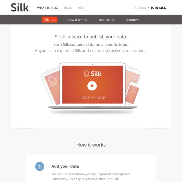
JuiceKit for Visual Analytics - JuiceKit™ SDK La buona scuola digitale - MIUR 01 marzo 2019 Avviso per partecipazione alla Settimana del PNSD e #FUTURAGENOVA Allegato Regolamento per la partecipazione al concorso #ilmioPNSD Allegato Dashboard Templates for Business Intelligence Wikispaces