Adaptive Images in HTML
Internet Explorer CSS3 PIE: CSS3 decorations for IE
HTML5 Image uploader with Jcrop
HTML5 Image uploader with Jcrop We have received several inquiries for the last time from our readers with a question – how to upload photos to website. I think that this is an interesting question, and, I decided to lift the veil of this question. But, I think that the basic file upload is a bit boring thing, so, I decided to add an important feature – Cropping. It should be more attractive. Moreover, we are going to use HTML5 FileReader in order to perform cropping with Jcrop (jquery library) at client size. It is the very time to test our demo and download the sources: Live Demo download in package Step 1. Our first step is html markup. first, we have to put styles and scripts in the HEAD section: And now, in the BODY section we can put our form: I hope that all is clear at this step – this is usual upload form, with hidden and visible fields, once we have selected an image, we will see second step (crop). Step 2. Now, I would like to give you CSS styles to stylize our form: css/main.css
alvarotrigo/fullPage.js
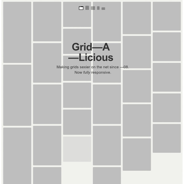
Golden Grid System
GGS was my next step after Less Framework. Instead of a fixed-width grid, it used a fully fluid-width one, without even a maximum width. The resources it was published with are still available on GitHub. The idea was to take a 18-column grid, use the outermost columns as margins, and use the remaining 16 to lay elements out. On smaller screens the 16 columns could be folded into 8, 4 and 2. This behaviour was inspired by Massimo Vignelli's Unigrid system. While the grid's columns were fluid — proportional to the screen's width — the gutters (spaces between the columns) were proportional to the font-size being used. GGS also contained a set of typographic presets, strictly to a baseline grid. Correctly setting all of these measurements is difficult, of course. When published, GGS gained a lot of attention, as the web design community was searching ways to work with fluid-width grids, which have always been troublesome, running counter to many graphic design principles.
CSS Layout Generator
About the CSS Layout Generator The CSS Layout Generator was first released by Tony Aslett in October 2003, since then over 871,000 layouts have been generated. Updated in November 2010, HTML5 doctype can now be selected and a simple HTML5 template with appropriate tags will be created. The generator helps you create the structure of your website template using valid HTML and CSS. You can create a fluid or fixed width floated column layout, with up to 3 columns and with header and footer. The generator requires a modern DOM capable browser with JavaScript enabled. Instructions To create your layout select the structural elements your site requires (header, footer, columns). Info popups are available where you see InfoMore info example :) icon, just hover over it for more information. Join the CSS Forum to suggest changes or ask for help where needed. Author: Tony Aslett
jquery FooTable
Cycle, un plugin jQuery pour créer un diaporama photo
Cycle est un plugin jQuery qui permet de créer un diaporama photo. L’outil est assez souple : plus d’une cinquantaine d’options sont configurables pour personnaliser les effets de transition, la vitesse d’animation, l’appel de fonctions de callback, etc. Simple et rapide à mettre en place. Des transitions personnalisables Toutes les caractéristiques de base d’un slideshow sont personnalisables : la vitesse d’animation, la lecture en boucle, le mode de déclenchement, l’appel de fonctions de callback, ou encore la mise en pause… Mais c’est surtout le nombre de transitions qui est remarquable : grâce au plugin jQuery Easing, vous pouvez utiliser une multitude d’effets de transition avec les fonctions « easing ». Un diaporama facile à mettre en place Après avoir inclus la librairie jQuery et le plugin Cycle, on définit la structure HTML de la façon suivante avec une simple div contenant des images. Puis on fait appel au plugin Cycle. C’est terminé, votre diaporama fonctionne.
CSS3 Animator, HTML5 Animations, Create Stunning Animations with Ease | Sencha Animator
The Sencha Web Application Lifecycle Management platform simplifies the challenges of managing the software development lifecycle of web applications. Now you can seamlessly design, develop, and test data-intensive web applications and deliver the right user experience, on the right screen, at the right time. Sencha Platform for Web Application Lifecycle Management The Sencha portfolio of products and services forms an integrated, modular platform for managing the lifecycle of your cross-platform web applications. Sencha products can be deployed separately or together to form an end-to-end solution. With the Sencha Platform you can prototype, develop, theme, debug, and test your web applications on any device running any browser. Design The Sencha platform helps you accelerate your web application development efforts with out-of-the box theming capabilities across all applications. Learn More: Ext JS | Architect | Themer Develop Learn More: Ext JS | Sencha Test | GXT Test An Open Platform
OiNutter/guggenheim.js
