
écomobilité, innovation, communauté.: Isokron illustre brillament l'intérêt de l'ouverture des données Deux jeunes développeursviennent de sortir une superbe vidéo qui fera, espérons le, mieux connaitre leur excellente application Isokron. Il s'agit, pour faire court, d'un calculateur de cartes "isochrones" en transport public donnant une représentation du temps nécessaire pour aller, en transport public, à chaque endroit du territoire. La vidéo résume une journée d'isochrones et permet de visualiser des pulsations qui correspondent au départ des modes rapides comme le métro. En plus, cette vidéo illustre bien concrétement l'intérêt pour la municipalité de l'ouverture des données publiques. En effet, elle est réalisée à partir des données de Rennes qui sont, depuis quelques temps déjà, ouvertes... Enjoy ! un lundi à Rennes from isokron on Vimeo. Pour ceux qui sont fans de ce genre de cartes, on rappelle mapnificient et même, la catégorie isochrone dece blog (dont le premier article remonte à 2006... ca nous rajeunit pas).
Global Population Density at a Glance (Infographic) Fathom Information Design/Promo image This population density map is making the rounds on the blogs today, to near-universal acclaim. And for good reason; it might be the most intuitive look at global pop. density ever cobbled together. The brainchild of Fathom Information Design, 'Dencity' uses small pixels to connote density, big ones to convey wide-open, unpopulated spaces. Fast Company explains why the design works: In the visual syntax of infographics and maps, bigger equals... well, bigger. Fathom Information Design/Promo image I don't really get what's so unorthodox about this; to me, it seems downright intuitive. China. Counterintuitive or not, it is indeed a brilliantly effective way to convey where population centers are grouped, and where there's still free range. Click here to view a larger image.
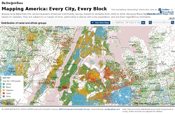
Open 311 America by Population Group Images below are via Radical Cartography (h/t Foseti) Similar US maps available for percent Native American and percent Pacific Islander A higher percent European population is generally seen in lower crime and higher income regions. A higher percentage of persons of African descent is generally seen in high crime, low income regions. The "hispanic" category is misleading and confused. As one would expect with such a confused category, crime and poverty rates associated with a high "hispanic" percentage are mixed. As with the hispanic category, the "Asian" category can refer to a wide range of population groups, from East Asians to South Asians to Southeast Asians, etc. Murder Rate per 100,000 in Large Cities Trulia Crime Maps The above map has a link to the Trulia.com crime map website, which will provide you with an incredible amount of "neighborhood-level" detail for crime in whichever city you select. Download full PDF report: Color of Crime Of course, it could be a lot worse.
Extrait de veille Open Data Octobre 2011 « Extrait de Veille Open Data Octobre 2011 Etalab Après plusieurs mois de travaux participatifs avec les acteurs de l’open data, Etalab sort sa licence nationale pour les données publiques. Etalab continue par ailleurs les rencontres autour des données (dernier atelier sur le datajournalism) et a également ouvert son compte twitter. Sénat Pour la première fois, le Sénat a publié les résultats des élections sénatoriales ainsi que les listes de candidats en temps réel sur le site du Sénat. Primaires Socialistes L’open data s’immisce en politique. Conseil National du Numérique Le CNN a ouvert un groupe de travail Open Data et prévoit la publication d’un livre blanc sur le sujet pour début 2012. Concours Google Google, la Netscouade et Dataveyes lancent un concours d’applications web sur le thème de la campagne présidentielle de 2012. Liste des bonnes pratiques Open Data Temesis a finalisé sa liste de critères et fonctionnalités attendus pour la mise à disposition de données publiques. Data Publica Enel
Census 2011 interactive: find out the truth about where you live | UK news Ethnicity On the rise Below are the ethnic groups whose populations have grown most in your area between 2001 and 2011. Overall growth is expressed as a percentage change. The figures under the circles to the right indicate the number of people in these groups in each of the two years. People Falling Below are the ethnic groups whose populations have declined most in your area between 2001 and 2011. National Religion Below are the religious groups whose populations have grown most in your area between 2001 and 2011 based on answers to the voluntary question: 'What is your religion?' Below are the religious groups whose populations have declined most in your area between 2001 and 2011 based on answers to the voluntary question: 'What is your religion?' Industry (men) The top three Below are the top industries employing males in the 2001 and 2011 census. Industry (women) Below are the top industries employing females in the 2001 and 2011 census. Household Composition
Census Maps Using Word Frequency From 19 Million Dating Website Profiles Chicago area Each decade the United States government embarks on a census of its entire population in order to update population numbers and demographic information that aids in the allocation of Congressional seats, electoral votes, and government program funding. But as helpful and interesting as this data is, what does it really tell us about who we are? To join a dating site you have to, quite literally, “put yourself out there”, describing yourself for the express purpose of being liked. I joined twenty-one dating sites in order to make my own census of the United States in 2010. These maps contain 20,262 unique words, based on the analysis of online dating profiles from 19,095,414 single Americans. Below are some examples of maps where locations are substituted with words people used to describe themselves. Central Texas California Michigan DuBois also used the data to generate heatmaps helping to draw comparisons between specific terms county by county. “Bored” (male vs. female)
Are the Richest Americans Also the Best Educated? More Infographics on Good