
The Internet map The map of the Internet Like any other map, The Internet map is a scheme displaying objects’ relative position; but unlike real maps (e.g. the map of the Earth) or virtual maps (e.g. the map of Mordor), the objects shown on it are not aligned on a surface. Mathematically speaking, The Internet map is a bi-dimensional presentation of links between websites on the Internet. Every site is a circle on the map, and its size is determined by website traffic, the larger the amount of traffic, the bigger the circle. Users’ switching between websites forms links, and the stronger the link, the closer the websites tend to arrange themselves to each other. Charges and springs To draw an analogy from classical physics, one may say that websites are electrically charged bodies, while links between them are springs. Also, an analogy can be drawn from quantum physics. Anyway, the real algorithm of plotting The Internet map is quite far from the analogies given above. Semantic web The Internet Phenomenon
Internet Mapping Project: Map gallery This map appeared in the December 1998 Wired. If you are interested in using this image in some way, contact the folks at Lumeta, who own the rights to the images and technology. These are variations on the IP address-based color schemes, basically just switching around R, G, and B. These have the technical names of color schemes 0, 1, and 2. Notes Both my wife and Lillian Schwartz, a noted artist, say this is better with a black background. What the Internet Actually Looks Like - Megan Garber GeoTel Communications via Fortune and Mashable Here is what the Internet looks like: not a series of GIFs or a video of surfing goats, but a spindly collection of fiberoptic cables. The Internet, as a physical thing, actually looks a lot like a series of tubes. We know this, of course, but it's nice to be reminded of the physical filaments that afford our digital connections. The image above, as seen from the North Pole, offers the global view of the Internet's major cables.
Measuring Influence: The Value of 3D Data Visualization Google and Apple Digital Mapping | Data Collection Over the past few years, at the kinds of conferences where the world's technological elite gather to mainline caffeine and determine the course of history, Google has entertained the crowds with a contraption it calls Liquid Galaxy. It consists of eight large LCD screens, turned on their ends and arranged in a circle, with a joystick at the centre. The screens display vivid satellite imagery from Google Earth, and the joystick permits three-dimensional "flight", so that stepping inside Liquid Galaxy feels like boarding your own personal UFO, in which you can zoom from the darkness of space down to the ocean's surface, cruising low over deserts, or inspecting the tops of skyscrapers. (The illusion of real movement is powerful; your legs may tremble.) You can swoop down to street-level in Cape Town, spot ships in the Mekong river, or lose yourself in the whiteness of Antarctica. But you don't, of course. Advertisement The transition to print gave far more people access to maps.
Norwayweb and Data Bodies Taking tax information and putting it into real time artwork Featuring: Bjorn Magnhildoen, Norwayweb I came across the Net Artwork Norwayweb whilst receiving my usual mass of e-mails. Even though I usually use filters, far too much spam still gets through. So, like so many other's around the world, I have the arduous process of picking out what is deemed worth keeping. As we all adapt and mutate in response to a more technologically determined world, we become something else. As I went through the (programmed) mannerism of switching between looking at e-mails on my Thunderbird client and clicking back to the Firefox browser to view how Norwayweb was doing; and visiting Facebook to see the various messages that had been left there for me by those who I wish to know and those who I do not wish to know. Bjorn Magnhildoen is known for his various net art works, incororating databases and networks. Recent information from the carpet... This is a fascinating artwork. [2]The Guardian.
The maps transforming how we interact with the world 12 September 2013Last updated at 19:35 ET By Matthew Wall Business reporter, BBC News An Ordnance Survey staff member interrogates 3D aerial mapping data The modern map is no longer an unwieldy printed publication we wrestle with on some blustery peak, but digital, data-rich, and dynamic. It is transforming the way we interact with the world around us. Thanks to "big data", satellite navigation, GPS-enabled smartphones, social networking and 3D visualisation technology, maps are becoming almost unlimited in their functionality, and capable of incorporating real-time updates. "Advanced LED screen technology and smartphones equipped with projectors are going to transform the way we interact with maps," says Ian White, founder and chief executive of Urbanmapping.com, a San Francisco-based geoservices provider. Continue reading the main story Soon we may not even be visualising maps. End QuoteJohn GoodwinPrincipal scientist, Ordnance Survey "They may be talking to us. Social maps 'Swan dust pillow'
A Trip Through Internet History with @wwwtxt As ethereal as the internet seems sometimes, it is also an amazing archive of words and language. Tweets are stored with the Library of Congress (and perhaps other government agencies), entire web sites are slurped up into archive.org, and deleting your LinkedIn profile remains a mystery. We know these facts intuitively and while we often discuss the privacy implications of this reality, it’s also striking to see how that archival quality can come to life in new ways. I’ve been following LA-based artist Daniel Rehn’s @wwwtxt for a few months now. The premise is simple: Rehn culls from internet messages posted between 1988 and 1994, before, as he writes on his site, “the multimedia revolution began to shape Web 1.0 and the modern internet.” They were early days, the 80′s and 90s’s internet, and he describes them best: The users of this era were not only programmers, physicists, and university residents — they were also tinkerers, early-adopters, whiz kids, and nerds.
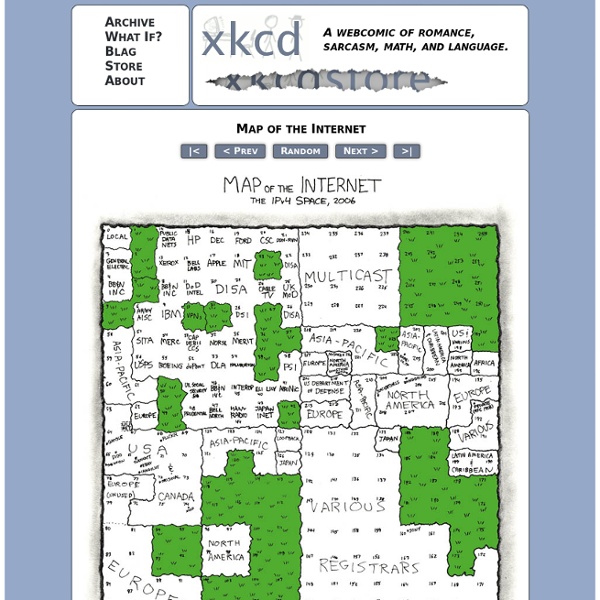
Web Trend Map v4 | David Roessli's Empty Set Information Architects Japan (iA) have published their annual Web Trend Map (v4) which lists the top 50 most influential domains (333), and the people (111) associated with them onto the Tokyo Metro map. The domains and people are selected by the iA research team based on their own set of criterias. The result, eventhough subject to discussion, is astonishing. Overall, the content is very anglo-centric - is this a surprise? Information Architects Japan are the guys who wrote that great article “Web Design is 95% Typography” back in 2006. I especially enjoy the mapping skills that have been deployed to produce this map. I love Jessica Hagy's Indexed weblog { PUBLISHED WEEKDAY MORNINGS as the COFFEE BREWS } which delivers fresh and unusual ways to apprehend the current zeitgeist through a line or pie chart. I remember ordering the first Map of the Internet from ThinkGeek back in 1999 and being captivated by its exploration (just like the one Vint Cerf showed at Lift 2009).