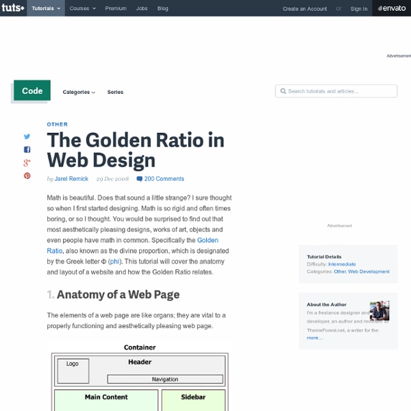
The Golden Ratio in Web Design

10 Free Printable Web Design Wireframing Templates
758 shares Drafting Tips for Creative Wireframe Sketches Much like other professional designers I’m a big fan of the wireframing process. Although it’s mostly associated with the field of web design, the concept of project planning is ubiquitous across all creative mediums. Read More 1024 shares 11 UI Kits for iPhone and iPad Development Last week we posted a collection of printable wireframing templates which included some for iPhone and iPad app design.
Page Transitions with CSS3
In the last few years, we've seen a lot of single page websites lying around the internet, most of them using JavaScript for some transitions effect. Well, now I'm gonna teach you how you can have your own, but instead I'll be using CSS Transitions and the :target property to do all the magic. View demo Download source In the last few years, we’ve seen a lot of single page websites lying around the internet, most of them using JavaScript for some transitions effect. The Dribbble shots used in the demos are by Matt Kaufenberg. Markup The HTML will contain five main divisions: a header and the four content sections. In the header we will have the main heading and the navigation: The reason for having such an “unordered” structure by adding the header to the end, is that we make the navigation “reachable” using the general sibling selector (~), so that we can color the respective items differently. First we will give style to our header and the navigation. And that’s all you need.
jQuery API
Ruby on Rails Development - 12 Spokes
BLUE VERTIGO | Web Design Resources Links | Last update MAR.09.2012
Best of Web Design in 2012
First of all, we would like to wish a Happy New Year to all of our readers! And to start 2013, we decided to gather some of the most appreciated designs we showcased here in 2012. We gathered the designs our readers most talked about, and we did this huge list to show you what we and our readers considered the best web designs of last year. The sites we will show here were featured because of use of textures, images, typography, navigation and much more. Captain Dash Inzeit Trent Walton Postable Pulp Fingers The Buffalo Lounge Designing Monsters Pursuit Pop-Up Shop shoplocket Denise Chandler Oliver Russell Whiteboard Bones Brigade DJs Fifty Three Fifty Three – Paper Whitmans New York Blind Pig Design my own bike Book of Beards Simon Foster Everything you need to know about Design Modo Luce BigNoise Fudge House Teacake Luke Stevenson open121 Yardsale Theory D10studio Lift Interactive coderwall Fear the Grizzly FoundryCo Kirschner Brasil Roundhouse Paid to Exist Barcamp Diehl Group Studio Airport These are Things Colorkite
Related:
Related:


