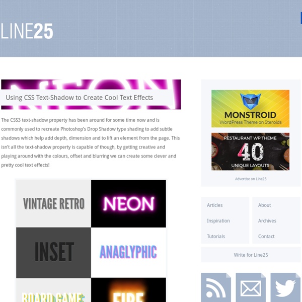
Using CSS Text-Shadow to Create Cool Text Effects
8 Useful CSS Tools
Writing better CSS is something all web designers and developers should strive for, and thankfully there are some useful tools out there to help do just that. For this post, we’ve rounded up a collection of new tools to help you with your CSS. From learning new CSS3 properties, to making your code more efficient, there’s bound to be a few tools here you will find useful. CSS3 Patterns Gallery CSS3 Patterns Gallery lets you browse various CSS3 patterns as thumbnails or fullscreen and grab the code so you can use them on your own site. PrefixMyCSS PrefixMyCSS helps you save time by letting you write your properties one way. Layer Styles Layer Styles is a HTML5 app for creating CSS3 in a intuitive way. Sencha Animator Sencha Animator is a desktop app to create CSS3 animations for WebKit browsers and touchscreen mobile devices. The Web Font Combinator The Web Font Combinator was created in order to preview web font combinations. CSS Pivot CSS Lint CSS Prism
Going Nuts with CSS Transitions
I’m going to show you how CSS 3 transforms and WebKit transitions can add zing to the way you present images on your site. Laying the foundations First we are going to make our images look like mini polaroids with captions. Here’s the markup: <div class="polaroid pull-right"><img src=".. You’ll notice we’re using a somewhat presentational class of pull-right here. The actual polaroid effect itself is simply applied using padding, a border and a background colour. The box-shadow property takes four values: three lengths and a colour. The colour value can be given in any format recognised by CSS. Rotation For browsers that understand it (currently our old favourites WebKit and FF3.5+) we can add some visual flair by rotating the image, using the transform CSS 3 property. -webkit-transform: rotate(9deg); -moz-transform: rotate(9deg); transform: rotate(9deg); Rotations can be specified in degrees, radians (rads) or grads. Animation Let’s go nuts. Here’s our new markup: Throwing polaroids at a table
Using The Best Ampersand Available
I really like one of the typographic tricks Mark Boulton makes in his "Better Typography" presentation. (Slideshow of the presentation here. Around slide #109) He suggests "using the best ampersand available". This just means that on some typefaces, the ampersand character can be a little lackluster and it can make a big improvement in style and readability to swap it out for another typeface. His (great) example is from SimpleBits: Now that's a nice looking ampersand. Then apply styling to the class. Check out some simple examples of how this can make text more pleasing: I should mention that the excellent wp-typogrify plugin automatically adds this span/class to ampersands on your WordPress blog, which is pretty slick and just one of it's many nice features. Share On
Code a Responsive Navigation Menu
Navigation menus used to be a fairly simple thing. Code up an unordered list, float it left and you’re good to go. With responsive design being all the rage these days though you’re faced with some new challenges when creating a menu design. Follow along as we start from scratch and code a simple but effective responsive navigation menu that you can easily modify and reuse in your own projects. What We’re Building If you’re the kind of person who likes to skip ahead, here’s a sneak peek at what we’re building. Demo: Click here to see and tweak it on Dabblet. The HTML Let’s jump right into this project without a bunch of unnecessary fluff. The first step is to decide on some markup. Believe it or not, this one little piece of code had my head spinning when it came time to test. Fortunately, the fix is easy, just drop in the famous html5shiv and you’re good to go (place this in the head portion of your document). Add the List Add The Sub Tag Progress Check Starter Styles Container Styles Border Fix
Related:
Related:
