ExcelUser Home Page
AEA365
Hello, my name is Jayne Corso and I am the Community Manager for AEA. As a community manager, I create weekly posts for AEA’s Facebook and Twitter pages. Although you can share similar content on Facebook and Twitter, your approach should be unique for each channel. I have put together a few tips for composing text for both Facebook and Twitter. Facebook: Hot Tip: Keep it to 80 characters The Facebook character limit is technically 63,206; however, when posting on Facebook, you should try to keep your text within 80 characters. Hot Tip: Don’t just post a link Facebook is a great channel for sharing blog posts or linking to external content, but don’t just post the link. Hot Tip: Use images Facebook posts that use images receive more engagement than posts without images. Twitter: Hot Tip: Keep it simple Twitter has a character limit of 140, but studies have shown that posts that are 120-130 in length receive better engagement. Hot Tip: Grammar is still important Good luck crafting your posts!
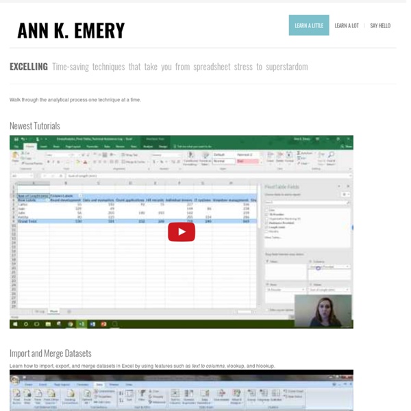
How to Create an Excel Dashboard - The Excel Charts Blog The Excel Charts Blog
Excel dashboards and executive reports are powerful, fairly easy to design and a great way to improve your Excel and data visualization skills. Because of its flexibility, you can virtually design any dashboard in Excel exactly the way you, or the users, imagined. And, best of all, you may want to implement it yourself or consider it a prototype and ask IT to implement it. Once you know what will the Excel dashboard be used for and what kind of metrics users expect, there are three major areas that you must address when creating it: how to bring data into your spreadsheets;how to manage the data and link it to the dashboard objects, like charts and tables;how to design the dashboard report. Let’s take a look at each of them. How to bring data into your Excel dashboard Yes, Excel is a very flexible tool, but to create an Excel dashboard you can’t just paste some data and add a few charts, can you? Usually, the data should not be entered directly into the spreadsheet. Named Ranges Macros
Each Little Spark | I am a writer who hasn't yet figured out exactly what I want to say. This is my practice space.
Dashboards.ORG - A Practitioner's Guide to Business Intelligence - Dashboards.ORG
angry chicken
Give Your Managers More Insight, More Quickly, Using Less Time and Money
Windows & Mac Excel Tens of thousands of Excel users in at least 160 countries are using my dashboard reports to improve business insight and WOW! their managers. Here's why... Good Excel dashboards can save hours of time...when you update your reports, and when your managers and other VIPs read them. Excel dashboards can present data from any number of sources in one report. They're created and maintained by users, who understand what the information means, not by programmers, who usually don't. They're a spreadsheet solution, not a macro solution. They can adapt quickly -- often, in minutes -- to managers' changing information needs. They can trap errors that normal reports typically ignore. And, because you already own Excel, your dashboard software costs nothing extra...it's free! Unfortunately, few people know how to create useable Excel dashboards. The kit includes my e-book, Dashboard Reporting With Excel, and more than 20 Excel workbooks. An Overview of the E-Book 1. 2. 3. 4. 5. 6. 7.
Increase sales, motivate your employees - Plecto