background preloader

Open the Door into the Science of Color Theory

Open the Door into the Science of Color Theory

Effective Use of Color Psychology in Web Design Colors are vital elements it web designing. It can make a site look visually attractive. It is important for web designers to consider colors for it can greatly influence the site and the visitors as well. The choice of colors has different effect to a person. That is why one should think before choosing the color to use. Different colors influence the mood and state of the human mind. 1. The color red is considered as the hottest and most dynamic color. View Site Finer Home uses red as its primary color and is made even more appealing with the use of floral patterns. View Site Also using patterns and two shades of red for its stripe background, Holiday To Go succeeded to make the site look more inviting for costumers. 2. The color orange can show comfort, creativity, celebration, fun, youth, and affordability. View Site Colourpixel managed to use different shades of orange for their site which make it look creative and vibrant. View Site 3. View Site View Site 4. View Site View Site 5. View Site

Six Tips For Designing a Memorable Brand | Co.Design When clients call on Yang Kim and Kevin Budelmann, principals of branding firm People Design in Grand Rapids, Michigan, they usually ask for a new logo. "But the logo is just the tip of the iceberg," Budelmann says. Usually, what they really want is a redesigned brand. Kim and Budelmann should know. "You never see a logo by itself," Kim says. "It's definitely our point of view," Kim adds. Here's six lessons drawn from their book: 1. WordWorld by Siegel + Gale So many companies strike out because they don't do their homework. 2. Kapulica Studio by Bunch Can you have a constant logo that is still recognizable but also for its variety? 3. The Mob Museum, Wall-to-Wall Studios The authors say this submission is funny, appropriate and cool. 4. Chokolate by Bunch It's not such a stretch that a talent agency named Chokolate would play up their similarity to the word chocolate, but here, Bunch created an entire system of collateral that riffs on the idea. 5. 6. *Credits for composite image: 1.

The Science Behind Design Color Theory Color Theory has been a subject of interest for years in the art community. The rules and guidelines hold true when working on digital projects just as much as physical items. There is a lot to learn in the subject of color so I’m going to cover just some of the key points. Terminology is something many designers get caught up on which really shouldn’t scare you or hold you back. The science behind color theory is brilliant yet elegant. Color Terminology Terms are very important when it comes to working as a designer. Hue is one I’m sure most have at least heard of before. Most web developers are familiar with RGB values for hues. Saturation is another buzz word designers have probably heard of but never truly defined. Color sets with less saturation work best as background elements in a website. Their light-blue background is the perfect level of saturation to fit in a background setting. Tone or value is a term most haven’t heard of. Relationships for Color Theory Conclusion

Color Psychology by David Johnson Like death and taxes, there is no escaping color. It is ubiquitous. Yet what does it all mean? Colors often have different meanings in various cultures. Black Black is the color of authority and power. White Brides wear white to symbolize innocence and purity. Red The most emotionally intense color, red stimulates a faster heartbeat and breathing. The most romantic color, pink, is more tranquilizing. Blue The color of the sky and the ocean, blue is one of the most popular colors. Green Currently the most popular decorating color, green symbolizes nature. Yellow Cheerful sunny yellow is an attention getter. Purple The color of royalty, purple connotes luxury, wealth, and sophistication. Brown Solid, reliable brown is the color of earth and is abundant in nature. Colors of the Flag In the U.S. flag, white stands for purity and innocence. Food for Thought While blue is one of the most popular colors it is one of the least appetizing.

Color Matters - Design and Art - Color Theory 
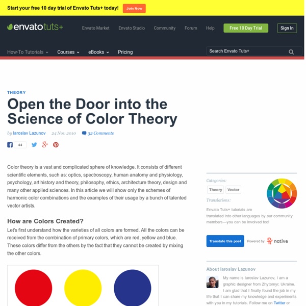
Color theory encompasses a multitude of definitions, concepts and design applications - enough to fill several encyclopedias. However, there are three basic categories of color theory that are logical and useful : The color wheel, color harmony, and the context of how colors are used. Color theories create a logical structure for color. For example, if we have an assortment of fruits and vegetables, we can organize them by color and place them on a circle that shows the colors in relation to each other. The Color Wheel A color circle, based on red, yellow and blue, is traditional in the field of art. There are also definitions (or categories) of colors based on the color wheel. Primary Colors: Red, yellow and blueIn traditional color theory (used in paint and pigments), primary colors are the 3 pigment colors that cannot be mixed or formed by any combination of other colors. Secondary Colors: Green, orange and purpleThese are the colors formed by mixing the primary colors. Color Harmony 1.

Web Design Tutorials for Developers - Web Design Blog – DesignM.ag Get the FlatPix UI Kit for only $7 - Learn More or Buy Now Modern development APIs work like agents for sharing information to other 3rd party websites. I’ve written many past tutorials about API development to help anyone new to this process. In this tutorial I want to demonstrate how we can access the Forrst API using jQuery. Read More I was browsing through websites one day and came across one really interesting feature. So in this tutorial I want to demonstrate how we can build a very simple HTML5 webpage recreating a full author bio display. Read More Any company selling a service with payment plans usually breaks up the structure into different packages. For this tutorial I want to demonstrate how we can create pricing tables with just a bit of HTML5 and CSS3. Live Demo – Download Source Code Read More Today, I would like to go over a quick and simple way to allow your users to switch page layouts by using CSS and jQuery.

Color Management: Calibration and Profiling – Graphic design tut Introduction Welcome to the second post in our color management series. Be sure to check out Part One if you haven’t already done so. Today we’re going to talk about the importance of calibrating and profiling your input & output devices in your color management workflow. This is probably the most important step in the color management process, especially calibrating and profiling your monitor display because you need to trust that the color you see on your monitor is true and correct in order for you to be able to make color and luminosity decisions. Profiling the display When we’re looking at a photo, or anything for that matter, on our monitor display, we’re basically looking at a huge number of pixels, each of which displays a certain color. Furthermore, the monitor display changes the way it interprets color information overtime, so you need to constantly tune your monitor to display color correctly, and this is when calibration and profiling of the monitor display comes into place.

Color Theory Tutorial by Worqx Why study color theory? If you are involved in the creation or design of visual documents, an understanding of color will help when incorporating it into your own designs. Choices regarding color often seem rather mystical, as many seem to base decisions on nothing other than "it looks right." Although often told I had an eye for color, the reason why some colors worked together while others did not always intrigued me and I found the study of color theory fascinating. While attending the University of Minnesota I enrolled in almost every course I could from different departments: graphic design, interior design, and fine arts. Communicating Color What is red? HTML Red Pantone® Red Pantone® Warm Red TRUEMATCH® 6-a Color Application With respect to the arts, color was part of the realistic, visual representation of form, but one group of painters abandoned the traditional practices regarding color in painting. The next several pages of this site offer a tutorial regarding color theory.

Simple, Practical Color Theory The mastery of color theory, relations and harmonies is one of the primary steps to uncovering the full beauty and potential of your images (in the realms of art, design and/or photography). Find out more in this simple, practical, colorful guide. Color Models Depending on your background and your purpose, you will view primary colors differently. There are three generally accepted models: RGB (red, green, blue), CMY (cyan, magenta, and yellow), and RYB (red, blue, yellow). Primary color models can be divided into two categories: additive and subtractive. The additive primary colors are obtained by light: red, green and blue (RGB). The subtractive primary colors are obtained by the subtraction of light: cyan, magenta, and yellow (CMY). Color Model Application: RGB: Photography, video/film and design. CMYK: Print design. RYB: Art, painting and design. RGB and RYB Confused? Now that we’ve covered the various color models and their uses, we can proceed with confidence. RGB Color Model Monochromatic

10 Tips for Designing Presentations That Don’t Suck: Pt.1 Powerpoint has produced more bad design in its day that perhaps any other digital tool in history with the possible exception of Microsoft paint. In this post we’re going to address the epidemic of bad presentation design with ten super practical tips for designer better looking and more professional presentations. Along the way we’ll see a number of awesome slide designs from Note & Point along with some custom examples built by yours truly. Let’s get started! Also be sure to check out 10 Tips for Designing Presentations That Don’t Suck: Pt.2! Not a Designer? Most of the content on this site is targeted specifically towards professional designers and developers, or at the very least those interested in getting started in this field. You’ve chosen a visual tool to communicate and should therefore take the time to learn a thing or two about visual communications. Follow the ten tips below and see if you don’t start getting comments about your awesome presentation design skills. Kuler Piknik

50 Totally Free Lessons in Graphic Design Theory 1,200+ courses and ebooks Design, code, video editing, business, and much more. Adobe Photoshop, Illustrator and InDesignGraphic, Logo and Print DesignSketch, Adobe XD & FigmaWordPressJavascript, PHP & PythonAdobe After Effects & Premiere ProMuch More Millions of creative assets Design templates, stock videos, photos & audio, and much more. Graphic TemplatesStock PhotosMusic TracksVideo TemplatesWeb TemplatesDesign AssetsWordpress Themes & PluginsMuch More 1,200+ courses and ebooks Design, code, video editing, business, and much more. Adobe Photoshop, Illustrator and InDesignGraphic, Logo and Print DesignSketch, Adobe XD & FigmaWordPressJavascript, PHP & PythonAdobe After Effects & Premiere ProMuch More Millions of creative assets Design templates, stock videos, photos & audio, and much more. Graphic TemplatesStock PhotosMusic TracksVideo TemplatesWeb TemplatesDesign AssetsWordpress Themes & PluginsMuch More

Related: