
Steps to creating a font... This tutorial is also available as a pdf version. If you wish to follow along with the tutorial, this bundle should provide you with the basic files you need. I shall not presume to teach aesthetics, I concentrate solely on the mechanics here. NOBLEMAN: Now this is what I call workmanship. Font creation First create a new font with the New command in the File menu (or by using the -new argument at startup). Give the font a name with the Font Info command from the Element menu. You may also wish to use Encoding->Reencode to change what characters are available in your font. Creating a glyph Once you have done that you are ready to start editing glyphs. The outline glyph window contains two palettes snuggled up on the left side of the window. Cubic layers (C) use third-order Bezier splines, like PS fonts. The foreground (F) layer contains the outline that will become part of the font. This window also shows the glyph's internal coordinate system with the x and y axes drawn in light grey.
Google Fonts Quantico Grumpy wizards make toxic brew for the evil Queen and Jack. Normal 400Grumpy wizards make toxic brew for the evil Queen and Jack. Normal 400 ItalicGrumpy wizards make toxic brew for the evil Queen and Jack. Bold 700Grumpy wizards make toxic brew for the evil Queen and Jack. Bold 700 ItalicGrumpy wizards make toxic brew for the evil Queen and Jack. One morning, when Gregor Samsa woke from troubled dreams, he found himself transformed in his bed into a horrible vermin. aa bb cc dd ee ff gg hh ii jj kk ll mm nn oo pp qq rr ss tt uu vv ww xx yy zz ªª µµ ºº ßß àà áá ââ ãã ää åå ææ çç èè éé êê ëë ìì íí îî ïï ðð ññ òò óó ôô õõ öö øø ùù úú ûû üü ýý þþ ÿÿ
Mind Your En And Em Dashes: Typographic Etiquette Advertisement An understanding of typographic etiquette separates the master designers from the novices. A well-trained designer can tell within moments of viewing a design whether its creator knows how to work with typography. Typographic details aren’t just inside jokes among designers. They have been built up from thousands of years of written language, and applying them holds in place long-established principles that enable typography to communicate with efficiency and beauty. Handling these typographic details on the Web brings new challenges and restrictions that need to be considered. Setting Body Copy Good typography comes down to communicating information, and the basis of information is good old-fashioned body copy – simple blocks of text. Indentation or Space After a Paragraph? When signalling the end of a paragraph and the beginning of another, you can generally either indent or insert a space between the paragraphs. But there is no hyphenation control in CSS. The Hyphen (al)
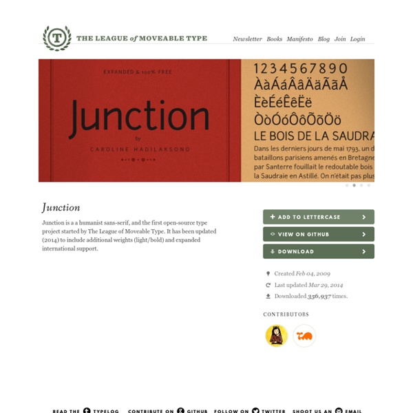
Free Font Delicious by Exljbris This license can also be found at this permalink: -This font is free for personal and commercial use -The font file/software may be modified to suit design of system requirements, but strictly for your own (personal or commercial) use. You may not sell or distribute it -Embedding (in PDF’s, Flash files and programs) is allowed -Using this font for a @font-face decleration is allowed, but only if a readable link to my homepage is put on every page where this font is used. -This link may be the size of a regular copyright notice.
Get to Know a Typeface! Minion | The IBD Blog Normally, on this site, we write about expressive typefaces that evoke strong responses. And since Shea and I are bitter, unhappy people, we write about typefaces that are easy to hate like Comic Sans and Papyrus. Minion, designed by Robert Slimbach in 1990, is one of those typefaces that only a typographer could love (not that other people dislike it; they just don’t notice it). If Minion were at a high school dance, it would sip punch with its back against the wall trying not to make any sudden movements while Curlz MT and Mistral breakdanced in the middle of the floor. Meanwhile, Comic Sans would try to make his friend Marker Felt laugh so hard that milk came out his nose and Papyrus would be smoking in the girls room. (This metaphor may be starting to break down.) The Elements of Typographic Style by Robert Bringhurst is one of the most influential books on typography. There is nothing to dislike about Minion.
Fonts Ubuntu Grumpy wizards make toxic brew for the evil Queen and Jack. Light 300Grumpy wizards make toxic brew for the evil Queen and Jack. Light 300 ItalicGrumpy wizards make toxic brew for the evil Queen and Jack. Normal 400Grumpy wizards make toxic brew for the evil Queen and Jack. Normal 400 ItalicGrumpy wizards make toxic brew for the evil Queen and Jack. Medium 500Grumpy wizards make toxic brew for the evil Queen and Jack. Medium 500 ItalicGrumpy wizards make toxic brew for the evil Queen and Jack. Bold 700Grumpy wizards make toxic brew for the evil Queen and Jack. Bold 700 ItalicGrumpy wizards make toxic brew for the evil Queen and Jack. One morning, when Gregor Samsa woke from troubled dreams, he found himself transformed in his bed into a horrible vermin. aa bb cc dd ee ff gg hh ii jj kk ll mm nn oo pp qq rr ss tt uu vv ww xx yy zz ªª µµ ºº ßß àà áá ââ ãã ää åå ææ çç èè éé êê ëë ìì íí îî ïï ðð ññ òò óó ôô õõ öö øø ùù úú ûû üü ýý þþ ÿÿ āā ăă ąą ćć ĉĉ ċċ čč ďď đđ ēē ĕĕ ėė ęę ěě ĝĝ ğğ ġġ ģģ ĥĥ ħħ ĩĩ īī ĭĭ įį ıı ijij ĵĵ ķķ ĸĸ ĺĺ ļļ ľľ ŀŀ łł ńń ņņ ňň ʼnʼn ŋŋ ōō ŏŏ őő œœ ŕŕ ŗŗ řř śś ŝŝ şş šš ţţ ťť ŧŧ ũũ ūū ŭŭ ůů űű ųų ŵŵ ŷŷ
How to design your own typeface | Typography After many years as a graphic designer and type enthusiast, I decided to channel some of my passion into my own lettering and typography design projects. After researching how to make your own font, it seemed a natural evolution to try my hand at designing a typeface. Much has been written about type design; on the history, drawing and technical complexities of creating typefaces (I've linked to some excellent resources at the bottom of this article) and many typography tutorials. But where exactly do you begin if you want to make your own font? I had found some useful pieces of information but they were scattered across many sources and many were dated by technology. Sharing insights To get started on the right path, I enrolled in the short Type Design (TDi) course at Reading University, which also runs the world-renowned MA in Typeface Design that has produced many successful alumni. 01. Designing a typeface can be a long journey so it's prudent to have a clear vision of its purpose.
@font-face Okay Type · Alright Sans Alright Sans is a contemporary sans-serif with a clean, prudent voice that avoids looking stiff or bland. Actually, it has just the right amount of warmth to convey a serious-yet-friendly tone. It has an open structure with shorter-than-normal capitals and a large x-height, giving it a roundabout economy that works exceptionally well across all media, in both large and small sizes. Alright Sans Black Italic & Regular Alright Sans Extra Thin Italic & Bold Alright Sans Light Italic Alright Sans Regular Italic Alright Sans Medium Italic Alright Sans Extra Medium & Thin Italic Alright Sans Regular & Regular Italic Alright Sans Thin & Ultra Alright Sans Medium Alright Sans Bold Alright Sans Black Alright Sans Ultra Alright Sans Extra Thin OpenType features are awesome. Small Caps All Caps Ligatures Discretionary Ligatures Old-Style Figures Lining Figures Tabular Old-Style Figures Tabular Lining Figures Arbitrary Fractions Contextual Arrows Small Cap Ampersand Italic Alternates Subscript Letters & Numbers Punctuation
Google Fonts Rokkitt Grumpy wizards make toxic brew for the evil Queen and Jack. Normal 400Grumpy wizards make toxic brew for the evil Queen and Jack. Bold 700Grumpy wizards make toxic brew for the evil Queen and Jack. One morning, when Gregor Samsa woke from troubled dreams, he found himself transformed in his bed into a horrible vermin. aa bb cc dd ee ff gg hh ii jj kk ll mm nn oo pp qq rr ss tt uu vv ww xx yy zz ªª µµ ºº ßß àà áá ââ ãã ää åå ææ çç èè éé êê ëë ìì íí îî ïï ðð ññ òò óó ôô õõ öö øø ùù úú ûû üü ýý þþ ÿÿ
Simplifica Typography | Creative Alys SIMPLIFICA typography is an exceptional typeface created by KAIWA. It is a little condensed sans-serif typeface presenting a consistent and narrow line width. It’s excessive positioned capsheight and ascender favors legibility. Related Posts Fenix Typography Fenix is a serif typeface designed for display and long texts, its foundations are based in calligraphy, with strong serifs and rough strokes. Google Fonts Tinos Grumpy wizards make toxic brew for the evil Queen and Jack. Normal 400Grumpy wizards make toxic brew for the evil Queen and Jack. Normal 400 ItalicGrumpy wizards make toxic brew for the evil Queen and Jack. Bold 700Grumpy wizards make toxic brew for the evil Queen and Jack. Bold 700 ItalicGrumpy wizards make toxic brew for the evil Queen and Jack. One morning, when Gregor Samsa woke from troubled dreams, he found himself transformed in his bed into a horrible vermin. aa bb cc dd ee ff gg hh ii jj kk ll mm nn oo pp qq rr ss tt uu vv ww xx yy zz ªª µµ ºº ßß àà áá ââ ãã ää åå ææ çç èè éé êê ëë ìì íí îî ïï ðð ññ òò óó ôô õõ öö øø ùù úú ûû üü ýý þþ ÿÿ āā ăă ąą ćć ĉĉ ċċ čč ďď đđ ēē ĕĕ ėė ęę ěě ĝĝ ğğ ġġ ģģ ĥĥ ħħ ĩĩ īī ĭĭ įį ıı ijij ĵĵ ķķ ĸĸ ĺĺ ļļ ľľ ŀŀ łł ńń ņņ ňň ʼnʼn ŋŋ ōō ŏŏ őő œœ ŕŕ ŗŗ řř śś ŝŝ şş šš ţţ ťť ŧŧ ũũ ūū ŭŭ ůů űű ųų ŵŵ ŷŷ źź żż žž ſſ ƀƀ ƃƃ ƅƅ ƈƈ ƌƌ ƍƍ ƒƒ ƕƕ ƙƙ ƚƚ ƛƛ ƞƞ ơơ ƣƣ ƥƥ ƨƨ ƪƪ ƫƫ ƭƭ ưư ƴƴ ƶƶ ƹƹ ƺƺ ƻƻ ƽƽ ƾƾ ƿƿ ǀǀ ǁǁ ǂǂ ǃǃ DžDž dždž LjLj ljlj NjNj njnj ǎǎ ǐǐ ǒǒ ǔǔ ǖǖ ǘǘ ǚǚ ǜǜ ǝǝ ǟǟ ǡǡ ǣǣ ǥǥ ǧǧ ǩǩ ǫǫ ǭǭ ǯǯ ǰǰ DzDz dzdz ǵǵ ǹǹ ǻǻ ǽǽ ǿǿ ȁȁ ȃȃ ȅȅ ȇȇ ȉȉ ȋȋ ȍȍ ȏȏ ȑȑ ȓȓ ȕȕ ȗȗ șș țț ȝȝ ȟȟ ȡȡ ȣȣ ȥȥ ȧȧ ȩȩ ȫȫ ȭȭ ȯȯ ȱȱ ȳȳ ȴȴ ȵȵ ȶȶ ȷȷ ȸȸ ȹȹ ȼȼ ȿȿ ɀɀ ɂɂ ɇɇ ɉɉ ɋɋ ɍɍ ɏɏ ɐɐ ɑɑ ɒɒ ɓɓ ɔɔ ɕɕ ɖɖ ɗɗ ɘɘ əə ɚɚ ɛɛ ɜɜ ɝɝ ɞɞ ɟɟ ɠɠ ɡɡ ɢɢ ɣɣ ɤɤ ɥɥ ɦɦ ɧɧ ɨɨ ɩɩ ɪɪ ɫɫ ɬɬ ɭɭ ɮɮ ɯɯ ɰɰ ɱɱ ɲɲ
Typo sans-sérif avec beaucoup de personnalité. Elle est livrée avec un beau jeu de chiffre by shadazz Feb 14