How The World Spends Its Time Online
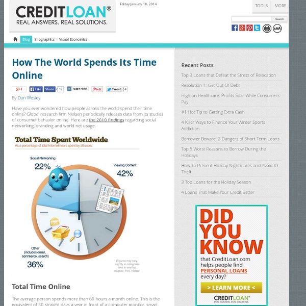
Have you ever wondered how people across the world spend their time online? Global research firm Nielsen periodically releases data from its studies of consumer behavior online. Here are the 2010 findings regarding social networking, branding and world net usage. Total Time Online The average person spends more than 60 hours a month online. Social networking accounts for 22 percent of the time while 42 percent is spent viewing content, whether watching videos, reading articles or playing online games. Among people who use the Internet, each person visits 2,646 Web pages on 89 domains and logs in 57 times per month. Most Popular Brands The percentage of all online users that visit Google is 82. Social Network Usage The highest percentage of internet users who log onto social media is in Brazil, with 80 percent using social network sites. Daily Internet Activities For many, internet use is a daily occurrence. Click For Full Size Comments comments
lunchbreath
El Clampersand Happy to announce the first batch of Clampersands is now on sale at Core77′s Hand-Eye Supply. The Many Faces of Don Draper The dude has become so boring lately. Some spec work that never made it to print. Did this for a certain editor at a certain magazine last year. Holiday Wrappin’ Paper We sent these to all our clients, freelancers and associates. Printed at Screwball Press, Chicago.
The Art of Insight and Action
Great Visualizers: Always With Honor
Design duo Tyler Lang and Elsa Chaves are Always With Honor, an Portland-based design team with a specialty in beautifully simple information displays and iconography. I first got turned on to / by their work when I spotted this awesome poster. It visualizes the many domains within design. (Here’s a link to a massive hi-res version) Simple shapes, simple typography, simple colour characterises their work. Struck me there was something cool about trying to visualize such an unimaginably complex process with super-simple graphics. Always With Honor create the best icons! They also had a strong influence on the look and feel of Good Magazine’s infographic Transparency section. My favourite piece, somewhat selfishly, is the Colours In Culture image on the cover of Information Is Beautiful. In fact, we’ve just litho-printed a gorgeous poster version of this image on 220 gsm, FSC-certified art paper. The coolest thing though is that it’s a 6-colour process print. Order a copy from our store now.
this isn't happiness™ Peteski
45 Fresh, Clean and Impressive Designs
Advertisement Sometimes it’s just amazing to see, which level of usability, legibility and visual appeal can be achieved using some basic design techniques. In fact, some talented web-developers manage to deliver powerful, functional and gorgeous web-design in “look-and-feel”-style, which is easy to use and nice to see. Recently we’ve listed 50 Beautiful CSS-based web-design of 20061 and chosen some of the most beautiful and inspiring dark web-designs2. Now we’ve selected 45 more fresh, clean and impressive designs. Let’s take a look. 5. 7. 8. 9. 12. 13. 16. 17. 18. 19. 21. 22. scpgt | matt northam15 23. sparklette.net16 26. 28. 29. luke stevens | design + consulting20 32. 34. sebdesign.eu | graphic and web design | online portfolio22 35. 36. 40. 41. kara burke illustrations : prints27 42. 45. It's done.
scrapbook: Fight For Your Right. (nice signs)
scrapbook. Est. 2007 This Blog Linked From Here Fight For Your Right. Posted by DL at 9.4.11 Labels: comical, food, mashup, poster, print, stationary No comments: Post a Comment Newer PostOlder PostHome
web2.0 top designs
Foam Magazine
Related:
Related: