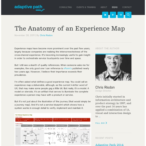
None
Thank you for your interest! This is the second of four instalments in our podcast series titled, The UX Power Tools Behind Compelling Software -- featuring one of Macadamian's all-star user experience researchers, Anneliis Tosine, and user experience designers, Sara Fortier. In this episode we discuss the importance of experience maps.
Continuous Improvement
Go here to view a customer journey map video explanation and download a free template. In a prior post, I discussed how most Lean practitioners focus primarily on the mechanical aspects of a process and often ignore the emotions of the customer. In other words, one can improve the process, but with complete disregard for the customer’s feelings as they go through the process. To be fair, they can be mutually exclusive.
Storyboards
Storyboard is a tool that helps communicating how a user would experience a product or service and how the proposed design will help them accomplish their goals (user journeys). This methodology has been borrowed by the movie industry and allows describing the interaction between the user and a product/service on one or more frame by showing the key experience touchpoints. Storyboards are great ways to share a concept with clients and customers and make them understand design ideas and decisions.
Endeavor Management Experience Mapping - Endeavor Management
Understanding customer experiences can be complex, and unfortunately customer satisfaction surveys alone usually do not provide sufficient insight. Experience mapping is a means to develop a deeper understanding of your customers’ experiences and expectations – and to ultimately create advocates out of your customers, because they are enthusiastic about the exceptional experience that you provide. Experience mapping offers you a game plan.
What’s Your Touchpoint ROI?
I was talking with a friend who works in the public relations field about an issue he was having with receiving funding for a project at his company. Even though this conversation occurred several months ago, a comment he made continues to linger in my mind: “It’s making a difference, but if you can’t prove it works with financial figures, you might as well kiss it good-bye.” I think we can all relate to that statement. It’s no secret that companies are more and more strategic and stringent with how they go about allocating resources across their organizations.
Develop Personas
Project Management (4) A project plan takes into account the approach the team will take and helps the team and stakeholders document decisions made regarding the objective, scope, schedule, resources, and... Creating an interdisciplinary team with the right mix of skills is vital to the smooth and successful execution of any project. Team members may be able to cover multiple roles or there may... Use your kick-off meeting to discuss the business case related to the site, the vision and mission based on user and organizational goals, and the vision for the site moving forward.
NoFlo Development Environment by The Grid
NoFlo Website, NoFlo Github Repos With your support, we will complete the hosted NoFlo UI, making software creation more accessible and collaborative. If you are a programmer, you don't have to wait for the UI.
I heart frameworks «
My most popular post is about customer experience maps – it gets about 50 hits a day (I’m blogging plankton in the scheme of things so 50 is a lot for me). I’m chuffed about that because maps and frameworks are just about my most favourite thing in design. They’re even a form of info design (which is my other favourite thing).
Complete Beginner's Guide to Design Research
In an industry devoted to the people who use our products, services, and applications, research is paramount. We ask questions. We take notes. We learn everything we can about the target audience, and then iteratively test our work throughout the design process. Want UX Tips Delivered Straight to Your Inbox?
ui disasters
Until humans learn how to command machines with their minds (or vice versa), we're always going to need some sort of menu, control panel or whatever to interact with our machines and tell them to do our jobs for us. And these controls had better be really freaking clear, and simple, and easy to use. A speedometer doesn't do any good if, say, it's mounted inside the glove box and requires you to do calculus to read it.
How To Map The Emotional Customer Experience
Most customer experience maps exclude one of the most important, most influential indicators related to driving loyalty, which is customer emotion. Bored during Hurrican Irene, I was perusing Twitter updates and stumbled upon a link called “Mapping The Emotional Customer Experience”. I clicked to learn more, because the topic sounded intriguing. The related projects I had been involved in to date were all process or technically oriented and did not consider emotions or feelings.
User Experience Jobs with High Salaries
A well designed website or application that effectively caters to its audience is a high priority for leading businesses these days. As a result, skilled professionals in the growing field of user experience design can earn a very respectable salary. Here are top paying jobs for Information Architecture, Usability, and UX practitioners plus reasons to explore each for your user experience design career - and bank your account! (Salary figures based on Indeed.com and GlassDoor.com data)
Mental Model Diagrams (Cartoon)
Advertisement We tend to carefully create our HTML and CSS, and meticulously place every pixel to our designs. We plan exactly where our content should be placed on a particular site. Among many other decisions we need to make, we always keep in mind to craft a great experience for all our users.