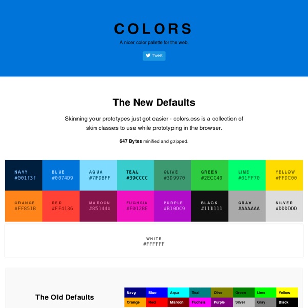


The Ultimate List Of Online Color Tools For Web Developers Jun 26th, 09 by Dicky | Tools Advertisement As a web designer, we will always deal with colors. There are a lot of useful online color tools such as color wheel, color scheme, color palette, color picker, and etc. When i try to search for a complete list of online color tools, i can’t found any. So, i decided to collect them and share the list as a useful resource for other web designers. Let’s start looking at the list: Color Wheel 1. 4096 Color Wheel 2. 3. Color Scheme 4. 5. 6. 7. 8. 9. 10. 11. 12. 13. Color Palette 14. 15. 16. 17. 18. 19. 20. 21. 22. 23. Miscellaneous Color Tools 24. 25. 26. 27. 28. 29. 30. 31. 32. 33. 34. 35. 36. 37. 38. 39. 40. 41.
CSS: centering things See also the index of all tips. Centering lines of text The most common and (therefore) easiest type of centering is that of lines of text in a paragraph or in a heading. CSS has the property 'text-align' for that: renders each line in a P or in a H2 centered between its margins, like this: The lines in this paragraph are all centered between the paragraph's margins, thanks to the value 'center' of the CSS property 'text-align'. Centering a block or image Sometimes it is not the text that needs to be centered, but the block as a whole. This rather narrow block of text is centered. This is also the way to center an image: make it into block of its own and apply the margin properties to it. The following image is centered: Centering vertically CSS level 2 doesn't have a property for centering things vertically. The example below centers a paragraph inside a block that has a certain given height. This small paragraph is vertically centered. Centering vertically in CSS level 3
50 Beautiful Color Palettes For Your Next Web Project Choosing the right color scheme is essential to your website’s success. Your layout and other design choices — including font — should be developed in concert with your color scheme, which can ensure readability, cohesiveness, and beauty in the final product. Unfortunately, making that choice or creating a color palette from scratch can be quite the challenge. That’s why for today’s post I’ve put together a collection of 50 beautiful color palettes that are ready to use for your next web project. If you like these, check out another 24 palettes I’ve recently rounded up. Getting the Most Out of This Post Before diving into the color palettes I’ve collected, I want to mention a few tools that can help you get the most out of this post. Editor’s Note: Want to make your own palettes even better? Remember that Photoshop will display certain colors far more vibrantly than they will look on the web when you use hex codes. That’s all. Pick Your Palette Bonus Resources!
Google Maps Google Maps offers powerful, user-friendly mapping technology and local business information — including business locations, contact information, and driving directions. Embedding a Google Map You can embed a Google Map into your WordPress.com blog using the following instructions. Visit Google Maps.Type in any street address or geographic location and click the Search button.Once your map is fully loaded, click on the Gear icon found in the lower right corner of your browser window. Here is an example of what the embedded map will look like. ↑ Table of Contents ↑ Embedding a Custom Map You can embed a Custom Google Map into your WordPress.com blog using the following instructions. Visit the Google Maps Engine.Create your map or open a map you’ve already created. Additional Info When adding Google Maps to your WordPress.com blog, do NOT manually open the shortcode as you normally do with other services (i.e. do not begin typing the shortcode and then paste the Maps code). Help us improve:
Michael Deal: Free Color Apps Examining Responsive Navigation Patterns - Tuts+ Web Design Tutorial As web designers create more and more responsive sites, patterns continually emerge for how we handle global navigation. This is the first in a series of posts focused on how to develop some of those patterns. This post will cover three responsive navigation patterns; the top-nav, priority, and select menu. One of the specific problems almost every responsive site has to deal with is what to do with the global navigation. Brad Frost collected many of these responsive navigation patterns and then collected some more complex patterns. The basic problem with responsive navigation is one of space. The 3 patterns we'll look at in this post are the: Top-Nav (do nothing) — keeps menu items to a minimum and uses css to adapt the navigation.Priority — prioritizes menu items to show and hide their display based on the available screen width.Select Menu — converts a navigation bar to a select menu where the available space is limited. The top-nav pattern is probably the most common approach in use.