
Logo design: 60 pro tips | Logo design Great logo design requires a complex mixture of design skills, creative theory and skilful application. Any designer worth their salt can create a fit-for-purpose logo, but truly mastering all aspects of the craft takes time. Exclusive offer: Save 15% on Adobe Creative Cloud now Of course, logo design is just one small sub-set of branding, but the logo or brand mark remains the centrepiece of most branding schemes. We've spoken to branding professionals about the intricacies of good logo creation, and what qualifies as a great logo. Logo design research and strategy Before pen hits paper on any new logo design project, thorough research is essential. 01. Before you even start working up a logo design concept, ensure you research your target market thoroughly. Compare all the logos in their competitive set. But bear in mind that many of the world’s most recognisable logo designs stand out specifically because they eschew trends and think differently. 02. Why are we here? 03. 04. 05.
Les cas sociaux du net | L'intelligentsia 2.0 A Practice for Everyday Life La Psicología del Color (Parte 1/3) Twitter1191 1191facebook25K 25Kpinterest20 20google plus297Share 297linked in23 23email1 1stumbleupon1Share 1meneame1Share Share Siempre ha existido una relación íntima entre los colores y el ser humano. En Psychology of colour, la socióloga y psicóloga alemana Eva Heller (1948-2008) ofreció un nuevo enfoque para la interpretación del color en nuestras vidas. En “Psicología del Color”, Heller incluyó el blanco y el negro (frecuentemente descartados como colores propiamente dichos) por su importancia cultural, así como el dorado y el plateado, lo que nos da una suma de trece colores que actúan en la psicología de las personas. Sin más preámbulo, les dejamos una breve explicación de cada color y algún dato relevante de interés para entender su historia e impacto en nuestras mentes. En memoria de la profesora Eva Heller. Azul, el color preferido del mundo. El color de la lejanía, la fidelidad y la inmensidad (debido al mar y al cielo). Al principio fue el rojo. Las contradicciones del amarillo. Parte 2
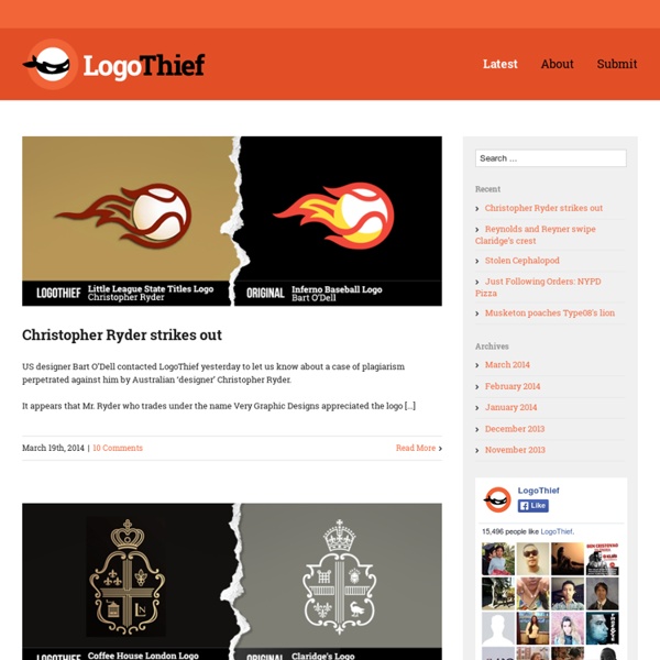
Plagiarism website shames logo thieves | Logo design Logo design can be a tricky state of affairs, with some of the most iconic brands providing more than just inspiration for up-and-coming companies. If you've ever spotted a logo that you think you've seen before - you probably have. Website Logo Thief aims to showcase the plagiarism that happens in the logo design world. The curated cases include a comparison between the copied and the original logo design, with the resemblance to the original design clearly shown. [via You the Designer] Like this? Create a perfect mood board with these pro tips The ultimate guide to logo design Our favourite web fonts - and they don't cost a penny Have you spotted a logo thief?
the magic behind the magic Hi everyone! This post is actually about two months overdue, but I kept putting it off in the hopes that I would feel inspired again. I haven’t updated this tumblr in a few months and before that, hadn’t been updating all that frequently. While I still love Disney and adore concept art and appreciate everyone who followed and affiliated and contributed to this blog, I’ve found that I don’t have the passion needed to update this tumblr on a regular basis. This is my official “~closure~” announcement — I say ~closure~ because I’m trying to make this post as not-serious as possible! Thanks so very much to everyone who followed, and I’ll close with a link to the song that started my fascination with Disney concept art: If I Never Knew You. Filed under disney Pocahontas A concept design for Governor Ratcliffe Source: Pocahontas special edition DV Filed under disney pocahontas The Little Mermaid Source: the Little Mermaid special edition DVD Filed under disney the little mermaid Cinderella
Streetplanneur » l'actu out of home & experiential marketing Imágenes gif para hacer storytelling POR: Oliverio Pérez Villegas Cuando alguien dice que “una imagen vale más que mil palabras” puede ser cierto siempre y cuando ésta lo diga todo. Es decir, el poder de una imagen es irrefutable en la medida en que sus elementos sean contundentes y expresen lo que cada persona o empresa, quiera comunicar. Si una imagen es tan poderosa, tratemos de vislumbrar el alcance que dos, tres, cuatro o más fotos dentro de un solo archivo le podrían dar a tu estrategia de marketing o de comunicación. Es por eso que más allá de crear un gif divertido para que tus amigos vean tu creatividad y originalidad, su uso para fines de marketing te puede permitir la construcción de un mensaje más poderoso y la exposición de ideas, conceptos o campañas enteras, además de que las posibilidades de enganchar con el storytelling serán enormes. Diseño para crear atmósferas Ahora sí, construye un storytelling Ya tienes la forma, y ahora podemos pasar al fondo. Siempre podrás hacer un gif Make a gif Gif generador Gif soup
How to choose a colour scheme for your logo design | Branding The human mind is highly responsive to visual stimuli, and colour is one of the major defining factors in that response. On both a conscious and subconscious level, colours convey meaning – not only in the natural world but also within the artifice of our culture. Graphic designers need to harness the power of colour psychology to bring resonance to their designs – and in no field is this more important than that of logo design. The use of colour can bring multiple layers of meaning, from primitive responses based on millions of years of evolved instinct to the complex associations we make based on learned assumptions. Companies can use these responses to underline and accent their branding messages. And your success as a logo designer will be boosted if you have a thorough understanding of colour psychology. What different colours mean Every colour, including black and white, has implications for logo design. Red implies passion, energy, danger or aggression; warmth and heat.
CMYK A QUIET WORD - Tamasin Cave & Andy Rowell Lobbying is a two-billion pound industry, answering to no-one and operating out of public sight. This book shows just how effectively the voice of public interest is being drowned out by the word in the ear from the professional persuaders of the lobbying industry. And if you’ve never heard about them, that’s because the most effective lobbying goes unnoticed. Our design echoes this dichotomy – the noise of the influence industry, driven by it’s silent mechanics.
10 mandamientos para juzgar diseño gráfico Al momento de evaluar piezas de diseño enfocado en comunicación comercial deben evitarse las opiniones simplistas, emotivas o de gusto personal, y en contraste, preguntarse si éste cumple y se alinean con la estrategia planteada por marca, así como si está orientada hacia el público meta objetivo. Dependiendo del enfoque que le apliquemos a un criterio podríamos obtener distintas visiones sobre una misma realidad, influyendo sobre la forma de comprender nuestro entorno y aquello que lo compone. Hoy, donde la cultura visual se manifiesta cada vez más poderosa, el diseño gráfico no escapa a este razonamiento y los nuevos lanzamientos son juzgados a partir de diversos parámetros que en muchos casos no son válidos. Evaluar una pieza de diseño resulta, paradójicamente, tan simple como complejo. A continuación, Adrián Pierini, cabeza del despacho argentino de diseño Pierini Partners detalla diez mandamientos para juzgar piezas de diseño gráfico 1. 2. 3. 4. 5. 6. 7. 8. 9. 10.
logo color psychology wheel Les Textapes d'Alice / saison III Les Textapes d'Alice / saison III Branding, Identity & Logo Design Explained A logo is not your brand, nor is it your identity. Logo design, identity design and branding all have different roles, that together, form a perceived image for a business or product. There has been some recent discussion on the web about this topic, about your logo not being your brand. Although this may be true, I haven’t seen any clarification of the differences between ‘brand’, ‘identity’ and ‘logo’. What is brand? To explain this in more detail, let’s start at the top – the brand. What is branding? Branding is certainly not a light topic – whole publications & hundreds of books have been written on the topic, however to put it in a nutshell you could describe a ‘brand’ as an organisation, service or product with a ‘personality’ that is shaped by the perceptions of the audience. Many people believe a brand only consists of a few elements – some colours, some fonts, a logo, a slogan and maybe some music added in too. As an example, let’s look at the well known IT company, Apple.