
Human-Centered Design Toolkit For years, businesses have used human-centered design to develop innovative solutions. Why not apply the same approach to overcome challenges in the nonprofit world? This project, funded by International Development Enterprise (IDE) as part of a grant from the Bill & Melinda Gates Foundation, sought to provide NGOs and social enterprises with the tools to do just that. The HCD Toolkit was designed specifically for NGOs and social enterprises that work with impoverished communities in Africa, Asia, and Latin America. The HCD toolkit has been used by organizations throughout the developing world, including Acumen Fund, AyurVAID, Heifer International, ICRW, IDE, Micro Drip, and VisionSpring. “Many thanks to IDEO for their Human-Centered Design Toolkit, which served as a guide for our work.” “An impressive study intended to create a common language around designing for social impact.
Retrospectiva / Retrospective : leonferrari Referencias al Centro Cultural Recoleta Las salas Cronopios y C del Centro Cultural Recoleta, son, como todo el Centro, espacios de la ciudad destinados a la exhibición de diversas expresiones artísticas. En el Centro se han realizado exposiciones de destacados artistas argentinos (Forner, Vidal, Alonso, Diomede, Iommi, Sábat, Robirosa, Carpani, Garabito, Kemble, Elía, Gambartes, Porter, Kosice, Berni, Aizenberg, García Uriburu, Elía, Spilimbergo, Castagnino, Nigro, Annemarie Heinrich entre muchos otros) y extranjeros (Tunga, Jean Pierre Raynaud, Cy Twombly, Pat Andrea, Barceló, Bernard Venet, Jacques Villegle, etc.). También se expusieron obras de arte sacro (la colección de íconos rusos de los tesoros del Kremlin), del arte de las primeras vanguardias (Vanguardias rusas), muestras antológicas del arte argentino (Arte Argentino. Lo que se muestra en estas salas responde a los criterios del arte, una de cuyas condiciones fundamentales es la libertad de expresión. Notas de prensa:
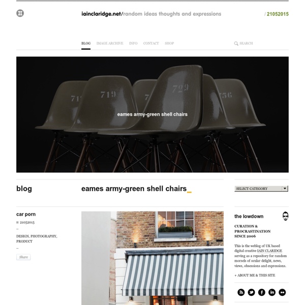
IKEA says goodbye to Futura After 50 years of the iconic Futura typeface, IKEA has made a switch to… Verdana? The 2010 IKEA catalog, now arriving at doorsteps around the world, reveals the company’s choice to change all typography to the Microsoft font that every web designer has grown to hate (you can already hear the cries). Verdana, specifically designed for on-screen readability, first shipped with Internet Explorer 3 in 1996. The font will replace IKEA Sans (a customized version of Futura by Robin Nicholas), and IKEA Serif (based on Century Schoolbook). Before After The 2010 edition of the world’s third most printed publication (next to the Bible and Harry Potter), is now available online. via Typophile UPDATE: People are passionate about IKEA’s typography, Verdana has made it to Twitter’s trending topics and there is already an online petition to replace it (Aug 26, 2009). We're surprised, but I think it's mainly experts who have expressed their views, people who are interested in fonts.
print & pattern Below The Clouds Graphic Design Tutorials : Graphic Design Software Directory & Portal for Graphics Tips : Desktop Publishing Resources & Graphic Design Links Spoon & Tamago NOTCOT Daily Icon Today's Inspiration Illustration and Art News for Illustrators and Artists Words and Pictures