
Here's why most world maps are really wrong Most likely, Greenland isn’t nearly as big as you think. This graphic by Seth Kadish of Vizual Statistix shows how the area of Africa (in white) compares to the area of Greenland (in green) in 11 different map projections. Because the Earth is a sphere, picturing the globe on a two-dimensional map usually involves some kind of distortion. The trick is in choosing where you can deal with distortion, and where you need accuracy. If you’re looking at local details, like the roads in your city, the Mercator projection is a good choice because it preserves local angular relationships, says Kadish. In many of the world maps you see (which follow Mercator projection), Greenland appears to be roughly the size of Africa – about 90 percent of the size, to be exact. The visualization demonstrates why map geeks so often gripe about the Mercator projection.
MyPantone App / Pantone | Interactivité Pantone vient de publier la dernière version de leur application mobile, myPANTONE , compatible iPhone et iPad. Le logiciel permet aux utilisateurs de capturer plus de 13 000 couleurs référencées Pantone en sélectionnant individuellement chaque pixel dans une image numérique. L’application offre également la possibilité de créer facilement des palettes d’inspiration pour les concepteurs et créatifs, et les stocke dans une section «mémoire couleur mobile” qui fera l’objet d’une future gamme référencée de nuancier Pantone. The problem with projections A map projection is an attempt to portray the world’s surface in two dimensions – such as for a wall chart or an atlas. So why is that a problem? Because the world is (approximately) round. If you peel the paper off a globe and lay it out on a table, it will look a bit like this: This example is from one of the world’s earliest globes to include America (sort-of). It was made in 1507, though the same techniques are still used today. As you can easily see, while those gores join together to make an accurate globe (or it would be, if we knew more about the world in 1507!) So geographers invented the idea of projections. The trouble is, however you decide to make this projection, it’s going to distort the reality of the globe in some way. Geographers have to choose between: Straight lines for latitude and longitude;Correct surface area for countries;Correct distances between places;Correct shapes, and several other possible requirements. Here is Wikipedia’s version of this projection: Read more
Mockup mobile et desktop - 10 PSD gratuits avec claque Smart object Se démarquer de la concurrence requiert du temps et de la patience. Néanmoins, quelques détails peuvent faire rapidement la différence. Notamment la manière de présenter votre travail. Voici une sélection de PSD gratuits idéale pour mettre en valeur vos maquettes de sites Web et d'applications mobiles. Il s’agit de mockups d’iPhone 5, d’Ipad, de MacBook Pro et de Nokia Lumia au sein desquels vous pourrez insérer facilement vos designs via un calque Smart object. Ne vous préoccupez ni de la perspective ni de la dimension de votre visuel, le calque Smart object s’en chargera pour vous. Si vous n’êtes pas adepte de Photoshop, l’outil PlaceIt est une très bonne alternative. Mockup iPhone 5 noir et blanc Mockup iPhone 5 noir et blanc vue 3/4 Mockup iPhone 5 blanc 3D Mockup iPhone 5 noir 3D Mockup iPad Mini noir et blanc Mockup iPad 3 noir et blanc vue portrait et paysage Mockup MacBook Pro Retina Mockup iPhone 5 noir et blanc vue paysage Mockup iPhone noir Mockup Nokia Lumia
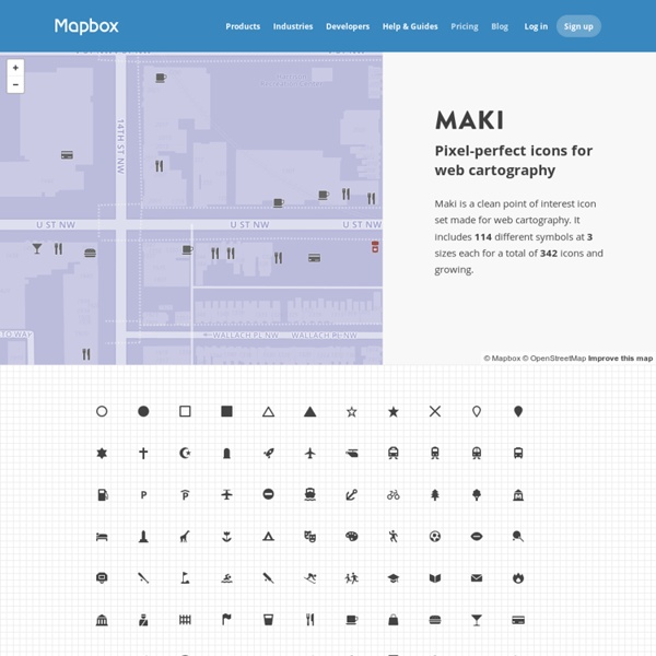
MapBox le logiciel de cartographie | Création et numérique MapBox est un logiciel Open Source, plateforme pour créer et utiliser des cartes. Il s’agit d’un ensemble d’outils et de services. On peut dessiner une carte avec MapBox Editor ou construire une application pour Android ou iPhone. MapBox est un l’un des plus grands fournisseurs de cartes en ligne personnalisés pour les grands sites tels que : Pinterest, Evernote ou Uber. On peut obtenir les cartes entre-autre en des données GeoJSON ou KML, JavaScript ou SDK (mobiles). Vision de MapBox Editor (sur internet) Vision de MapBox Studio (en application) Retrouvez MapBox et ses plugins : Posté dans : Billets
Accueil scriptopedia.org Kartograph.org Indiscripts - Laboratoire de Scripts pour InDesign Le monde en étoile: genèse d’une projection cartographique Le monde en étoile: genèse d’une projection cartographique Le constat est trivial, cartographier le globe est une platitude impossible. Cependant, malgré le succès des globes virtuels, les planisphères restent des oxymores bien pratiques. Leur pertinence réside dans la projection adoptée et peut-être plus encore dans le cadrage choisi. Si ce type de projection n’est pas nouveau, il n’en est pas moins relativement récent puisqu’il a été inventé en 1865 par Gustav Jäger (1832-1917), avant d’avoir été immédiatement perfectionné par les deux géographes allemands August Petermann (1822-1878) et Hermann Berghaus (1828-1890), qui en ont assuré la diffusion. Gustav Jäger, qui avait fait des études de zoologie à l’université de Tübingen, est, en 1865, au moment où il imagine cette carte, directeur du jardin zoologique de Vienne. Or la zoologie, au milieu du XIXe siècle, est en pleine révolution. Autrement dit, la géographie des animaux permet de comprendre leur histoire. Bibliographie RENNER T.