
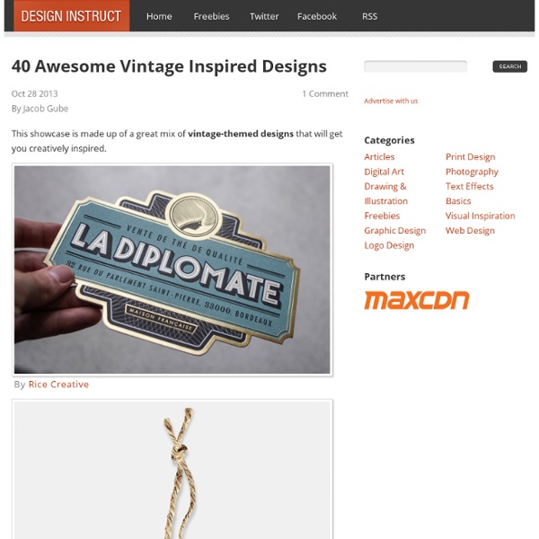
Best Practice Examples of Infographics The popularity of Pinterest and Instagram prove it; visuals entertain. More so than reading long text, and way more interesting than making your way through numbers, percentages and survey results. That’s why we’re seeing more and more infographics, on a variety of subjects. More images, less text The first, and ultimate, condition an infographic should meet is to contain as many visual elements as possible. This infographic about ‘The who, why and how of Twitter’ (click image to enlarge) is a good example of using as little text as possible. The infographic about ‘Global Hotel Price changes’ is also a good example of a visual representation of data: This infographic about Twitter, however, is not fairing so well. Follow a format Besides the text-to-image ratio, the size of the infographic has to be taken into account. Infographics are mainly viewed and shared online, for example, to support a blog post. This infographic is divided into different parts, separated by lines and subheadings.
Beautiful Packaging Design for Inspiration Package design can be a good alternative place for finding inspiration. From textures to color schemes and typography, we can get a lot of references from packaging designs. Today we gathered a few examples of inspiring packaging design from the web to showcase here. Check out each one of them and click on the images to find out more about each design and their designers. Artisans Collectors Bean House Bite ByAlex Country Archer Honey Hunter Jimbo Kathmandu OneTwoTree Pour Moi Coffee Rahal Farms Rivet Sway Sydney Hale Co. Untapped Beer Ursula Vintage Coke Bottles Yume Ume
50 Creative Examples of Negative Space Logos Creating a logo design you should consider less is more rule and make your logo as simple as possible and creative enough at the same time. Perfect technique to achieve this effect is to use negative space which can help you to achieve brilliant results. Negative space may be most evident when the space around a subject, and not the subject itself, forms an interesting or artistically relevant shape, and such space is occasionally used to artistic effect as the “real” subject of an image. This post is covering about 50 creatively designed negative space logos for inspiration. 1. 2. 3. 4. 5. 6. 7. 8. 9. 10. 12. 13. 14. 15. 16. 17. 18. 19. 20. 21. 22. 23. 24. 25. 26. 27. 28. 29. 30. 31. 32. 33. 34. 35. 36. 37. 38. 39. 40. 41. 42. 43. 44. 45. 46. 47. 48. 49. 50. You are most welcome to suggest any additions to this list.
50 Coolest & Creative Coca-cola Bottle Designs! The Dieline recently named the newly redesigned Coca-Cola aluminum bottles as the Platinum award winner in their beverage design category. From the product images above and below, you can see that the bottles are sleek, simple and bold. The bottles, designed by Turner Duckworth, remain instantly recognizable as Coca-Cola products while still being very fresh on the eyes. I had opportunity to come across these bottles for the very first time tonight and I was so impressed by how beautiful they look as shelf items. This bottle also named aluminium bottle. Nathalie Rykiel [via]Selfridges centenary coca-cola' is celebrating every londoner's favourite departmental store, selfridges' 100th birthday with the exclusive selfridges centenary bottle, an eye-catching limited edition original glass bottle that shines in the store's signature shade of yellow. Julien Muller, a graphic designer and illustrator from Metz, France has developed a summer concept for Coca-Cola. Versace Blumarine Missoni Cold
9 Sites That Made Me a Better Logo Designer Any person serious about their career – carpenters, graphic designers, dentists, or anyone else – is constantly trying to learn and improve at their craft. You and I are no different. If you’re reading this, chances are you’re an aspiring or perhaps established graphic designer (*design bro high-five*). Likewise, if you’re reading this, you’re interested in self-improvement. Brand New UnderConsideration’s Brand New is, in my opinion, the undisputed king of logo/identity design critiques. LogoDesignLove LogoDesignLove is another site that provides unique and thoughtful takes on any and everything related to logo and brand design. JustCreativeDesign JCD is one of the earlier design blogs I discovered. Creattica & LogoPond Every logo designer hits a roadblock at some point, and needs some inspiration to get the creative wheels turning. ReBrand In their own words, ReBrand is “the world’s leading resource focused on effective brand transformations”. Pentagram Your Logo Makes Me Barf Twitter
Nine unusual products from Japanese designer, Oki Sato We’ve introduced the work of Oki Sato of Nendo before with Coca-Cola bottleware and a Starbucks pop-up store, but you have yet to see just how creative and unusual his art can be. From floating chairs to puppet tote bags, Mr. Sato strives to “give people a small ‘ ! Thin Black Lines These chairs were part of an exhibit titled think black lines and were shown as part of a private exhibition at the Saatchi Gallery in London. bird-apartment It may look a little excessive, but this bird apartment has 73 small entrances for birds and one large entrance for humans. cabbage chair Made of pleated paper, a byproduct of pleated fabric production that is usually thrown away, the cabbage chair is unfinished and doesn’t have any nails or screws. The folks at Nendo hope to ship the furniture as a single roll, allowing the buyer to “peel” their chair at home. fadeout-chair The fade-out chair was designed to make it seem like the legs were immersed in fog. shivering-bowls fold chocolate-pencils socket-deer
Round Labels in a vintage style design Cathe Holden from justsomethingimade.com has designed an exceptionally beautiful vintage label set printable on our blank Round Labels in 2.5″ size. Free for download – Free for your personal use only. Vintage Round Labels Free printable round labels for your laser and inkjet printers. Use the these vintage designed round labels for your jars with jam, tin containers for candles, use them for wedding flavor gifts, for organizing your kitchen, for organizing your personal items or for any thing you need to make look beautiful!!! To change fonts: type, size or color, (as well as bold, italics, etc.) select Control +E if you’re using a PC or Command + E on a Mac. DOWNLOAD THE COMPLETE COLOR SET (Plain PDF) Flavor Box Organize your personal item Tin Containers for candles, candy, potpourri and more! Organize your items Perfect for labeling your food jars Excellent for your glass jars for jams and preservatives from her home studio in Petaluma, California while raising her children.
Modernism vs. Zen Aesthetic by Zoe Y. Zheng Seattle-based graphic designer Zoe Y. Zheng has created this clever series of minimalist posters entitled “Modernism vs. Zen Aesthetic”… Zoe Y. «Modernism vs. 6 rules for packaging design that dive off the shelf According to FMI (Food Marketing Institute), the average supermarket in the USA holds around 40,000 different items. This nearly $600 billion industry relies heavily on consumers, distributors, manufacturers and… graphic designers. Product packaging, as a graphic design discipline, is an industry itself. Multinational design agencies like Landor, CBA’a and Coley Porter Bell employ hundreds of designers who focus almost entirely on creating strong brands through packaging design and branding. Here at 99designs, product packaging is a growing category waiting for great designers to enter and build their portfolio. 1. Next time you go to a supermarket, pick a random shelf and browse through some products. What’s this product for? A great example of simple, clear yet highly distinctive packaging design. You’ll find products listing dozen of benefits with no clear brand name. This is a BAD example! So remember rule number one: be clear about the product, be clear about the brand. 2. 3. 4. 5. 6.
Ammonitum's beautiful wooden bathroom fixtures Posted by hipstomp | 24 Sep 2010 | Comments (1) Anyone who's ever dealt with wood rot will tell you wood has no place in the bathroom, especially not as a vessel for water; but Swiss manufacturer Ammonitum gets around the wood vs. water problem with special manufacturing techniques. Ammonitum's wooden sinks, bathtubs and toilet seats, after being glued up and shaped, are heavily polished, soaked in mordant solution, and covered in a minimum of ten layers of varnish. Finally they're coated in high-gloss NanoCover, a waterproof Danish solution used for everything from marine applications to anti-graffiti coatings. The whole process takes about twelve weeks, and the results are pretty darn eye-popping. Hit the jump to see more.